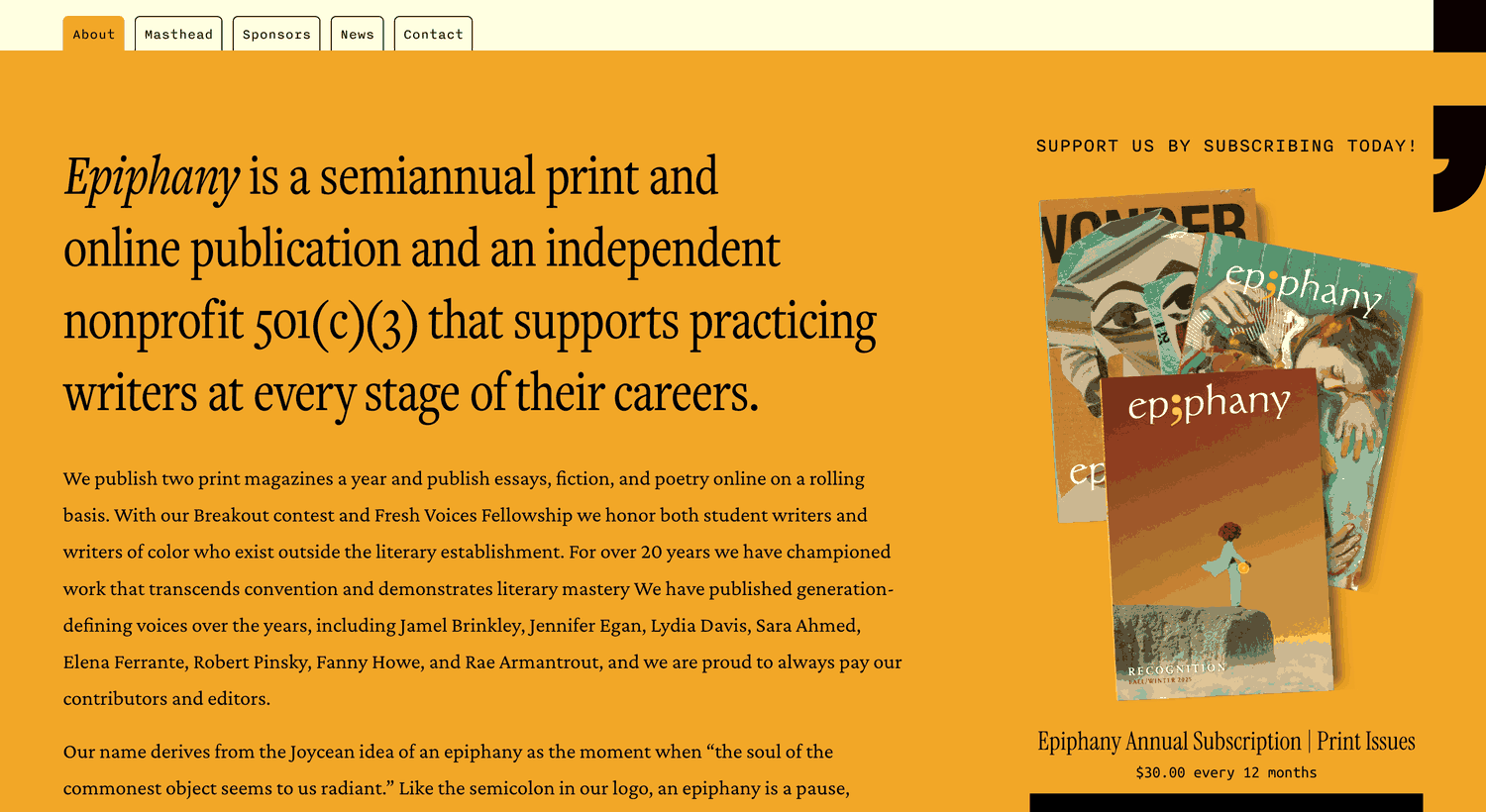
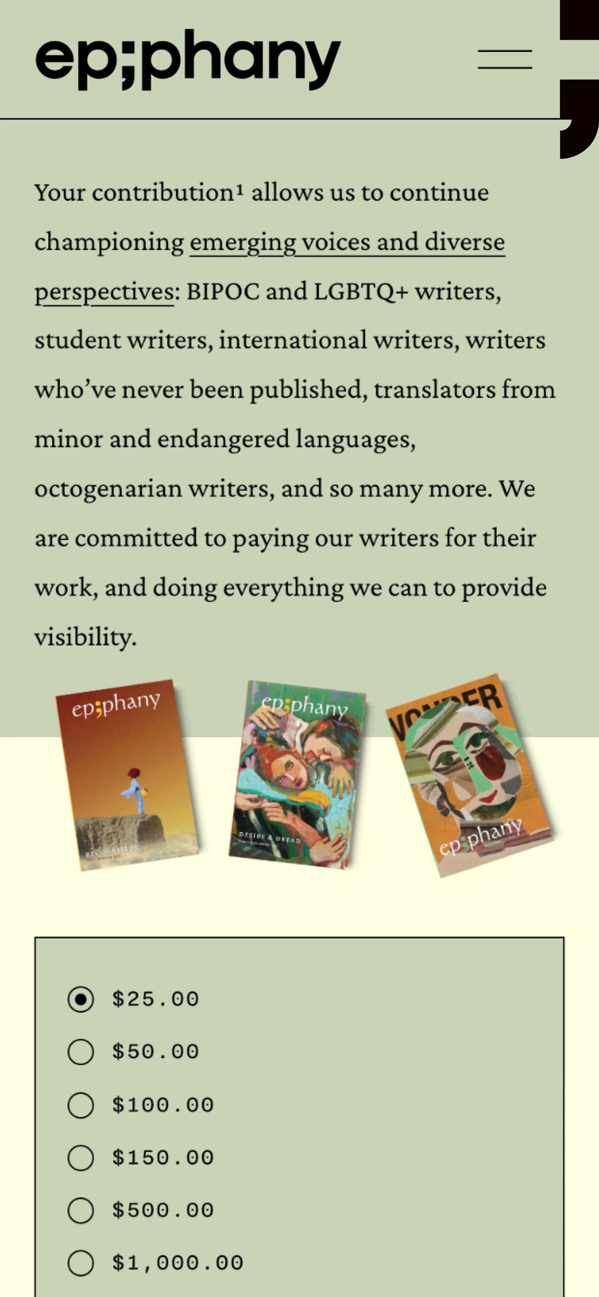
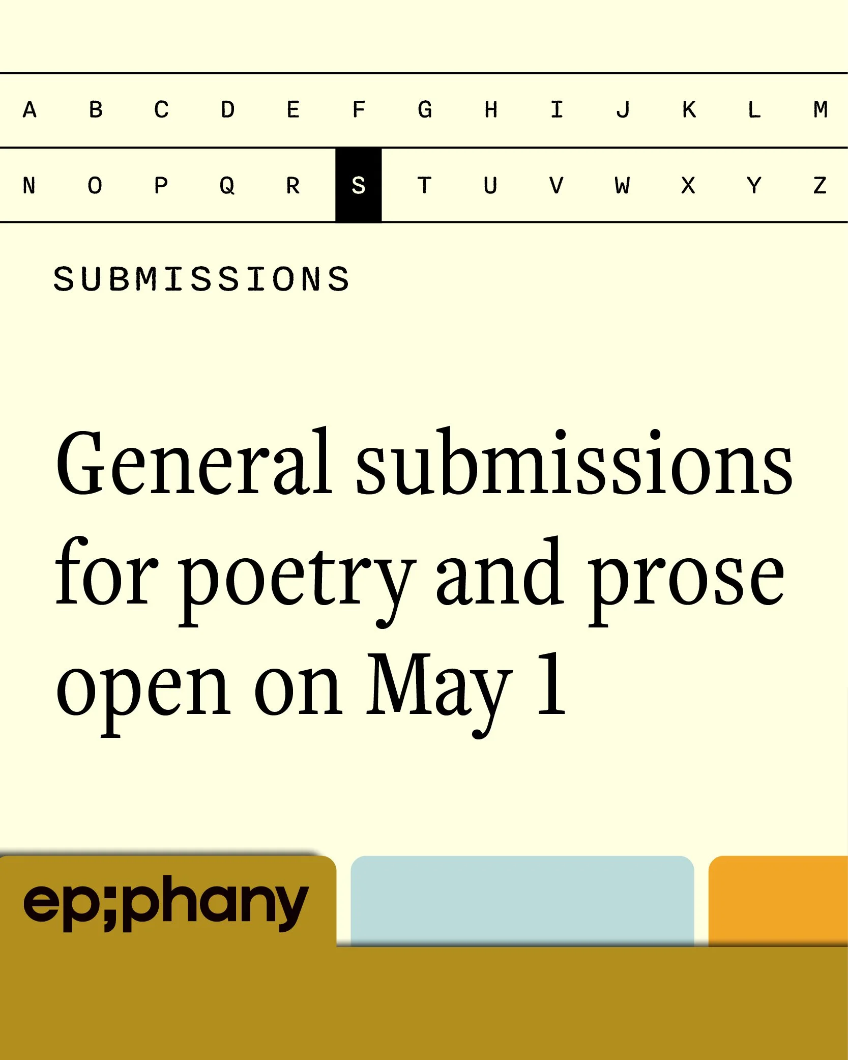
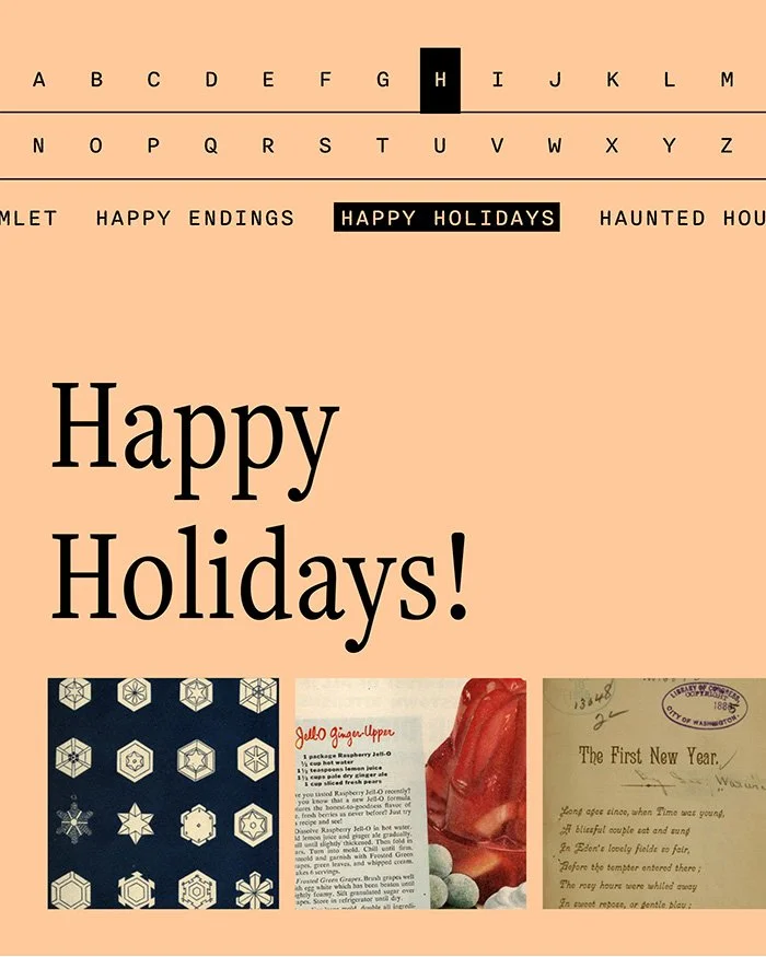
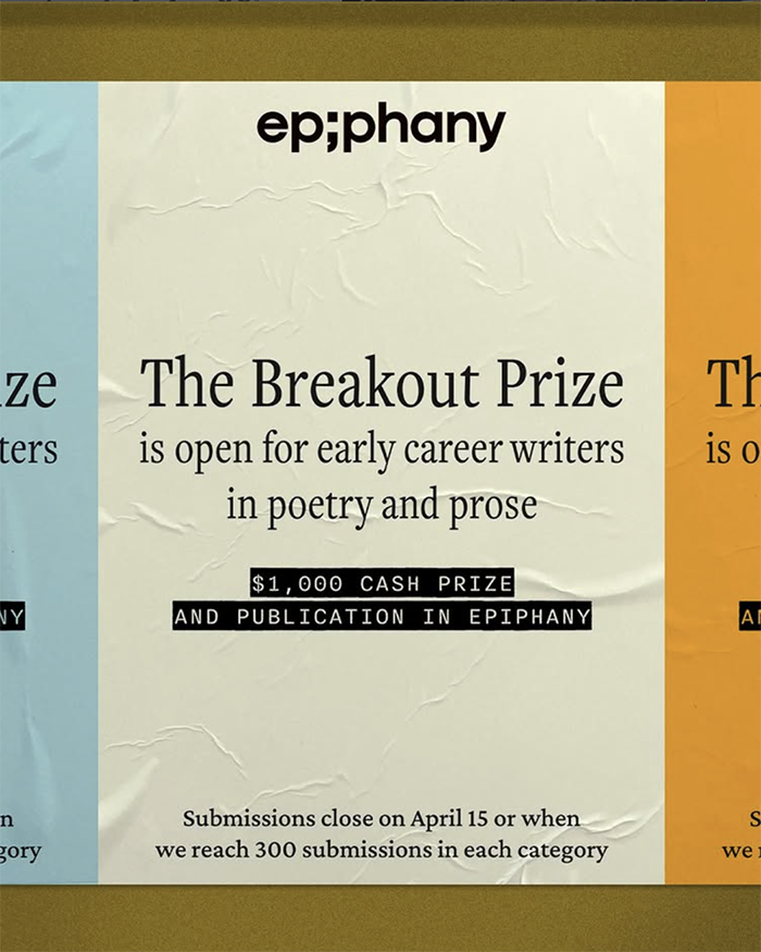
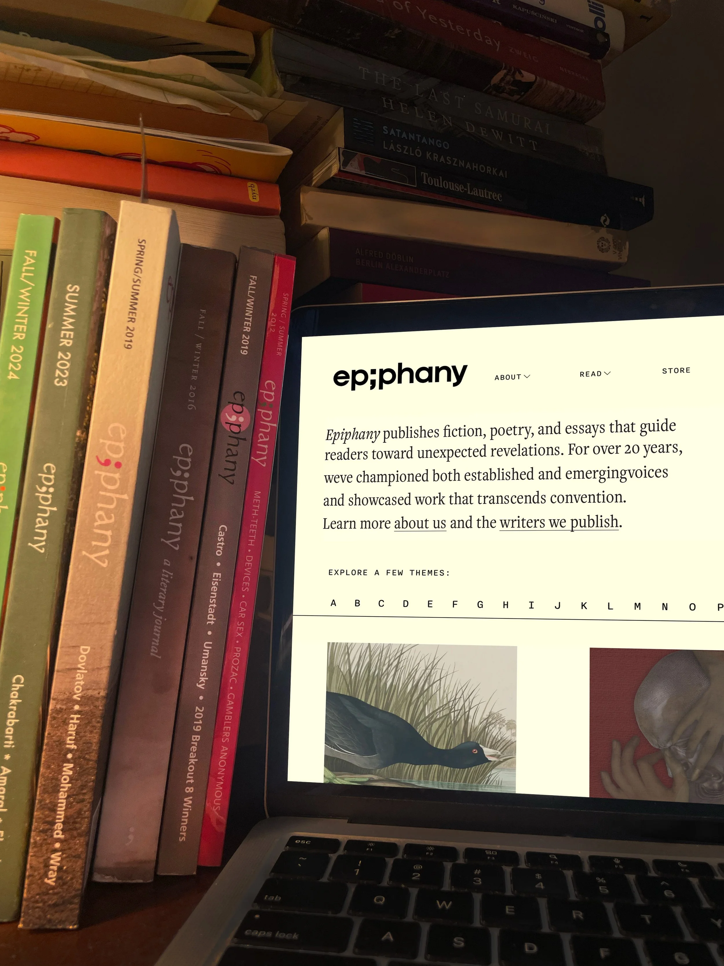
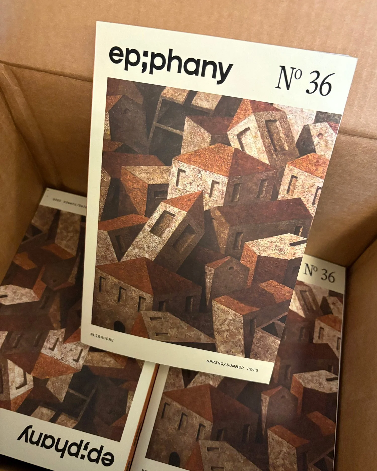
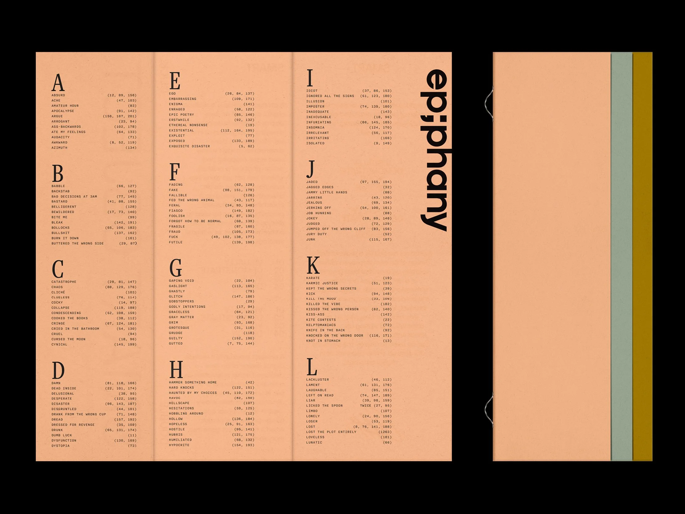
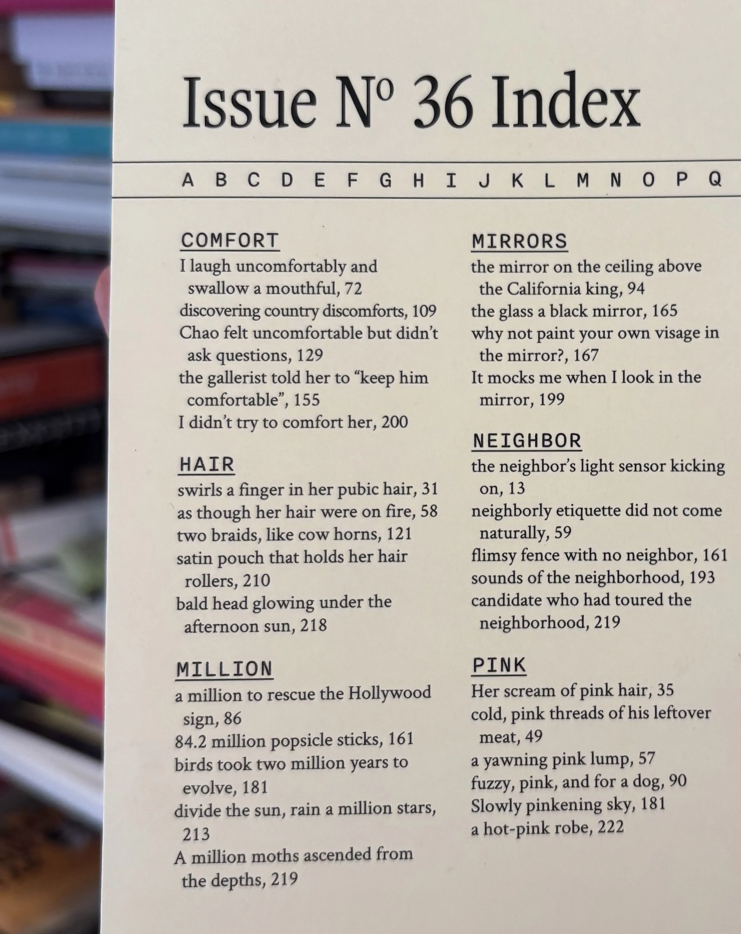
Epiphany is a literary magazine that’s been publishing fiction, poetry, and essays for over 20 years, championing writers at every stage of their careers. After two decades, the magazine needed a refresh that honored its history while bringing it into the present. The new identity draws on the magazine’s back cover index, a long-running, often irreverent feature that now appears throughout the system. It anchors discoverability on the website’s homepage, structures newsletter sections, and continues to live on the back cover of the redesigned print.
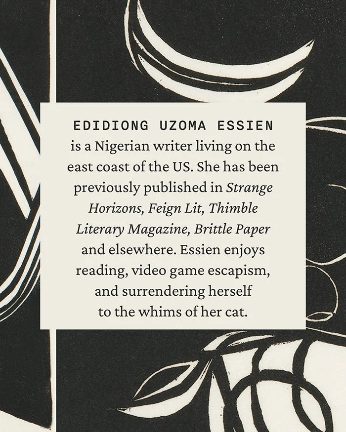
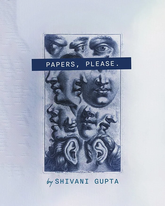
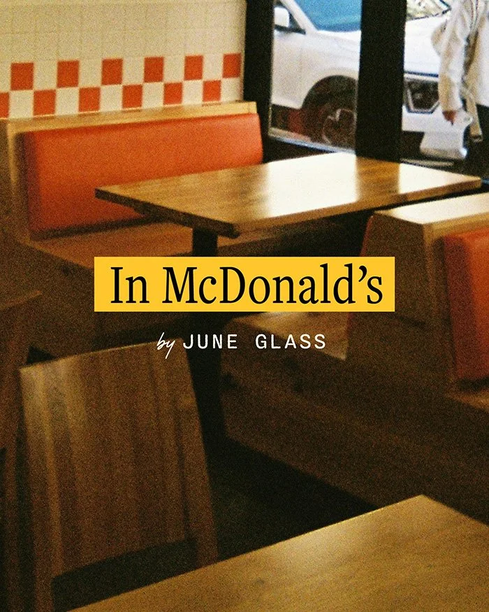
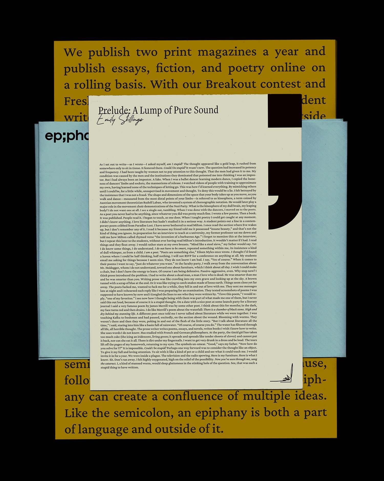
Around a clean custom logotype, the system layers editorial structure with the texture of real reading: annotations, collaged scraps, ephemera tucked between pages, photos that could double as bookmarks. A warm, nostalgic palette sits alongside a typographic system that pairs literary tradition with archival precision. The magazine’s visual world is meant to feel like a friend’s well-loved library, which you’ve been invited to wander through.
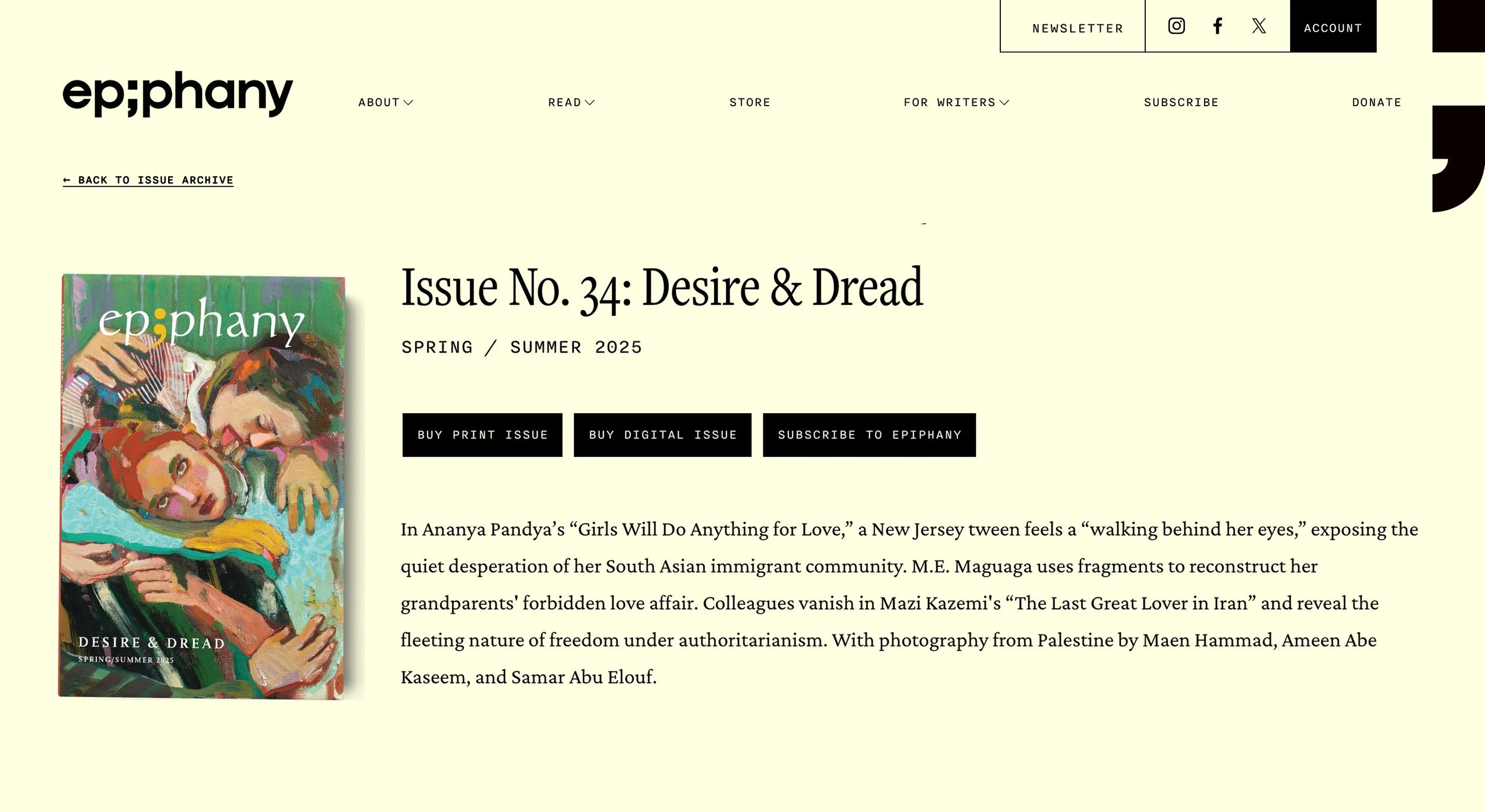
The logo embraces restraint. Anchored by the semicolon — the one element the team wanted to keep from the previous identity — the new wordmark feels effortless, as if lifted from a paragraph of carefully laid out prose. The semicolon functions as punctuation in its truest sense: a pause followed by a shift, a confluence of ideas, something both within language and just outside it. The design trusts that simplicity will carry weight, revealing itself slowly, like the writing the magazine publishes.
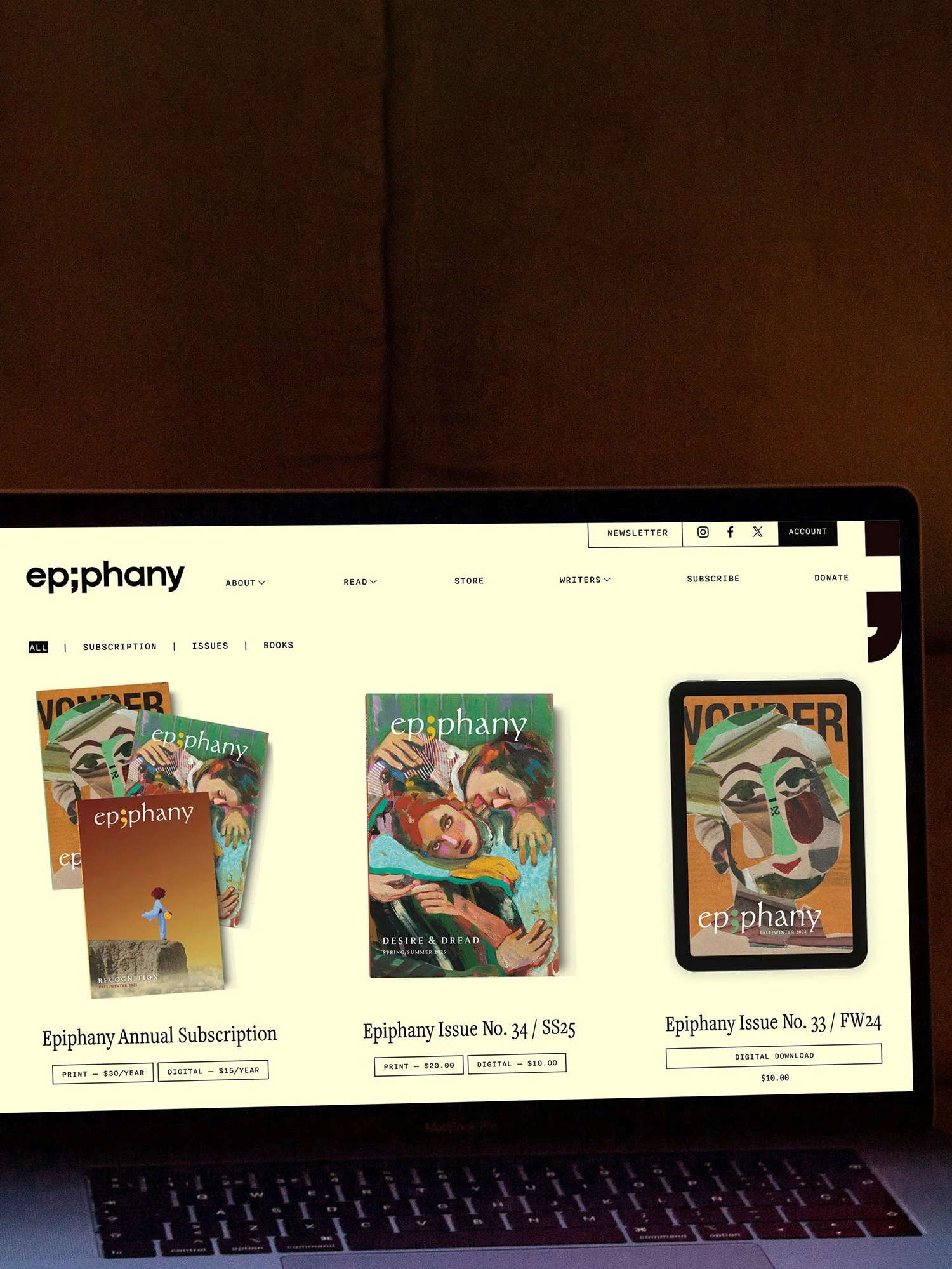
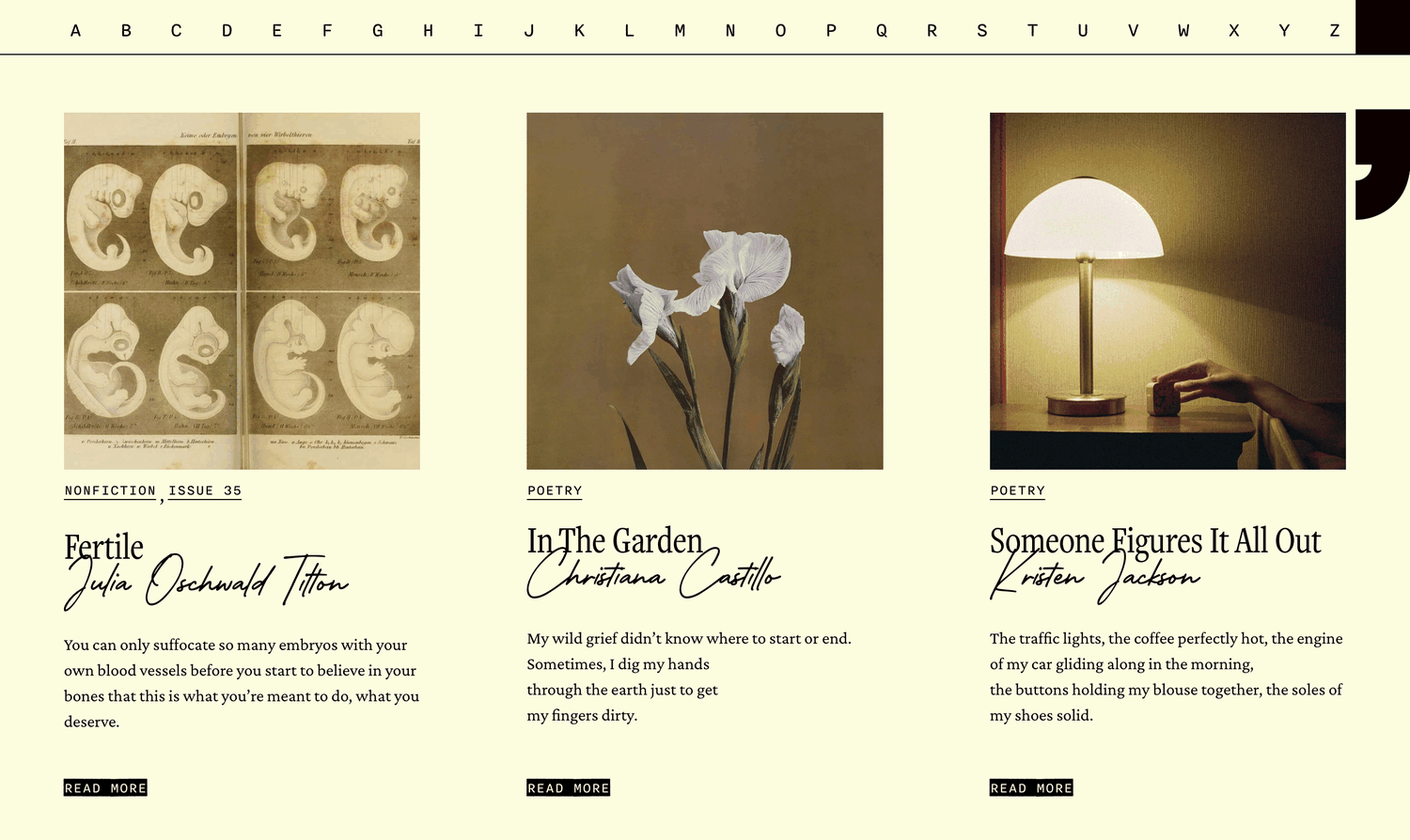
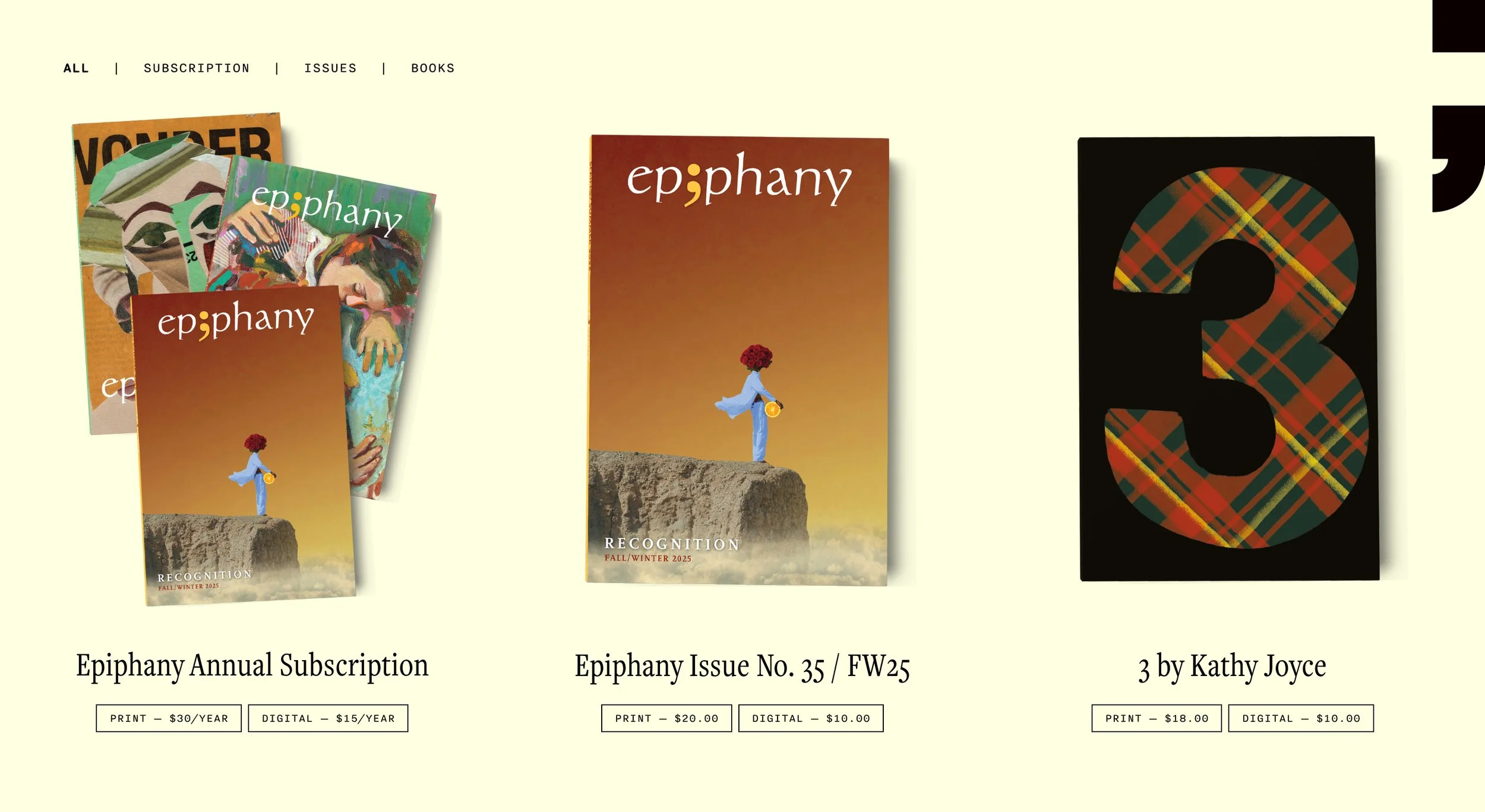
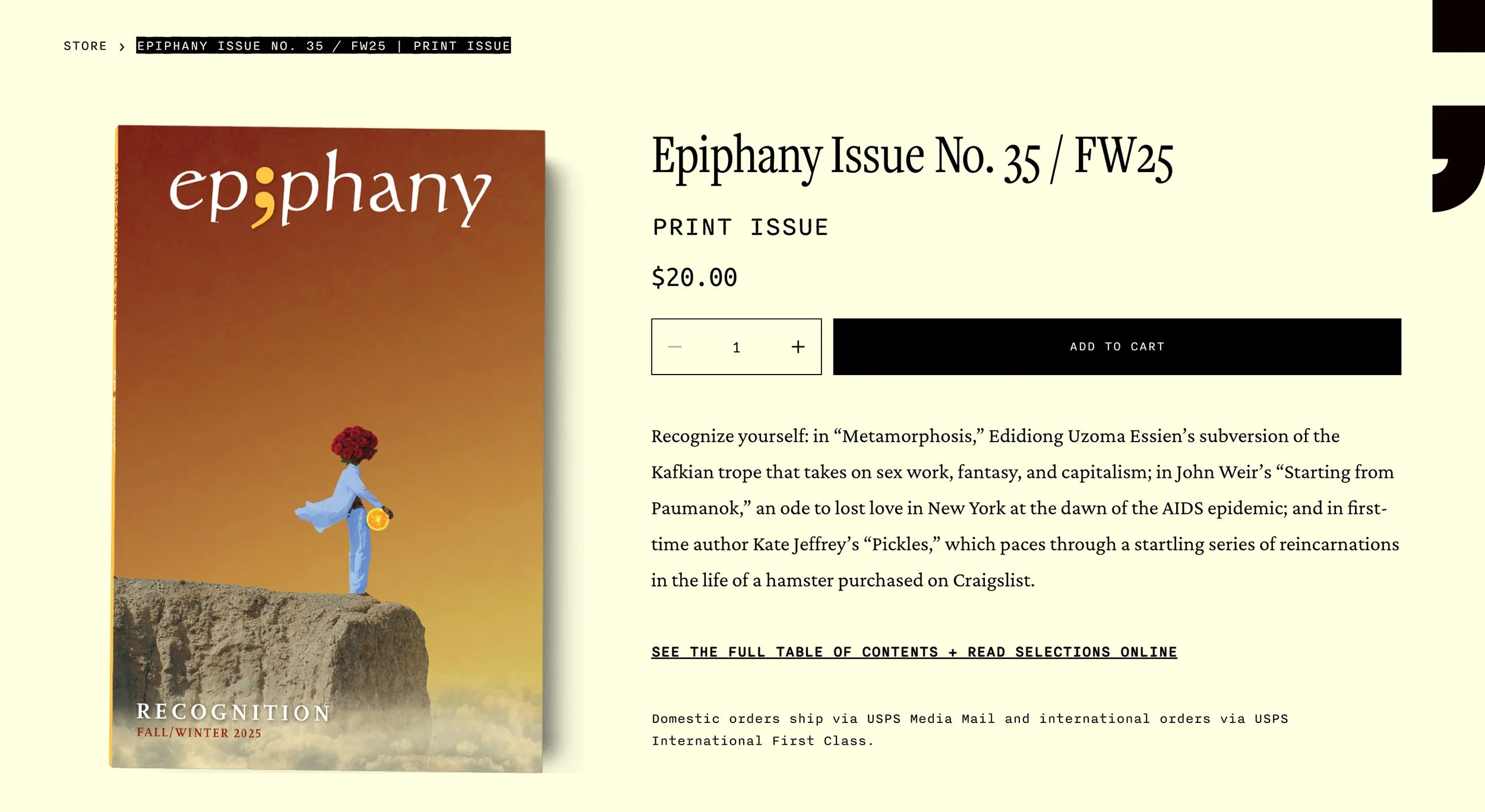
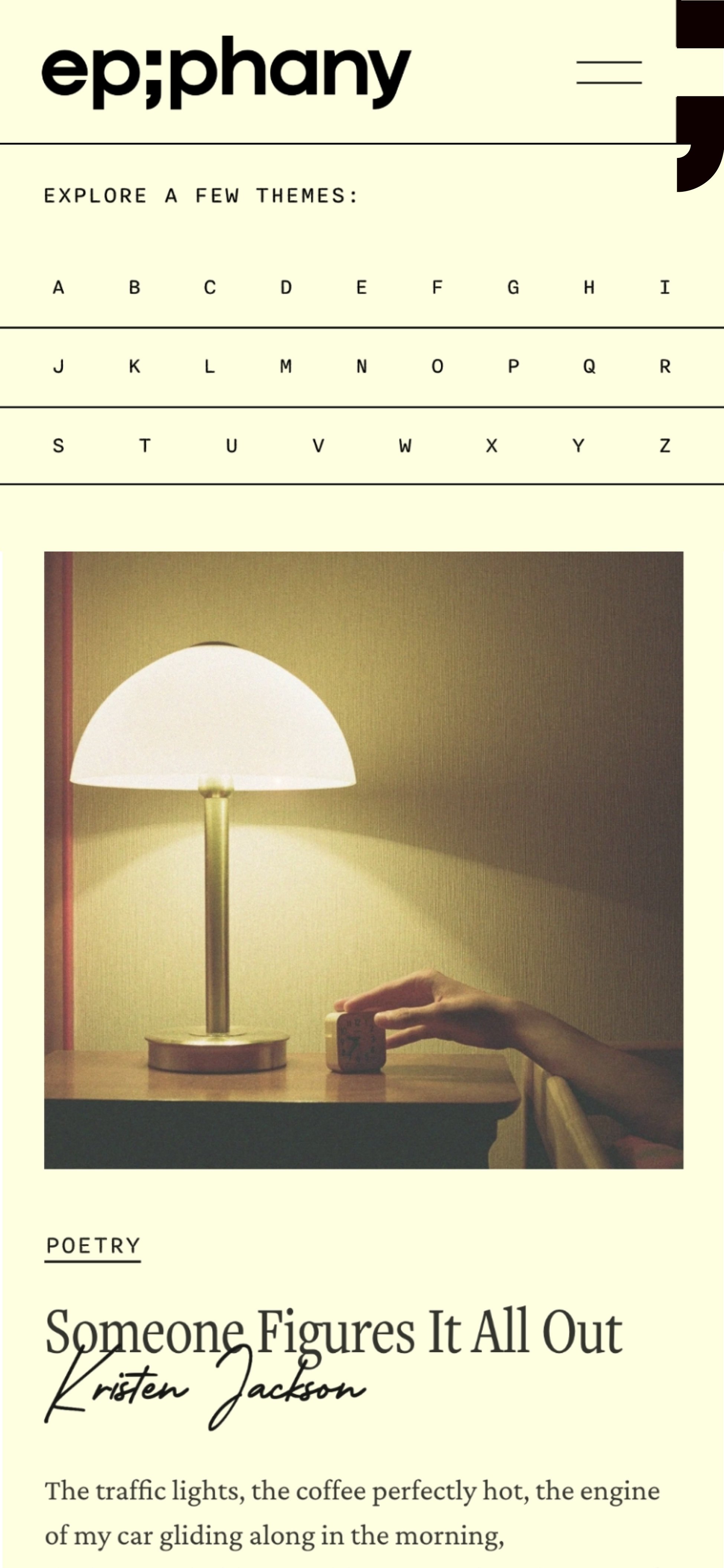
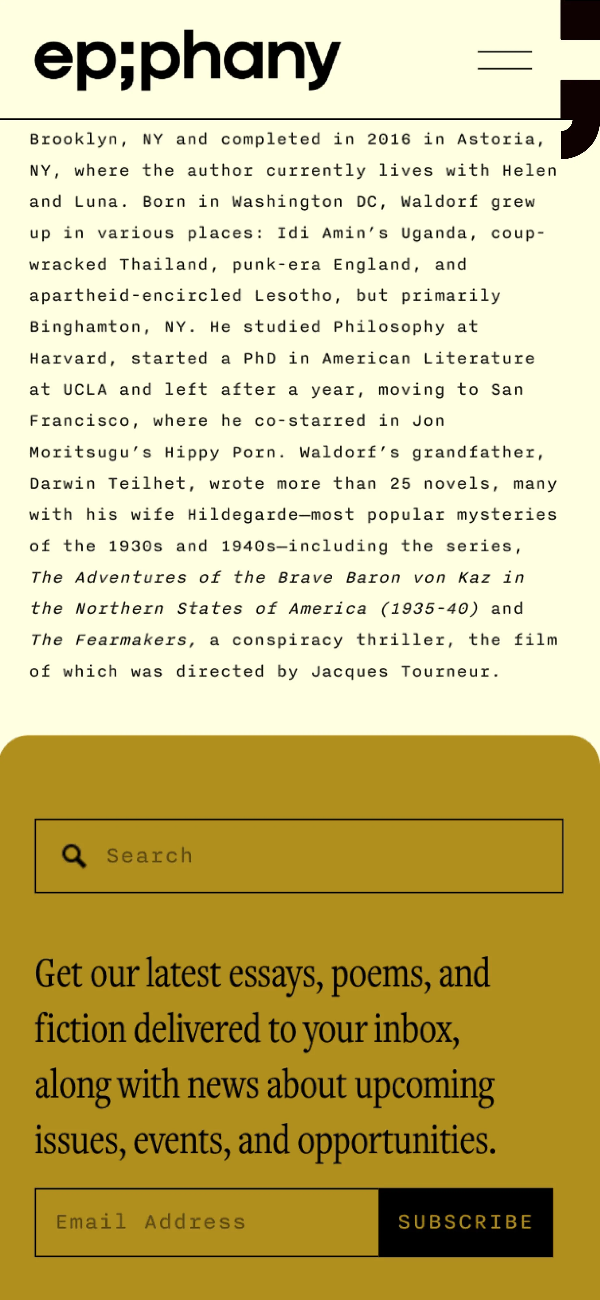
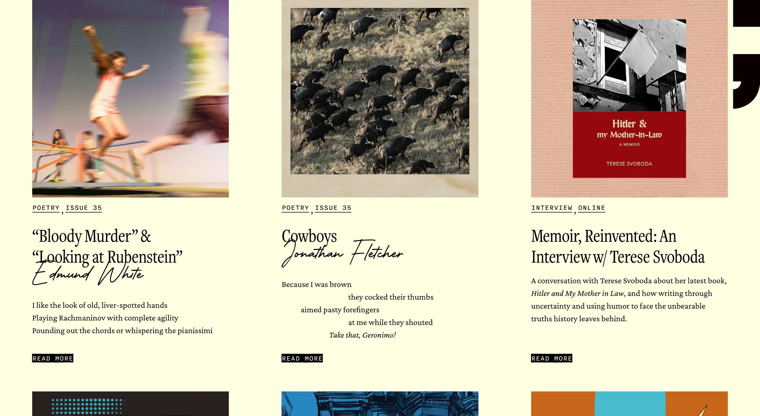
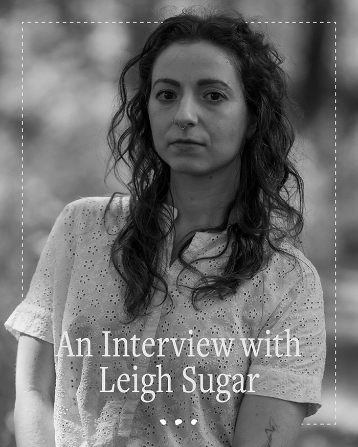
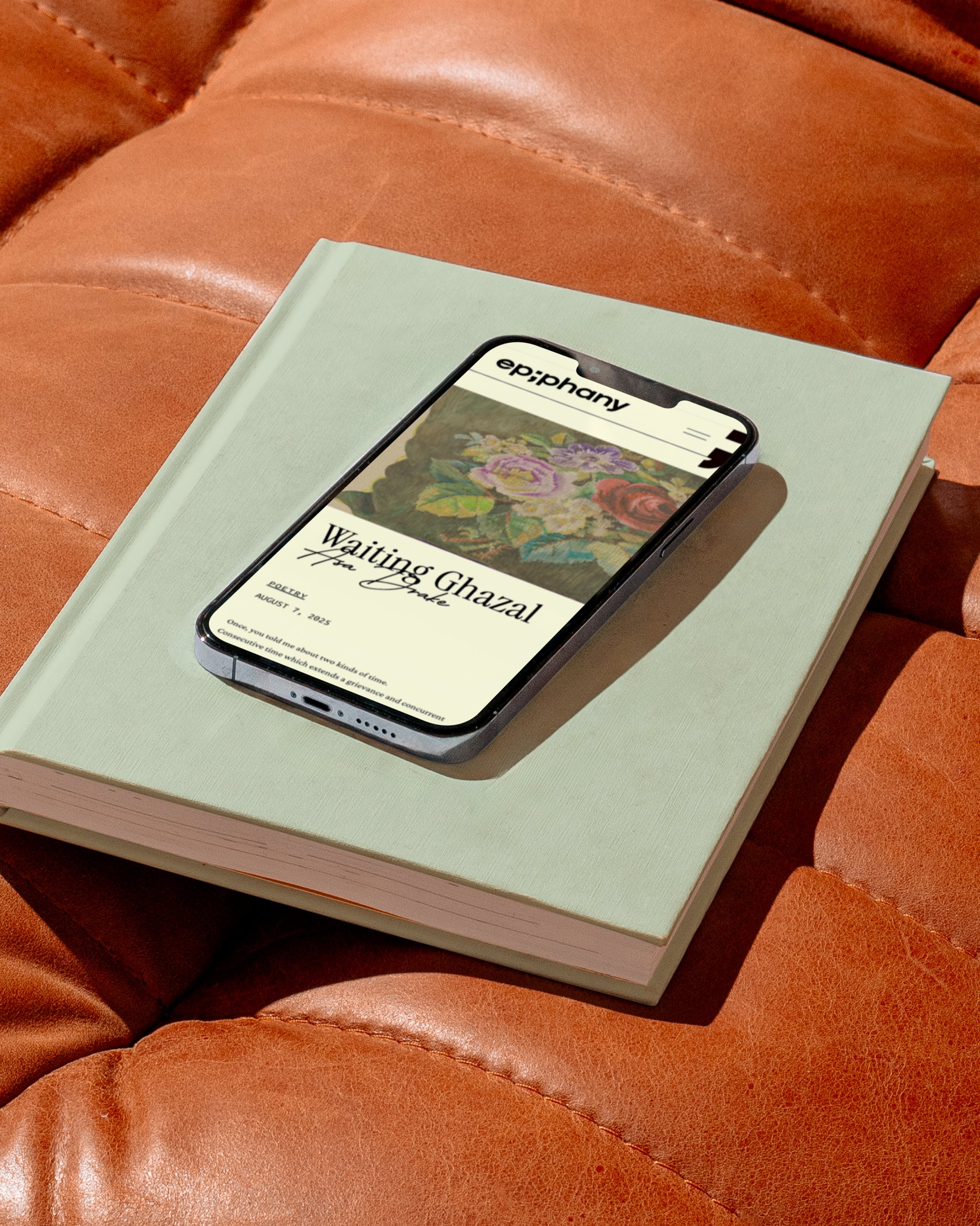
The redesigned website carries the new identity’s analog sensibility into the digital space, balancing the warmth of printed matter with the kind of structure and browsability a contemporary literary publication needs. The homepage index lets readers explore by theme, turning the magazine’s signature feature into a navigation tool and a quick window into its editorial viewpoint. The brand semicolon stays anchored to the top right corner of every page, a quiet, persistent presence that holds the identity together as readers move through the site. A narrow serif sets headlines, a fluid handwritten font is used for author names, and a rough-edged typewriter font balances it all across labels, tags, and metadata.
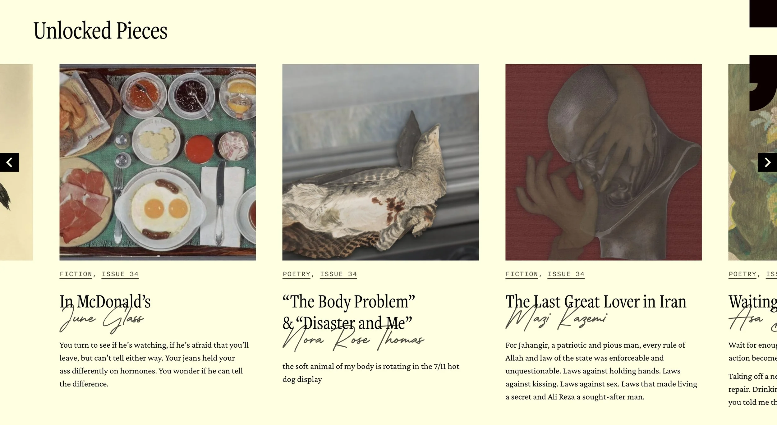
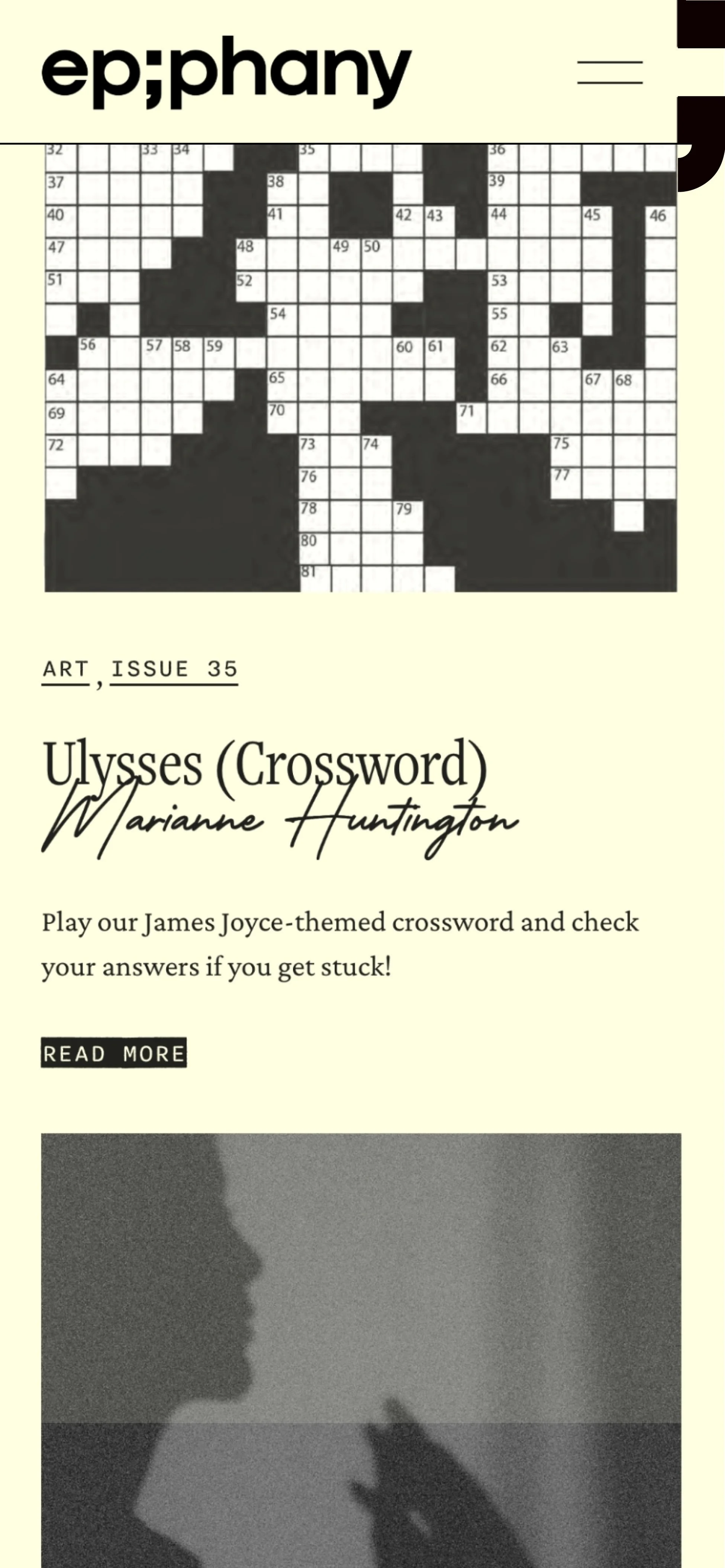
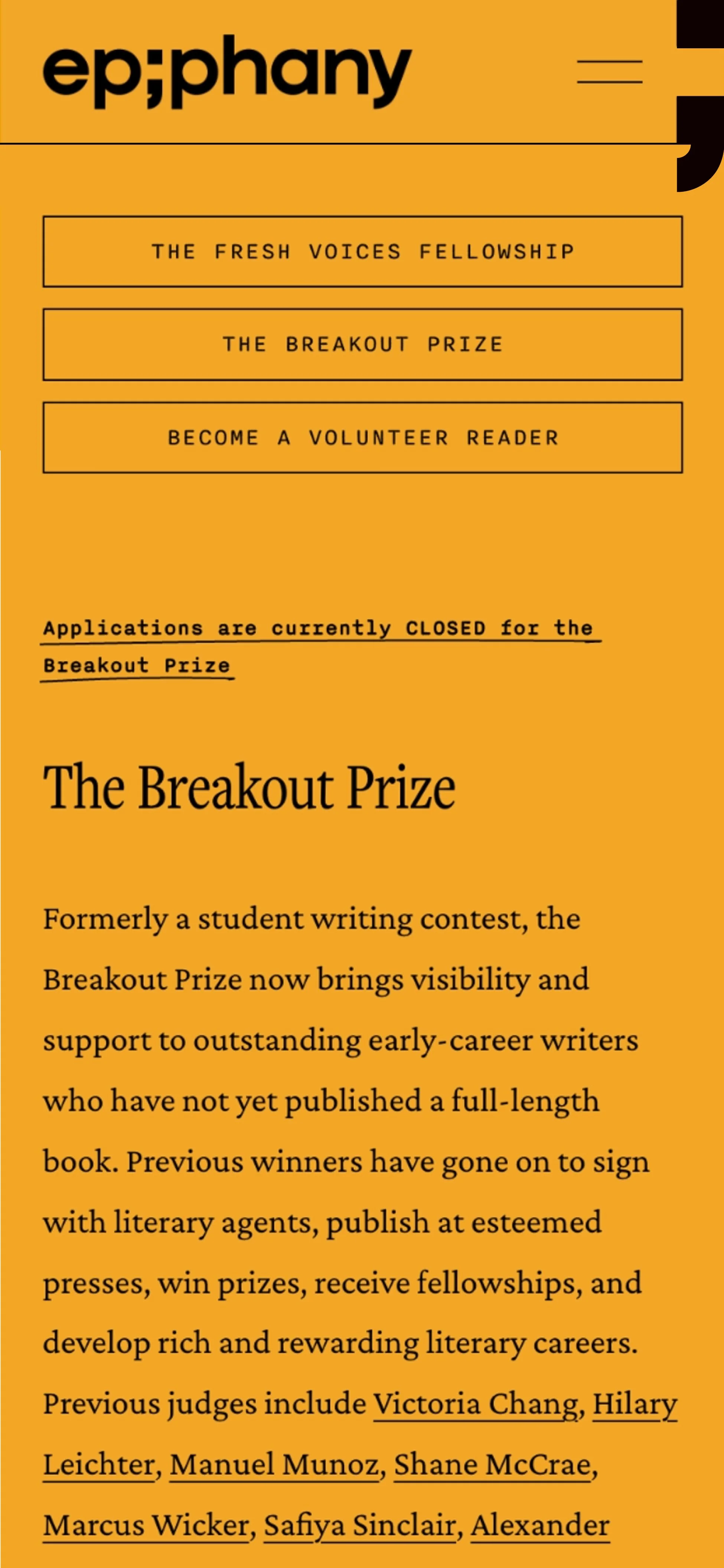
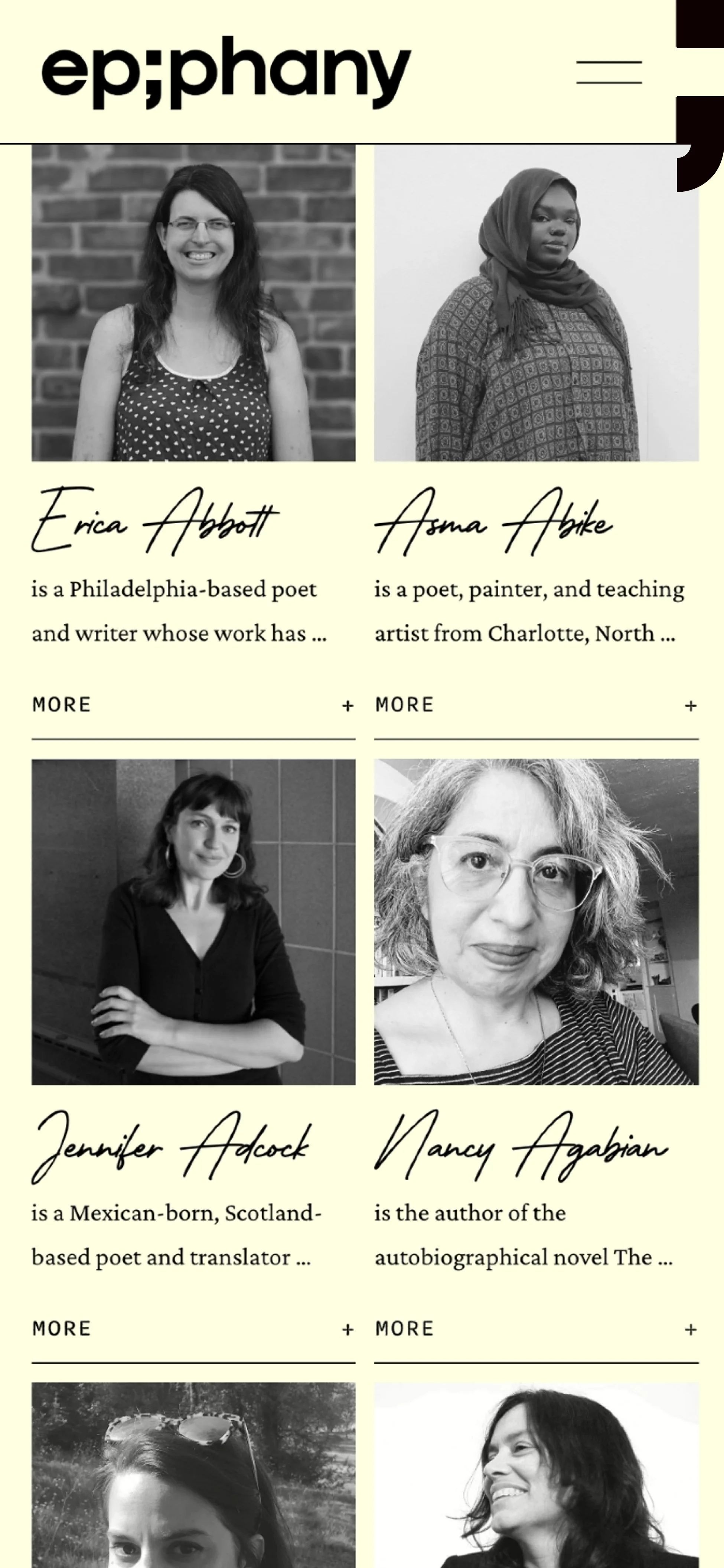
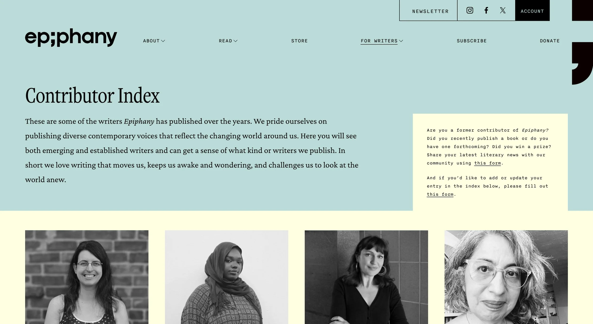
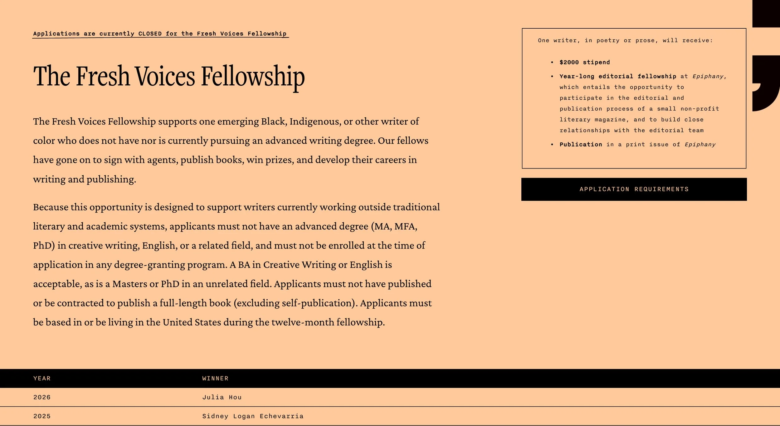
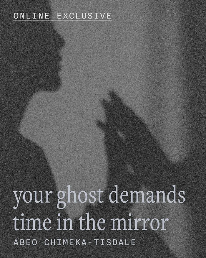
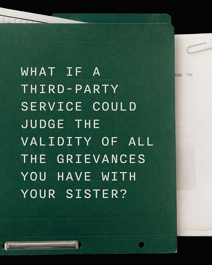
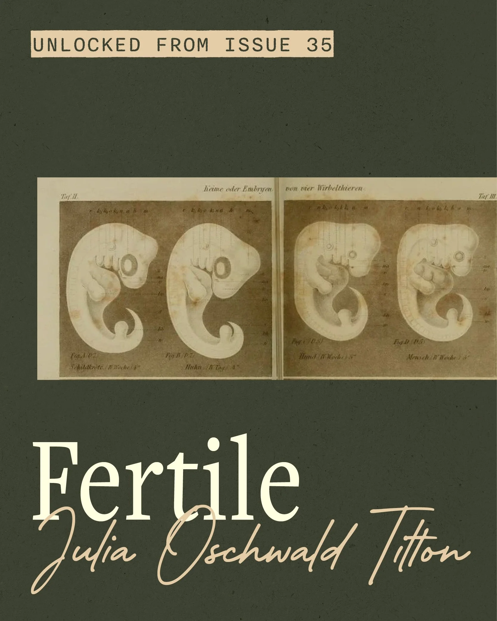
About pages use a tabbed folder structure to house the more informational elements of the site. Essays and poem pages were rebuilt with pull quotes in the margins and a comment section that keeps readers engaged. The archive surfaces online pieces from each issue through carousels, and a members area unlocks the full digital catalog for subscribers. A custom-built shop streamlines checkout and opens up the entire back catalog for purchase, turning the archive into a more robust revenue stream. An area for writers gathers submission guidelines and opportunities alongside a contributor index that reinforces the sense of community Epiphany works to build.