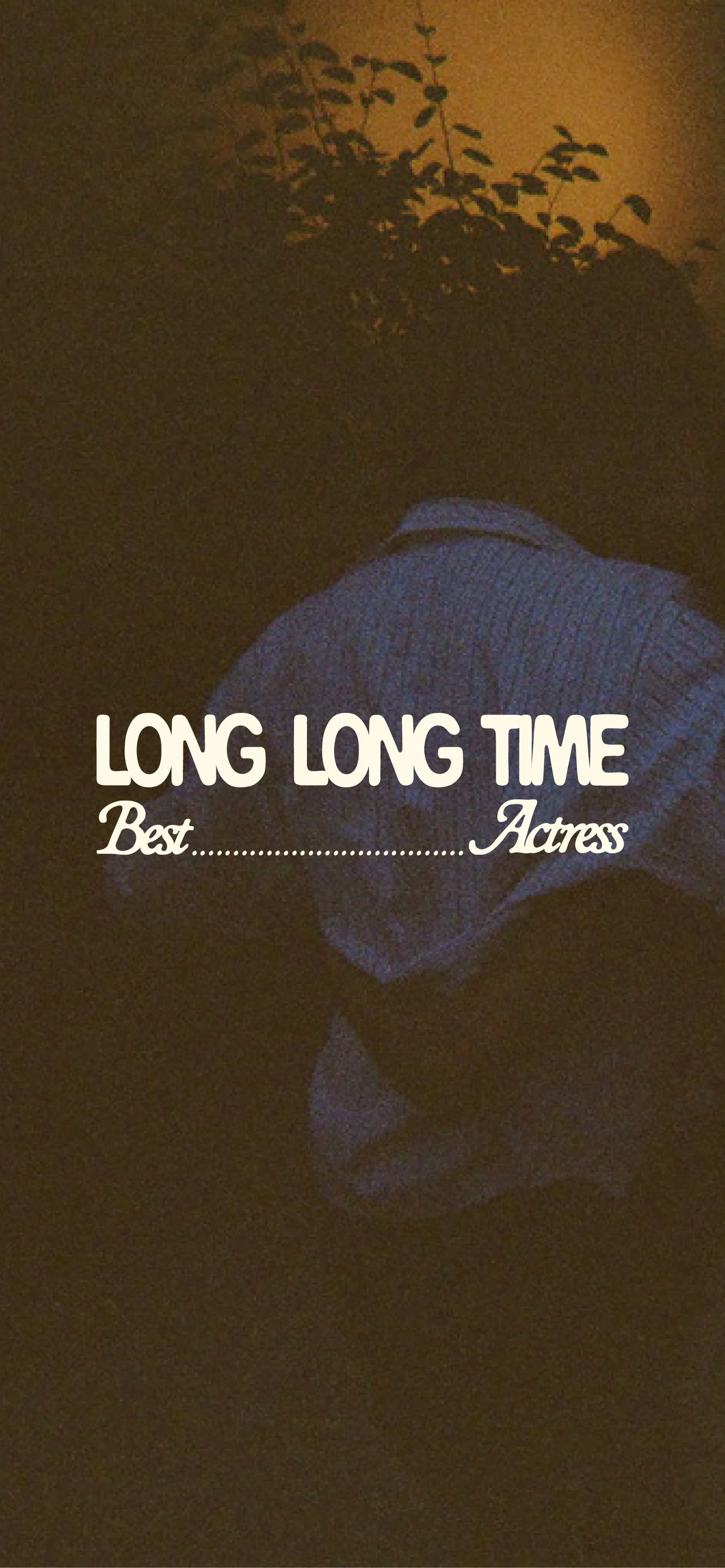
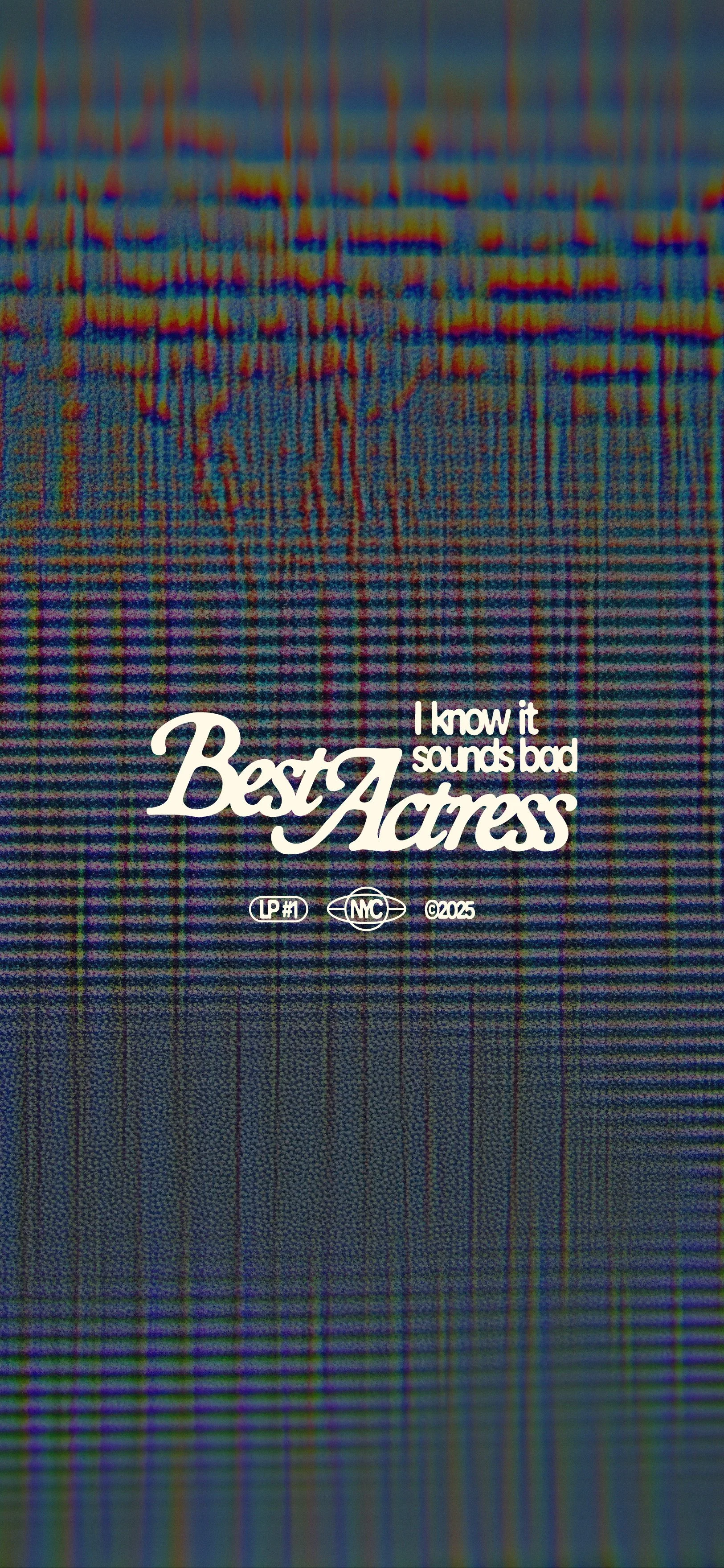
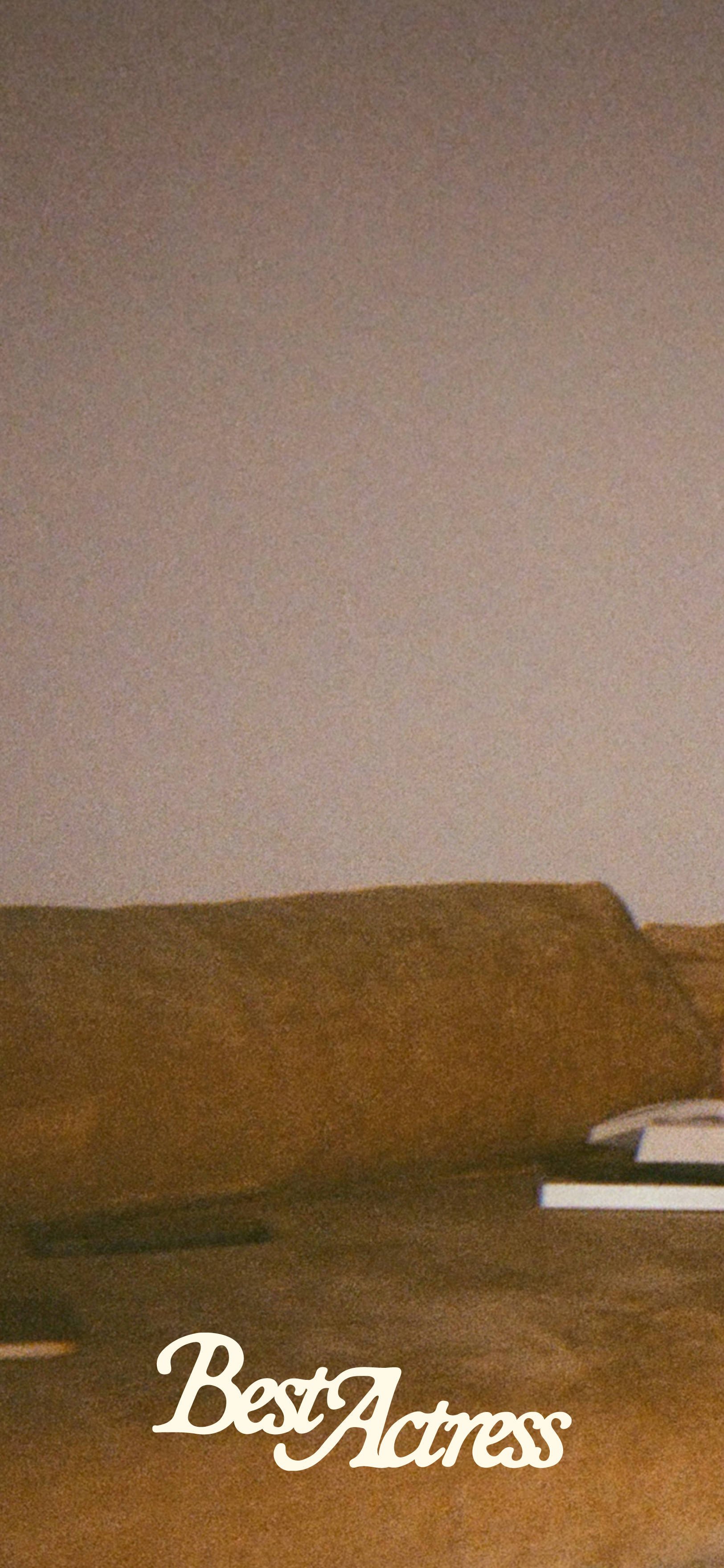
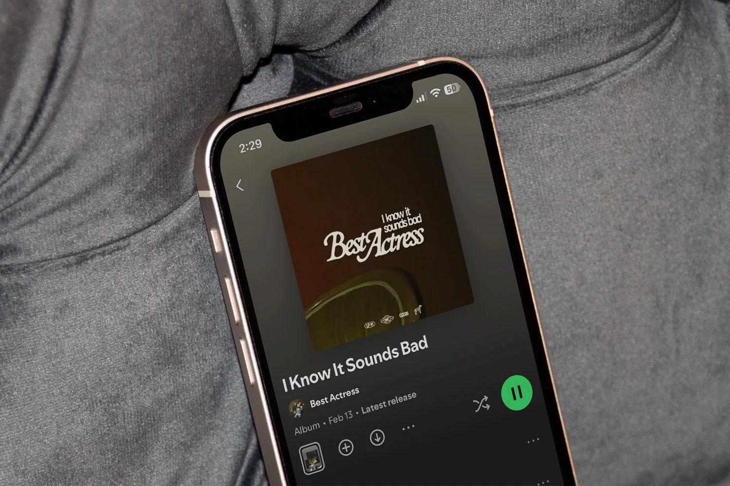
Best Actress lives in that sweet spot between self-aware performance and genuine connection, and the identity for the band and its first EP treats lo-fi moments with cinematic intention. It’s a living room film festival: ambitious enough to print proper programs, cozy enough that it’s happening on your couch. Everyday life as a stage worth documenting with both sincerity and whimsy.
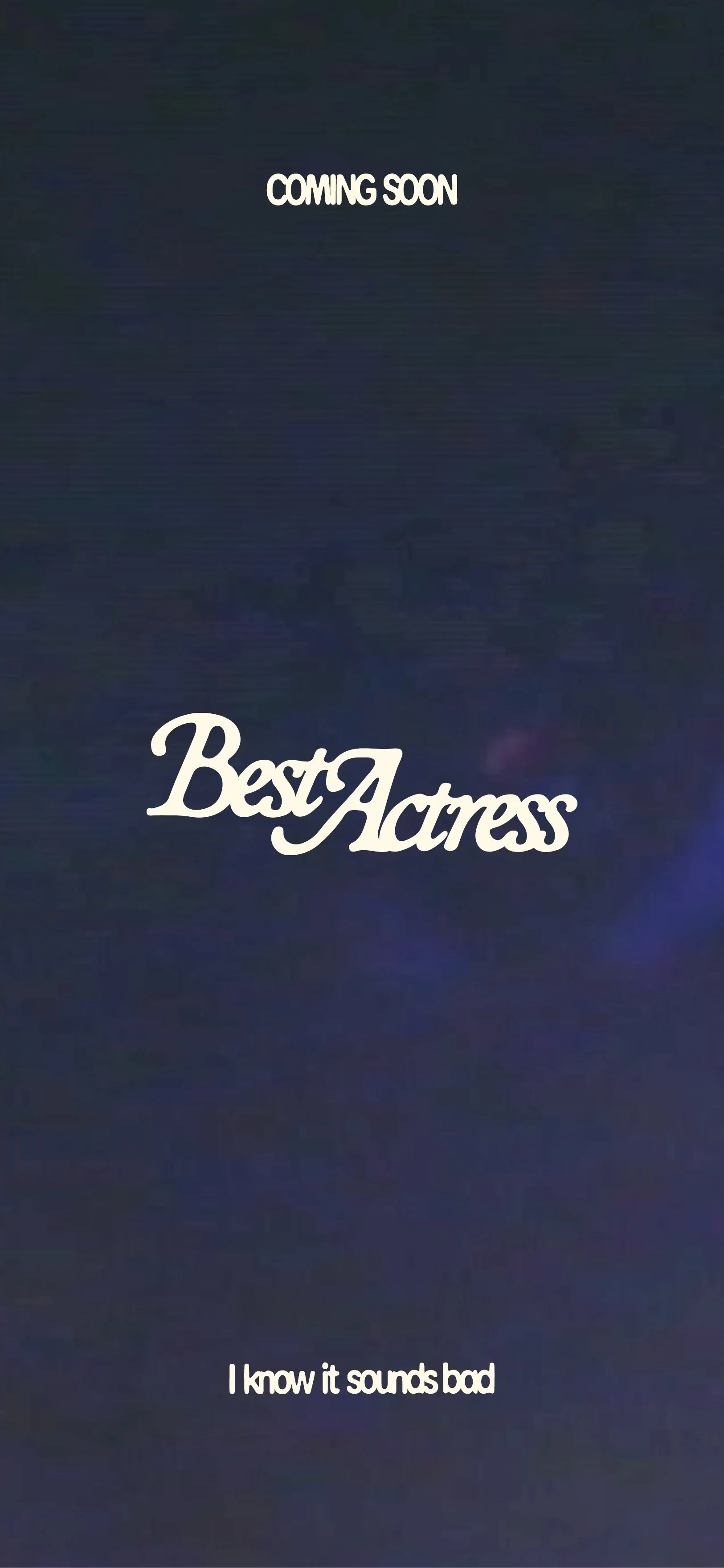
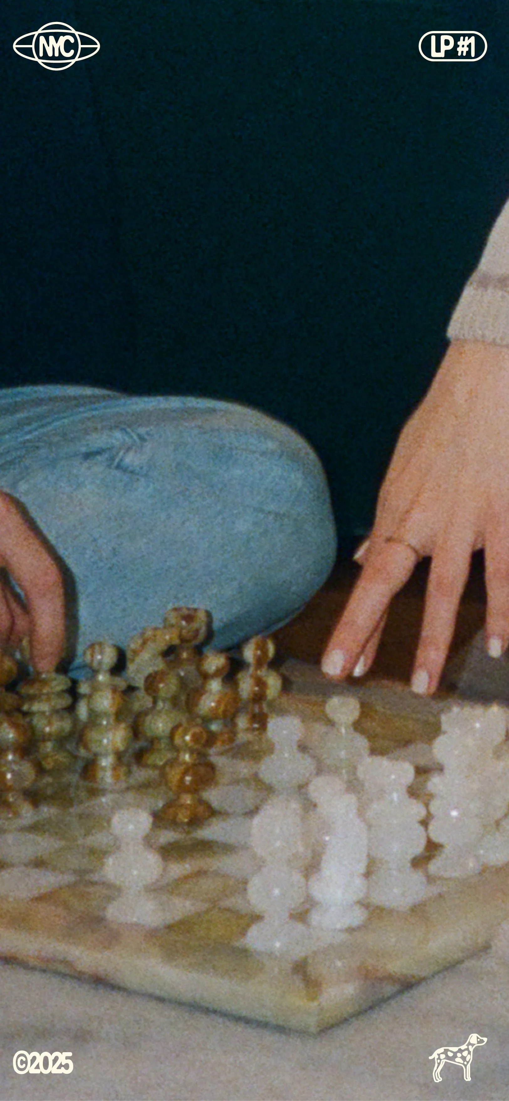
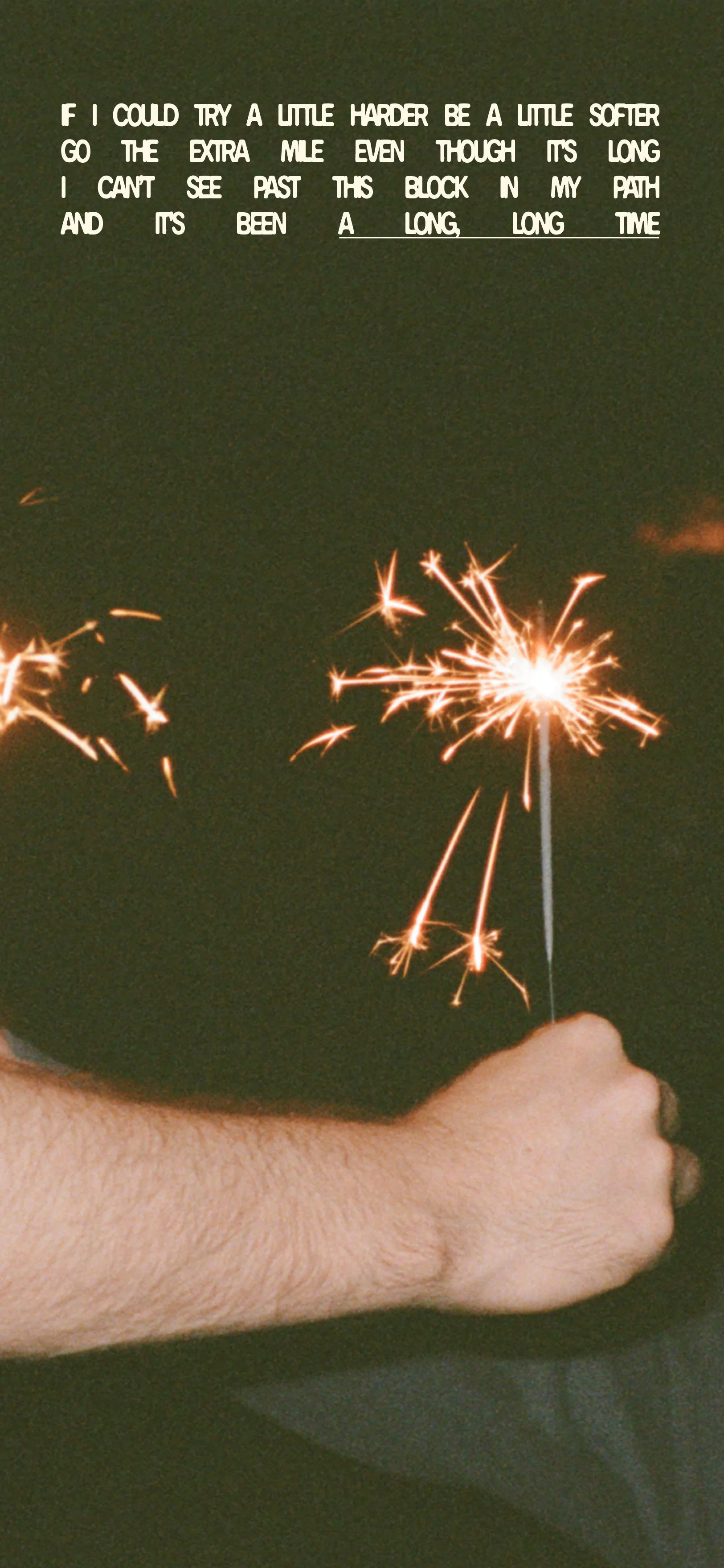
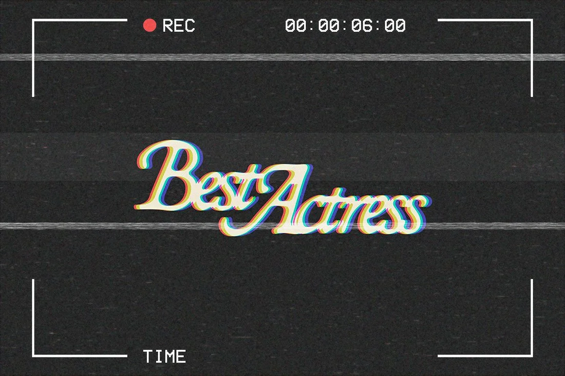
The visual language pulls from vintage film credits and home movie aesthetics. Retro typography with ink-bleed imperfections, micrographic details that wink at studio logos, and photography that frames casual hangs with real care. Small filmic flourishes (credit-style treatments, slightly unnecessary technical specs, tongue-in-cheek details) add playful deference, and the whole thing feels timelessly nostalgic. It’s a little 70s, 80s, and 90s all at once, but not quite placeable. And each future album can become its own ‘movie’ within the same evergreen visual world.
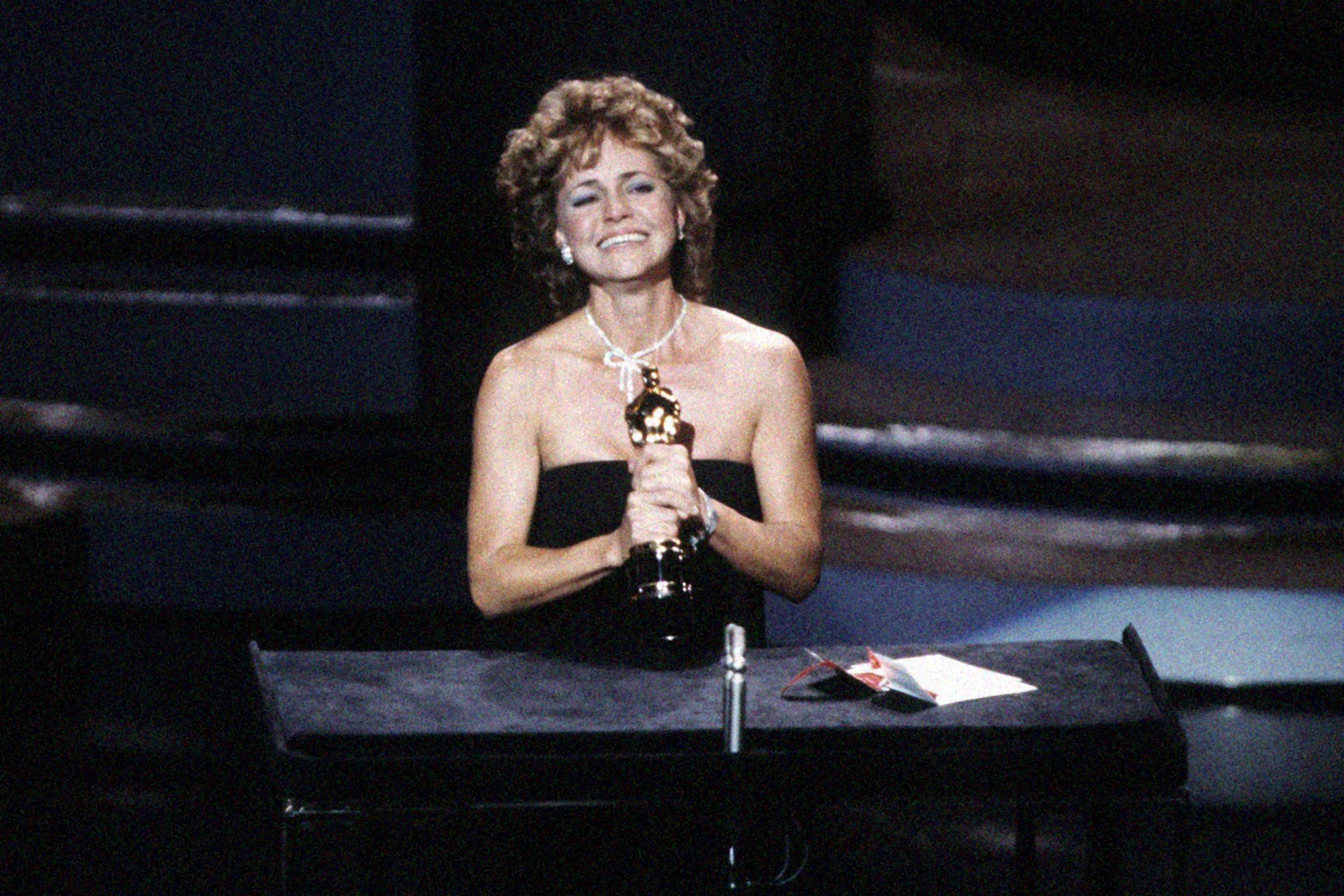
— All photos © best actress
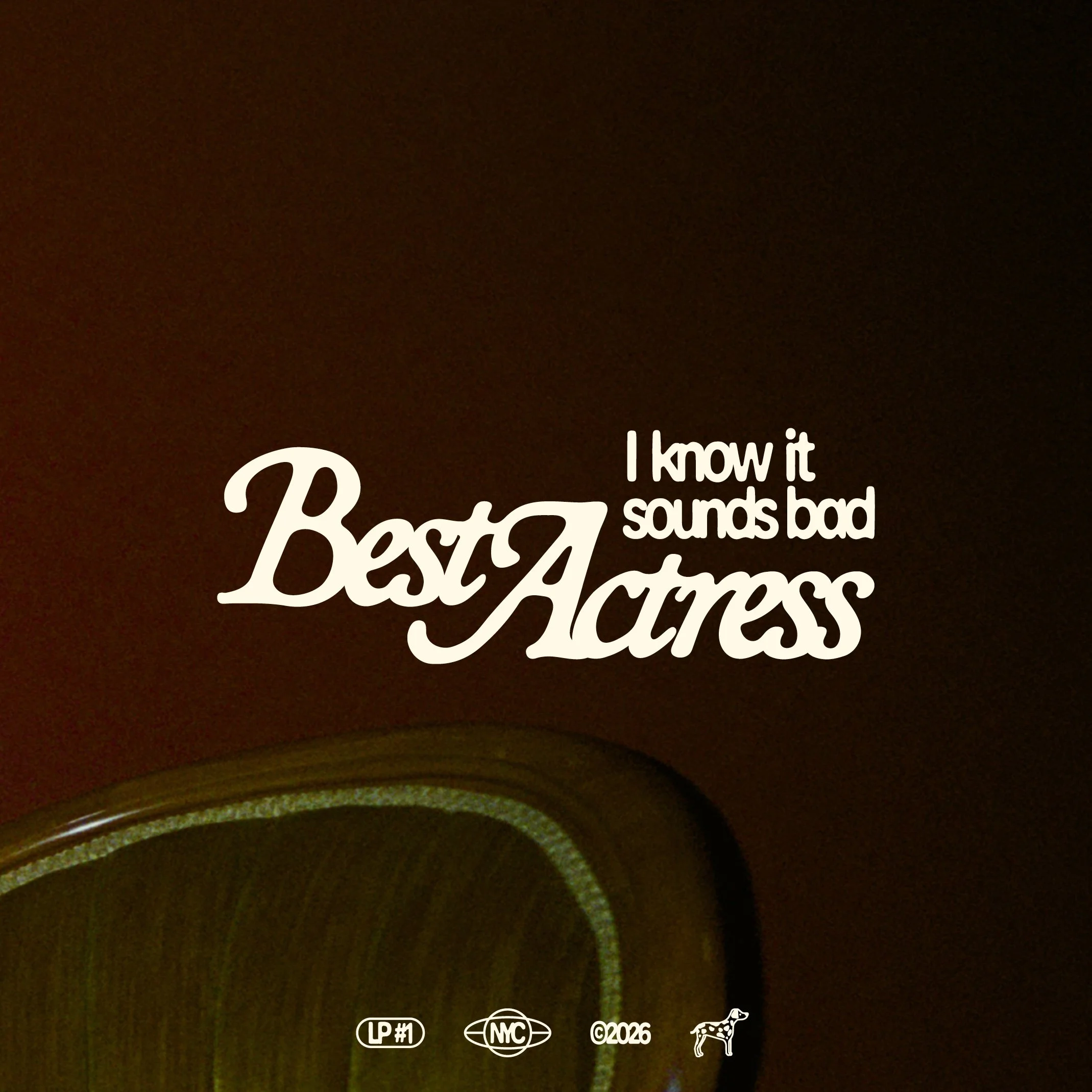
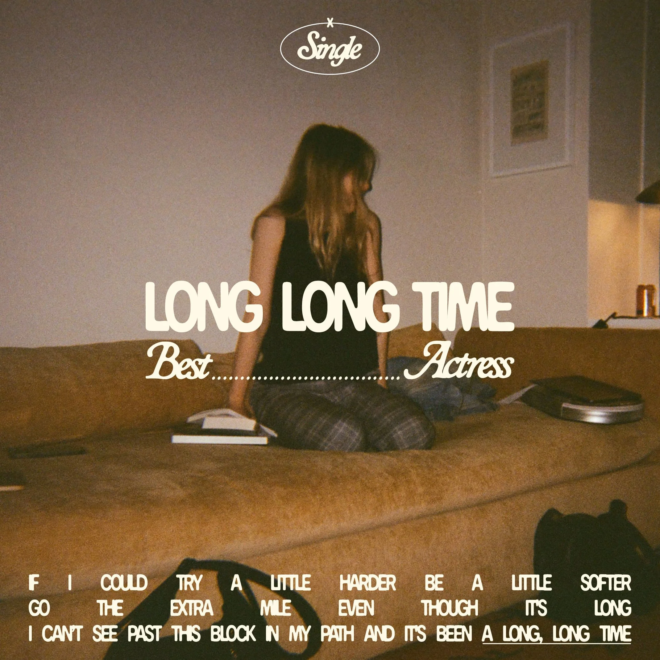
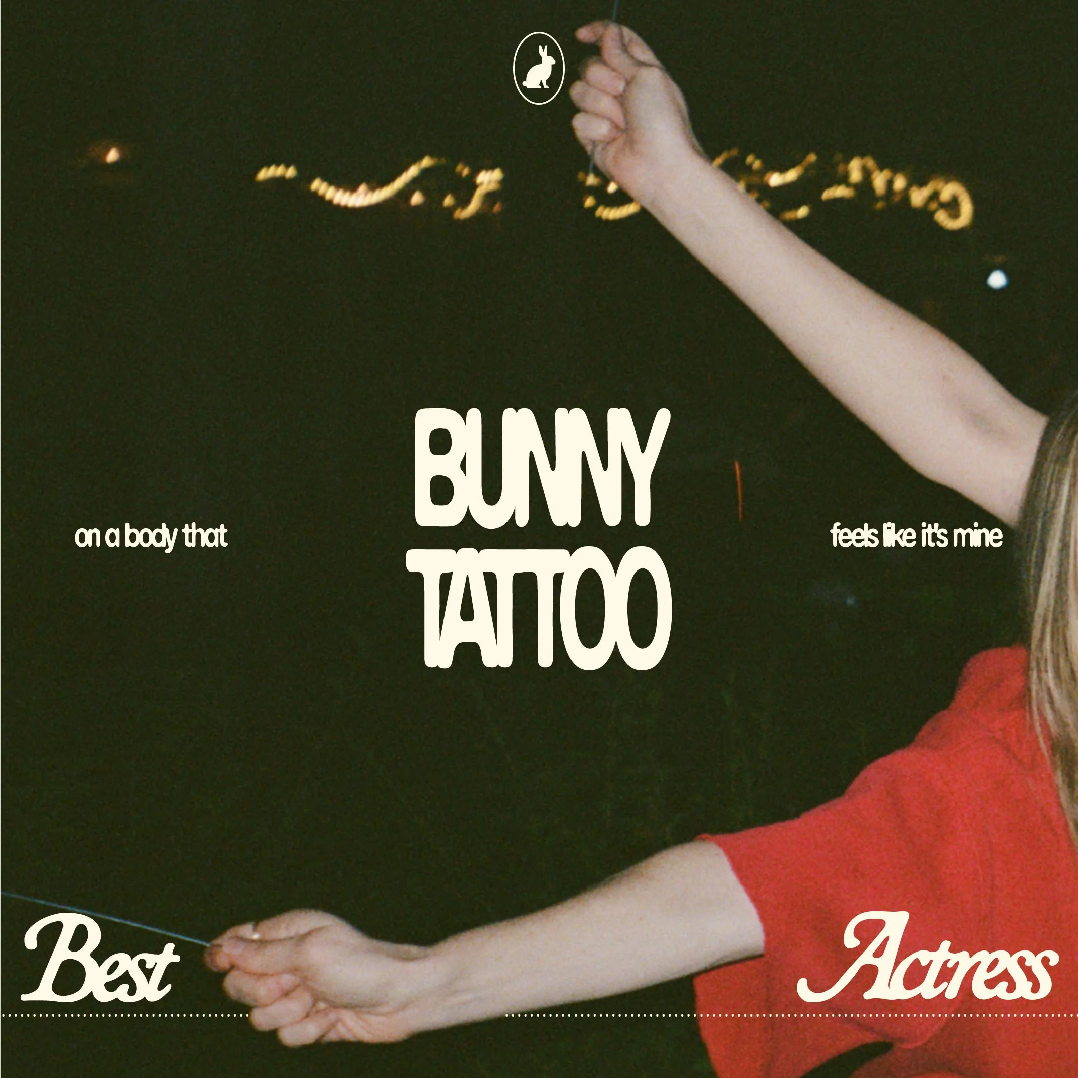
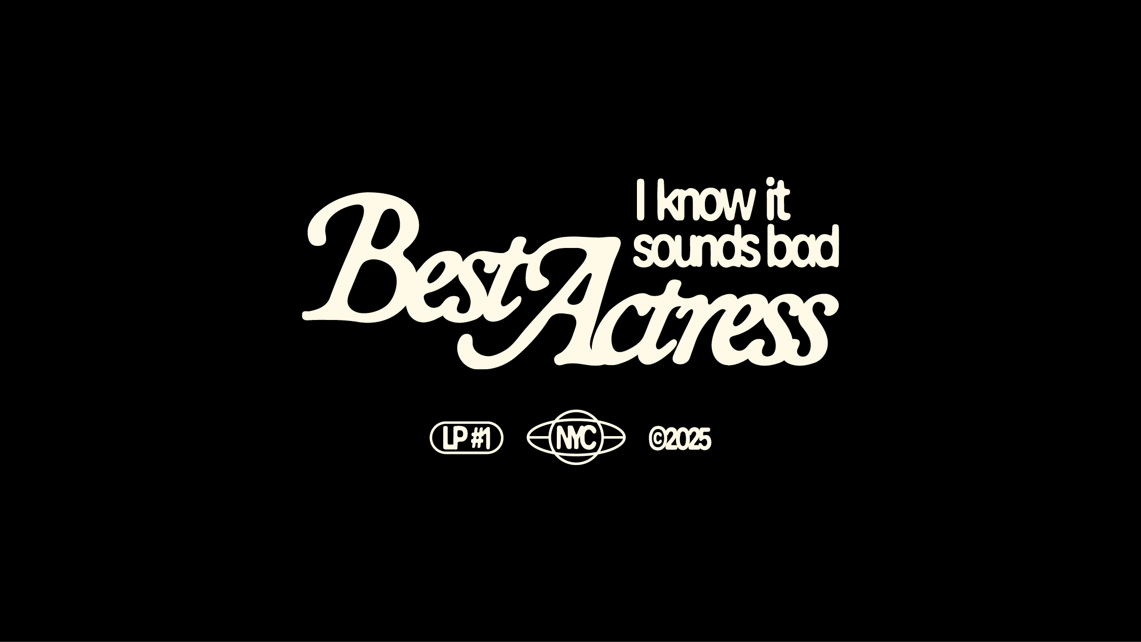
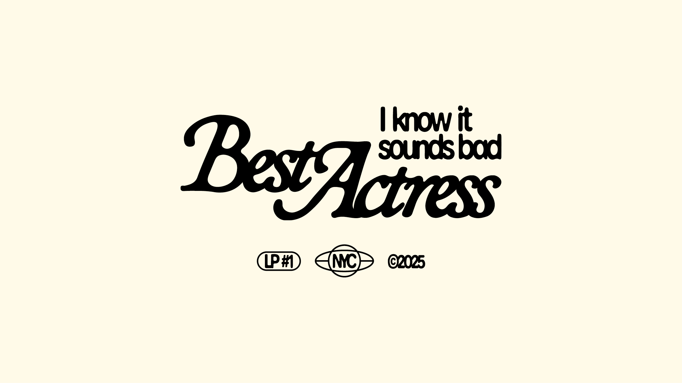
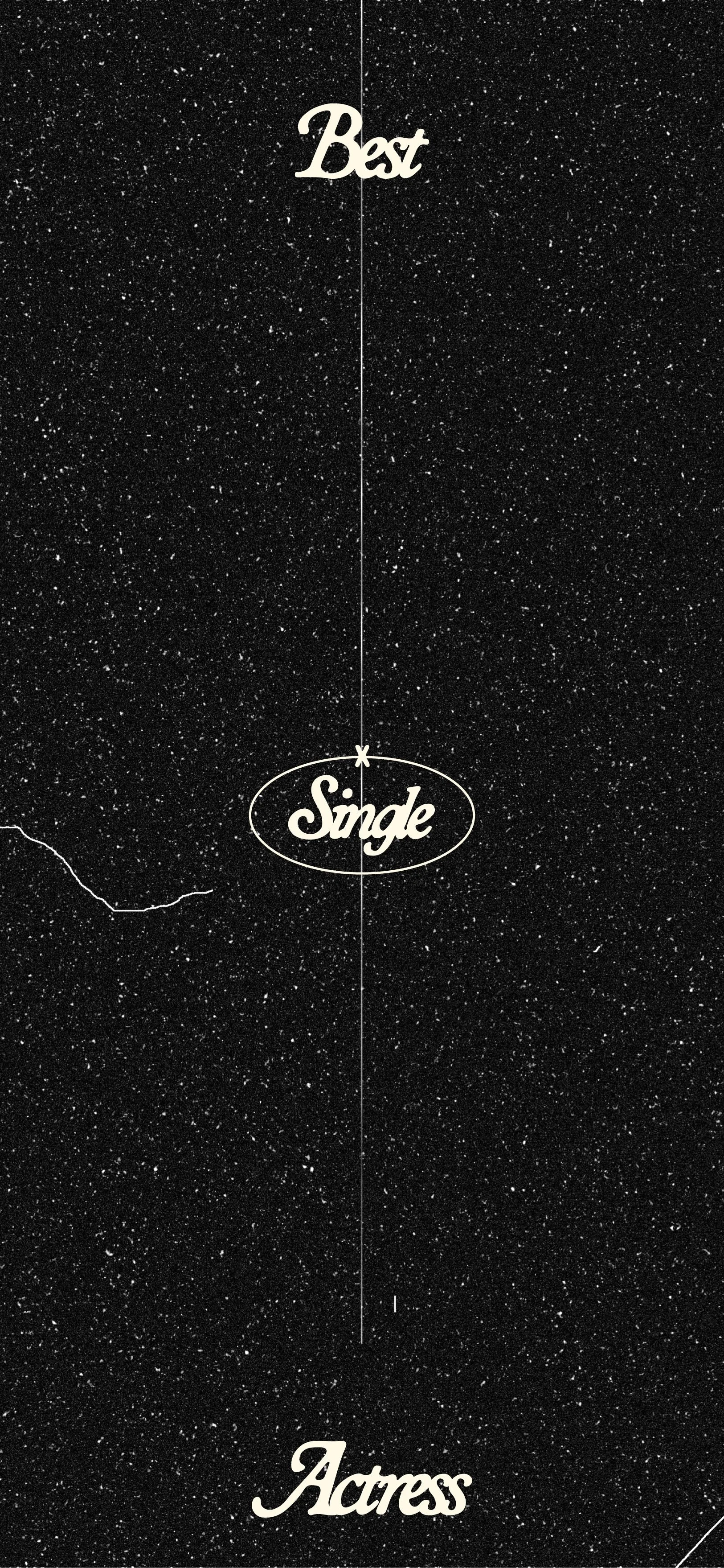
The logo is the band’s primary visual identity. It’s formal and sweetly precious in its retro-ness, with a romantic, yearning quality undercut by a crowded, ink-bleed treatment that makes it feel a little world weary.
One of the key visual signatures of the identity is the mock-reverent use of micrographics—those tiny technical details usually reserved for studio logos, film ratings, copyright notices, and audiovisual specs at the bottom of movie posters or the end of credit sequences. Including them manufactures that sense of official cinematic documentation implicit in the band’s name and doubles down on the idea of committing to the bit.