Impact reports and publications for progressive, mission-driven nonprofits, created under Buoy’s expert marketing direction. These organizations do vital, complex work — from shaping evidence-based policy to holding special interests accountable — and their communications need to match that ambition. Each project requires translating dense research and data into visual narratives that are clear, compelling, and built for broad audiences.
The publications for groups like Results for America, Accountable.US, and What Works Cities respect each organization’s core identity while pushing their visual language forward. The resulting materials raise the bar for nonprofit communications, helping these groups better engage stakeholders, policymakers, and the communities they serve.
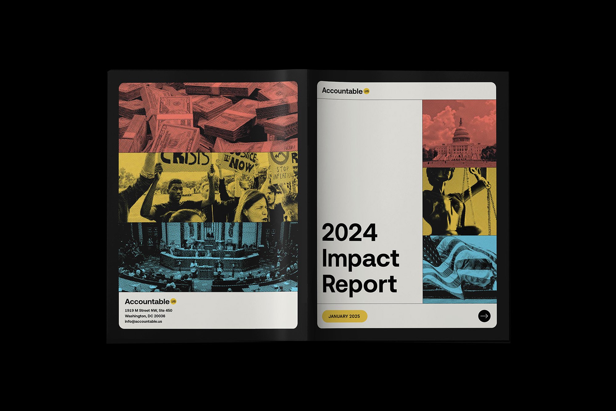
Accountable.US produces incisive research that exposes special interests and drives progressive change. Their annual report takes inspiration from digital communications, incorporating UI elements and pixel-based iconography that nod to the organization’s rapid-response nature. The clean, inviting design transforms their bold investigative work into an accessible narrative while propelling their established brand language into new territory.


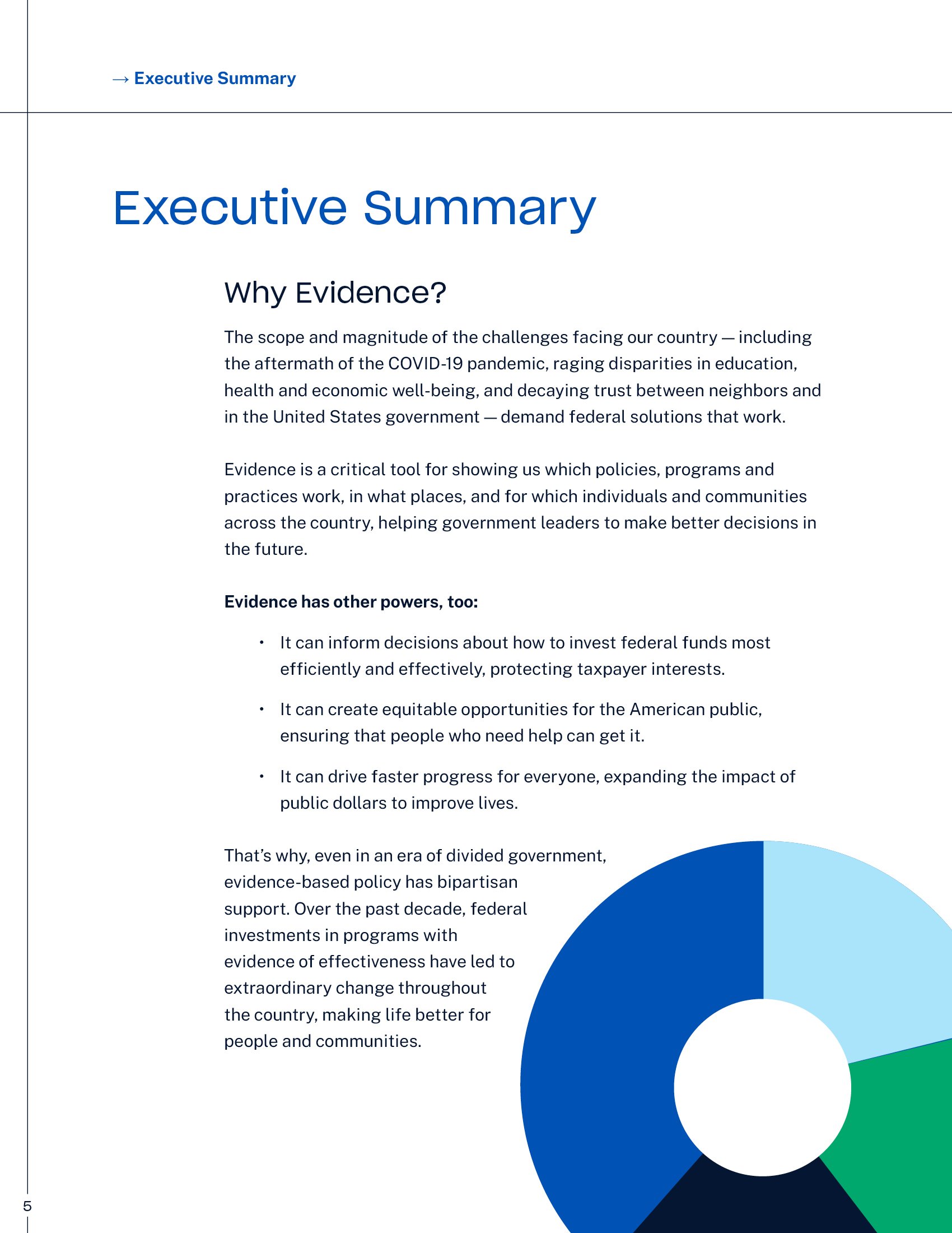
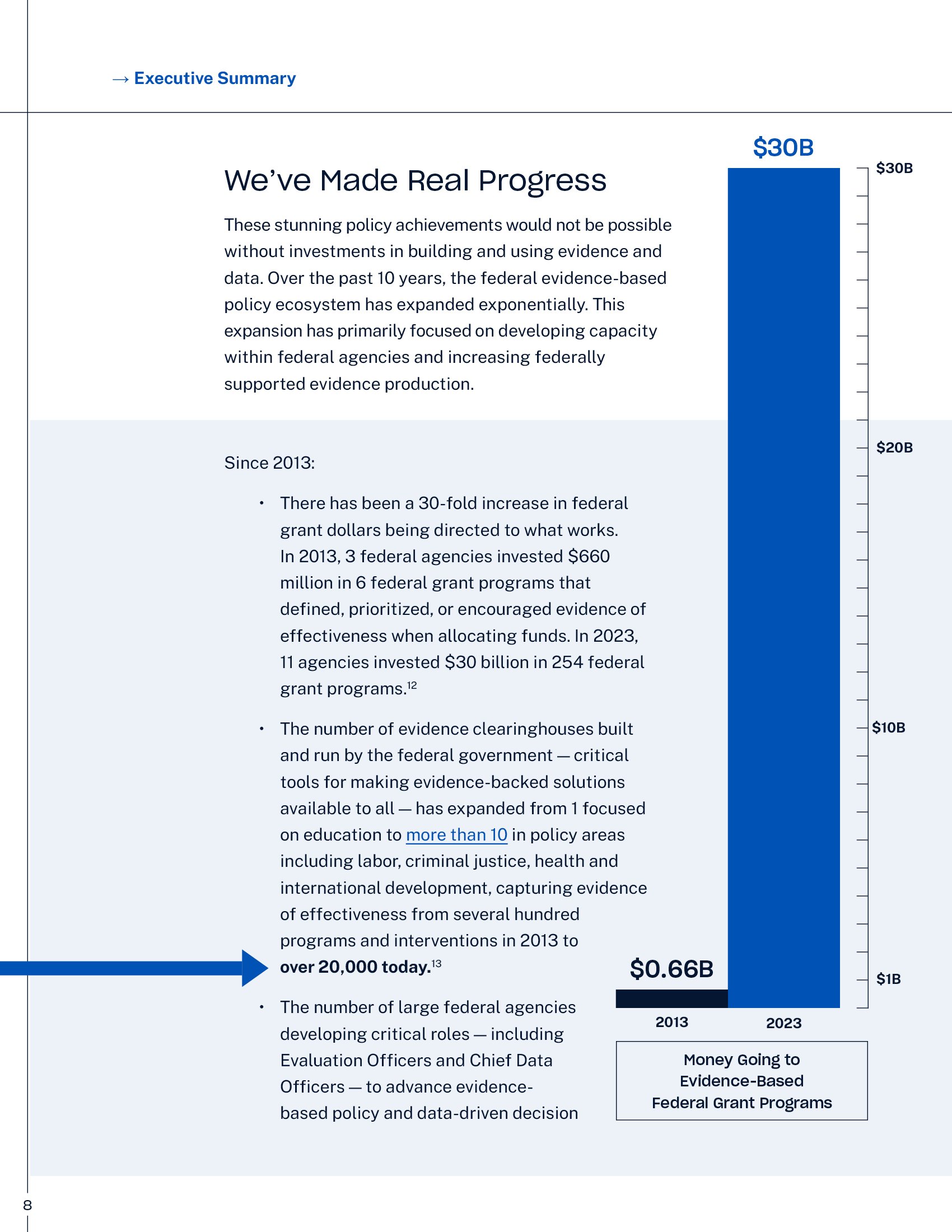
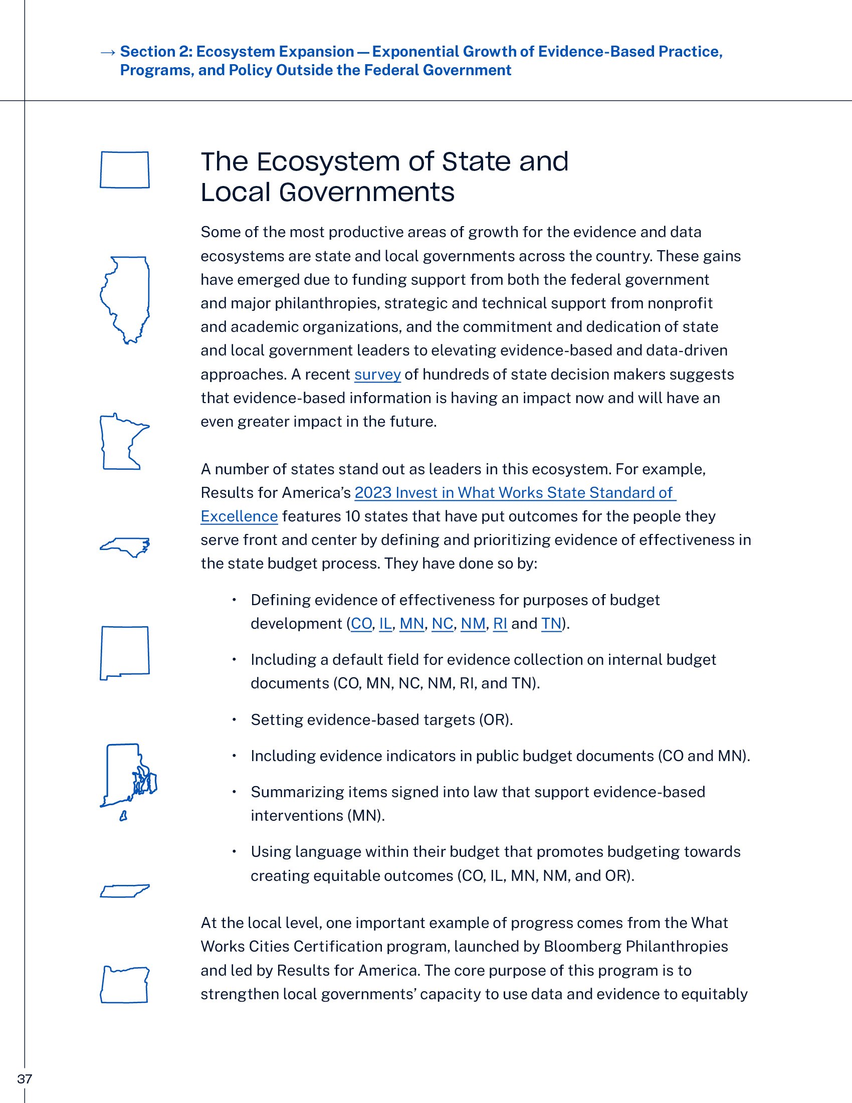
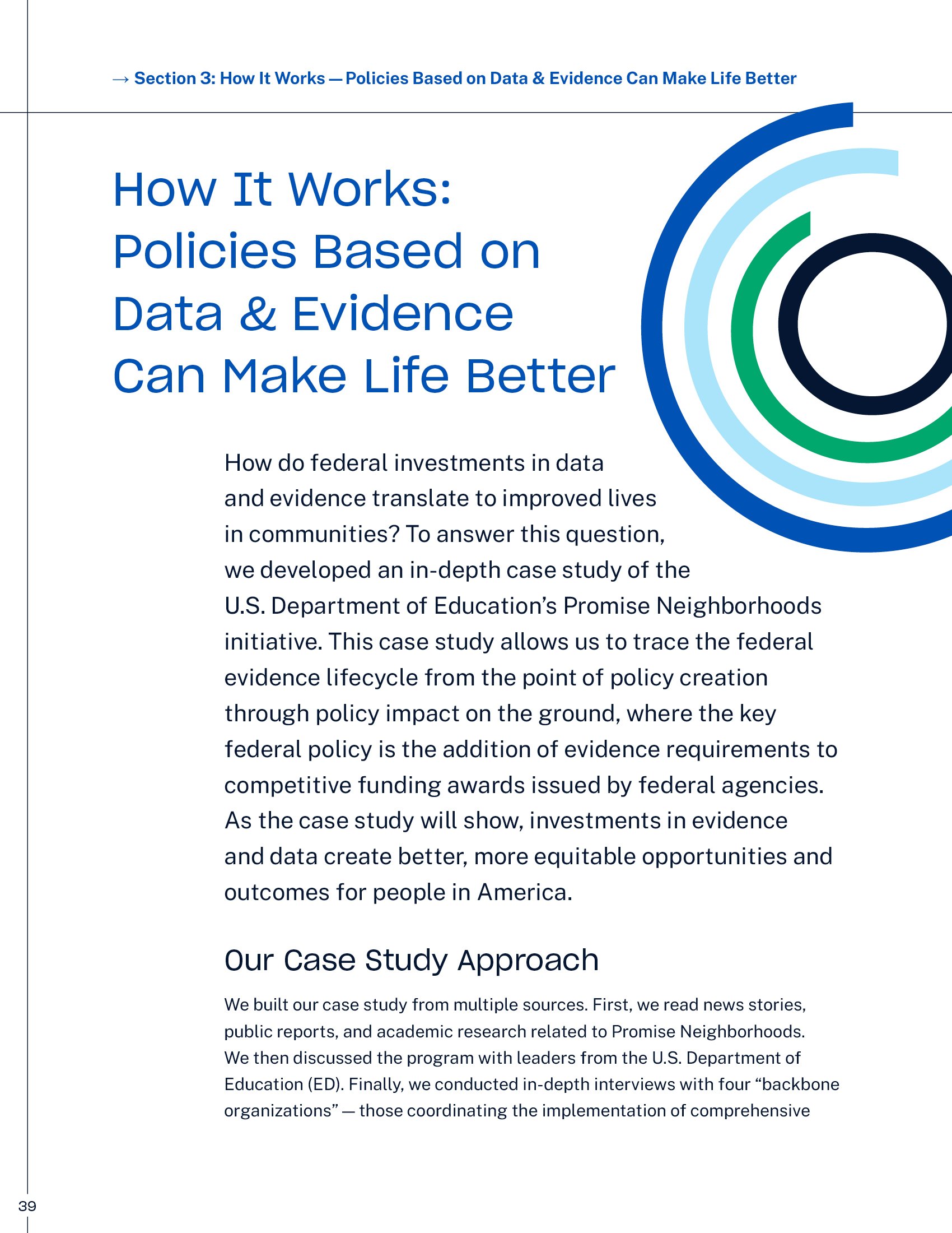
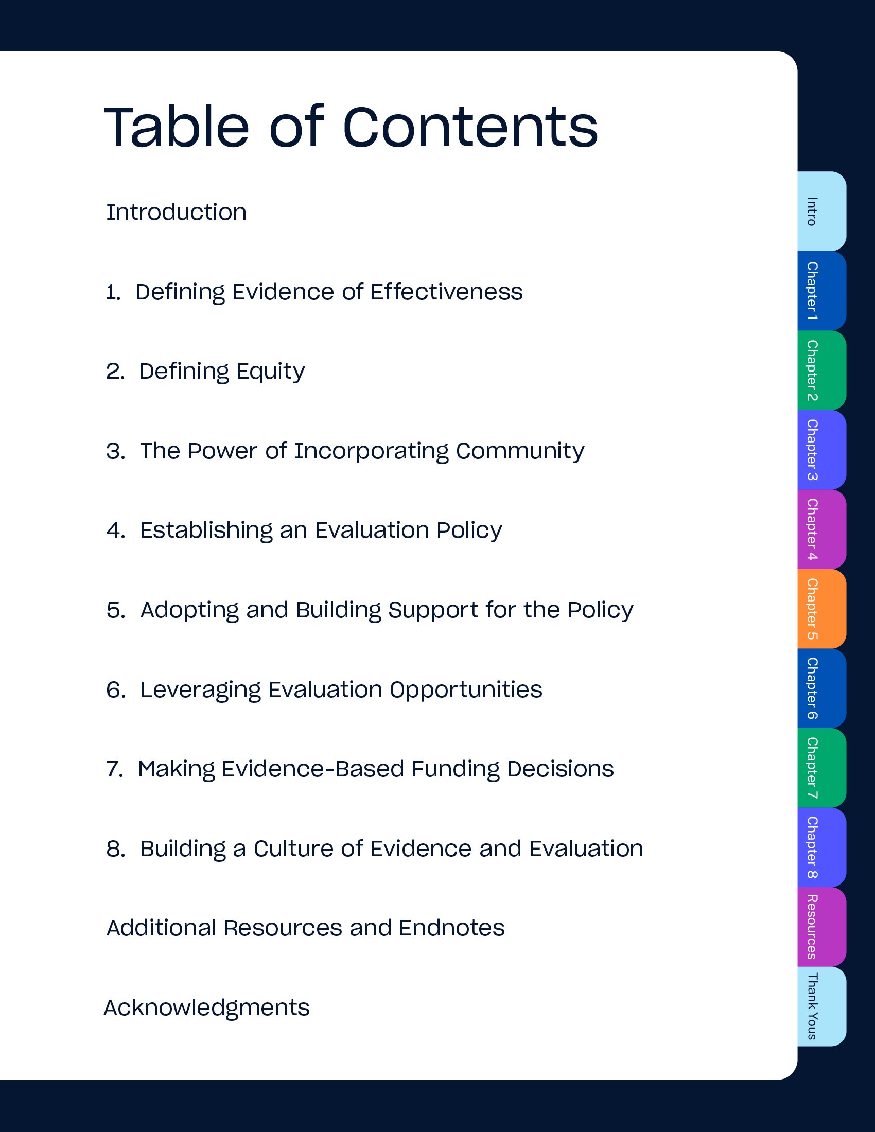
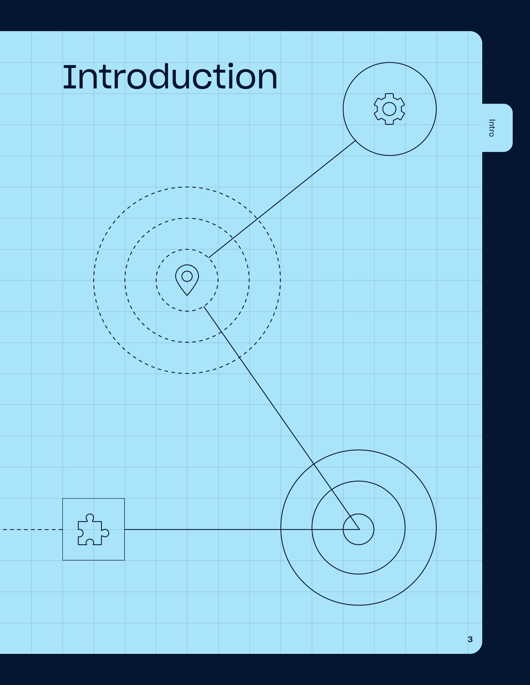
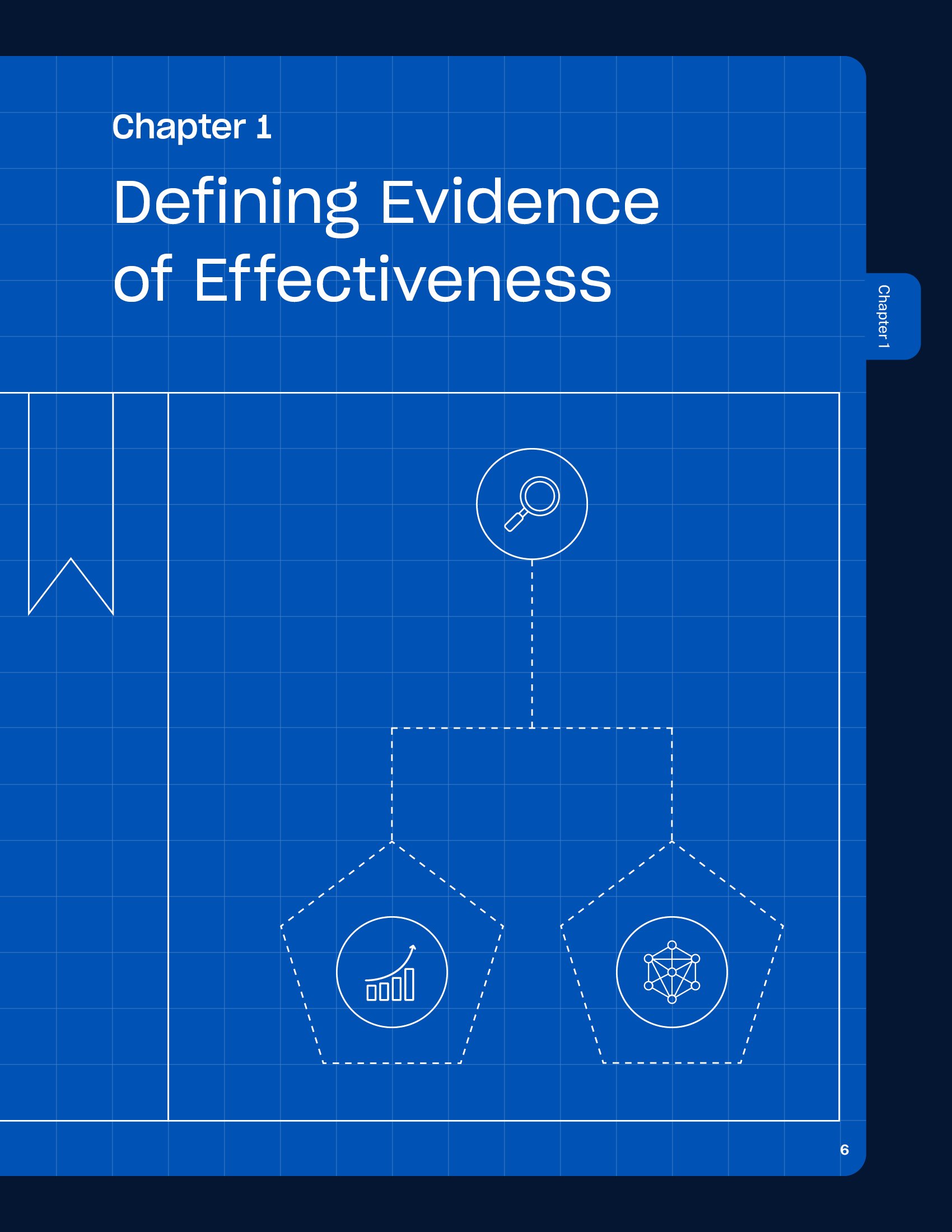
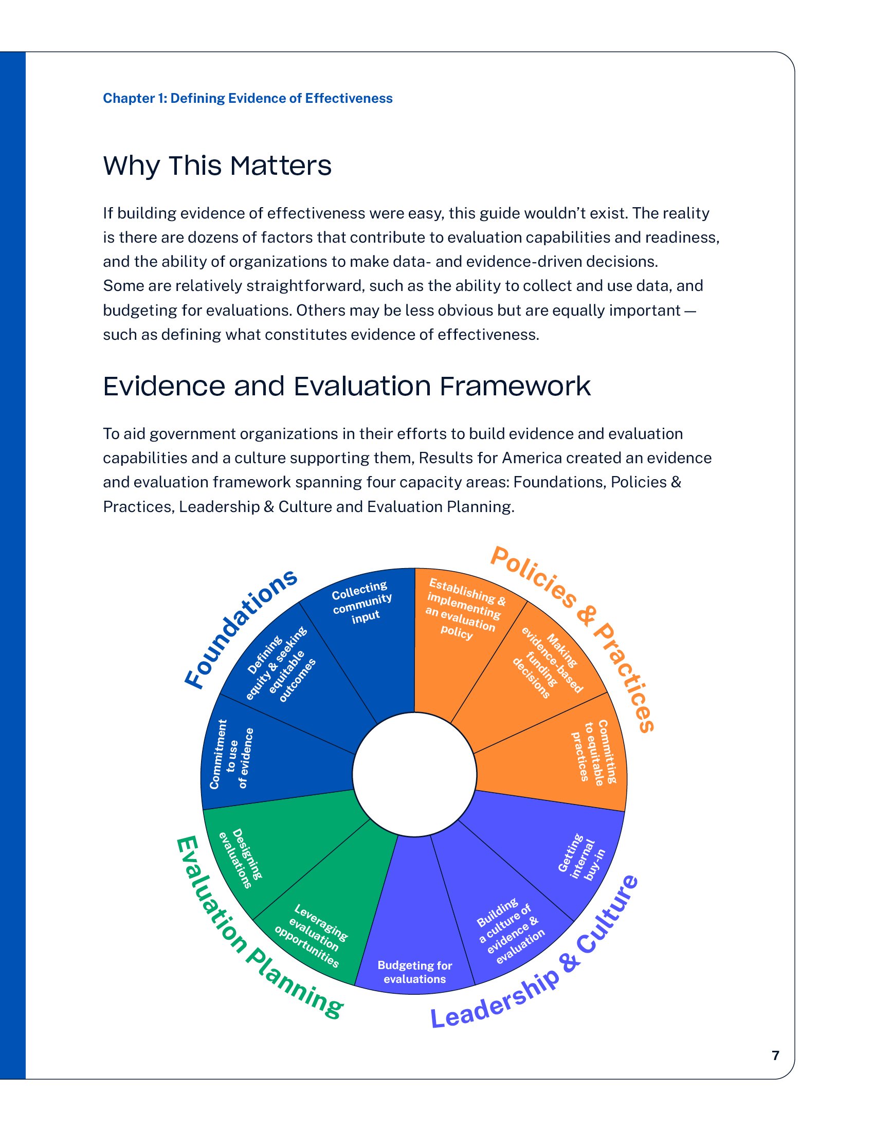
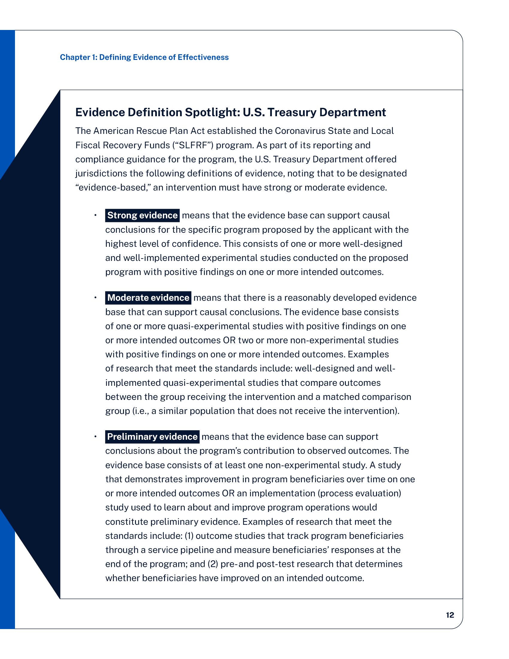
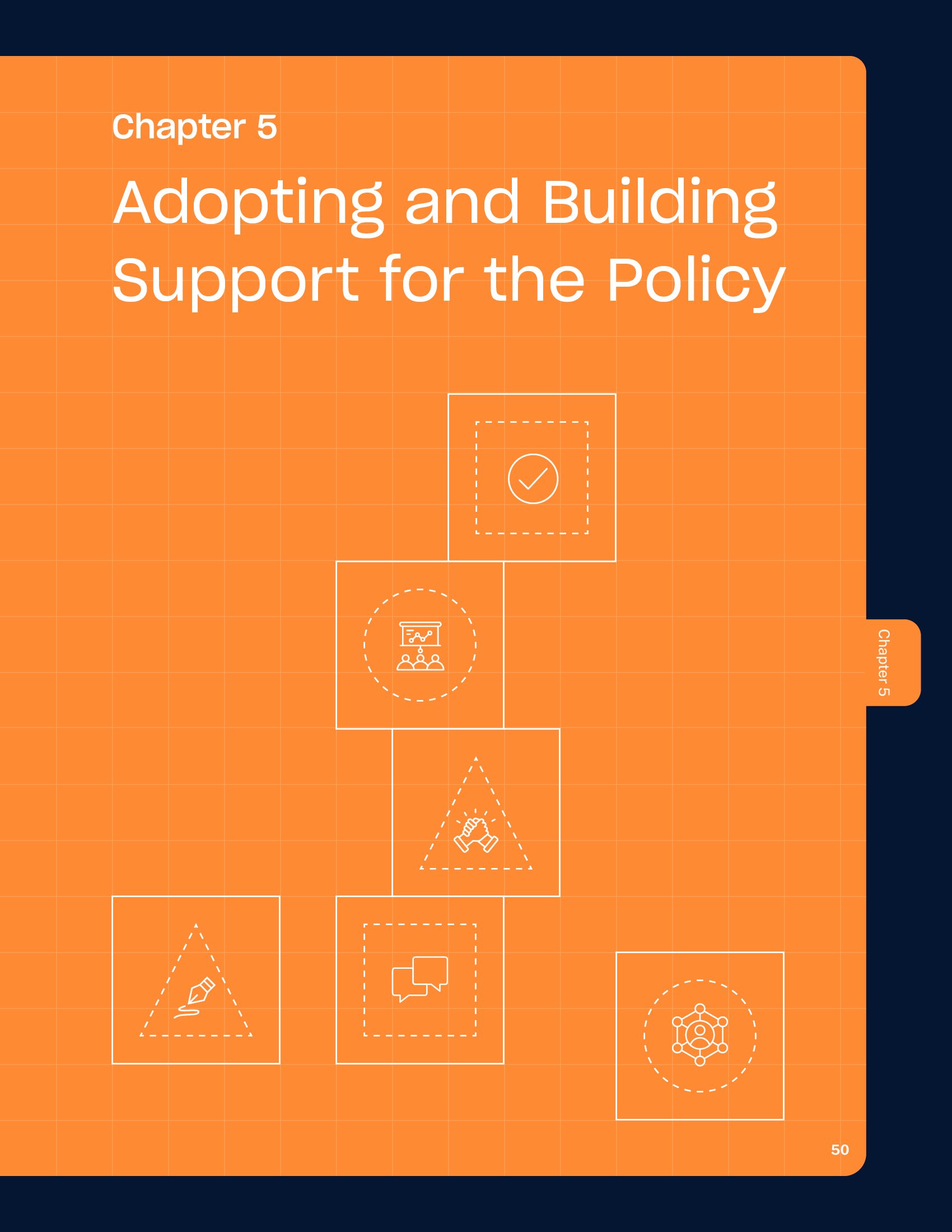
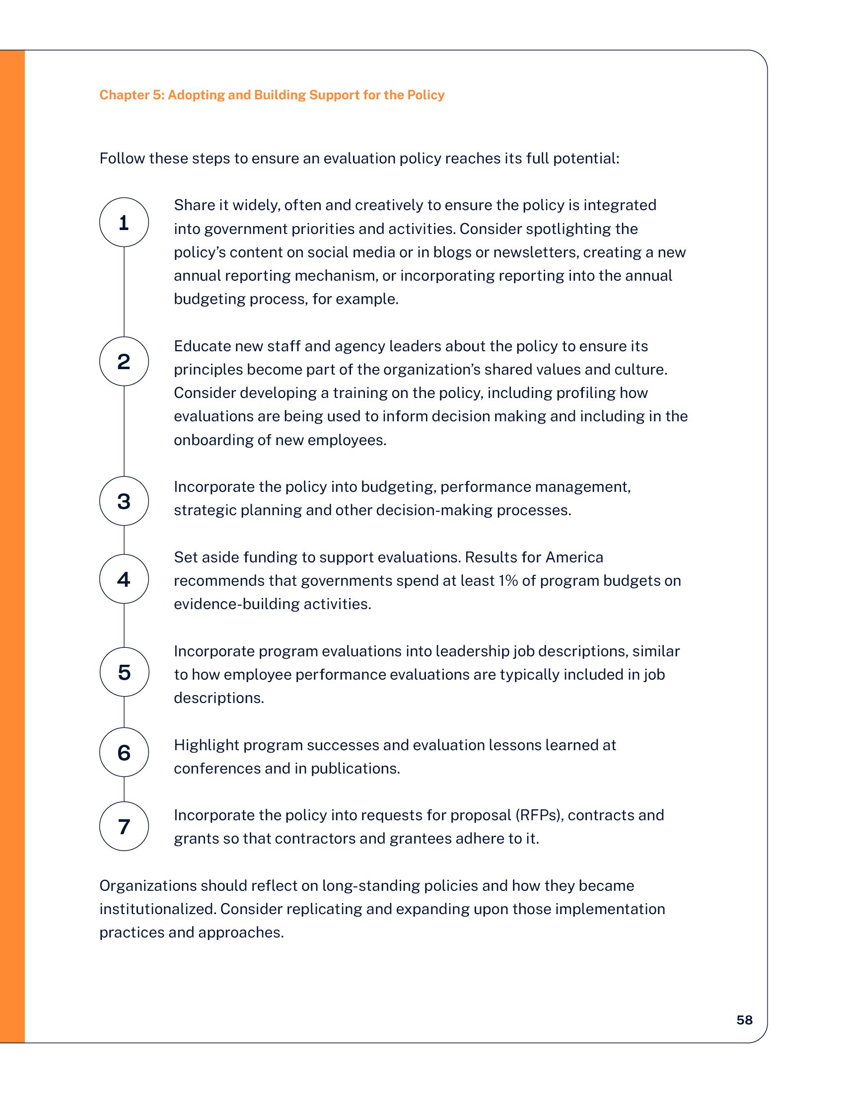
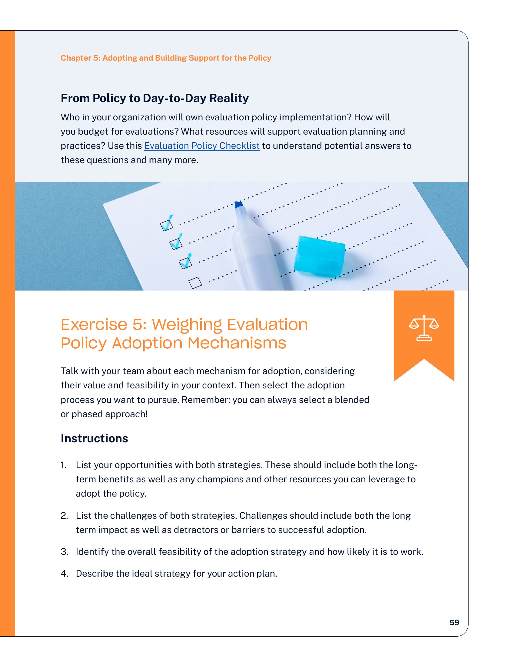
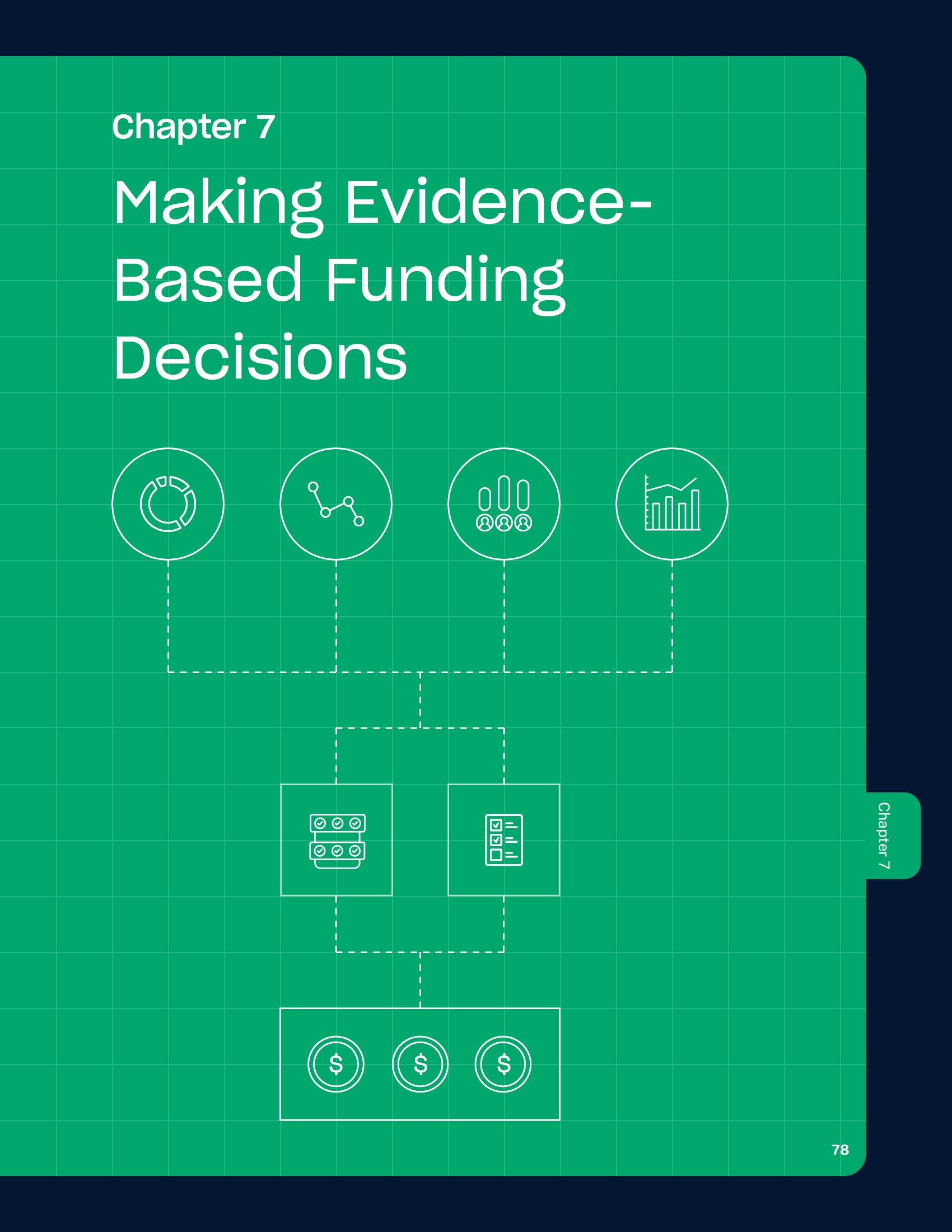
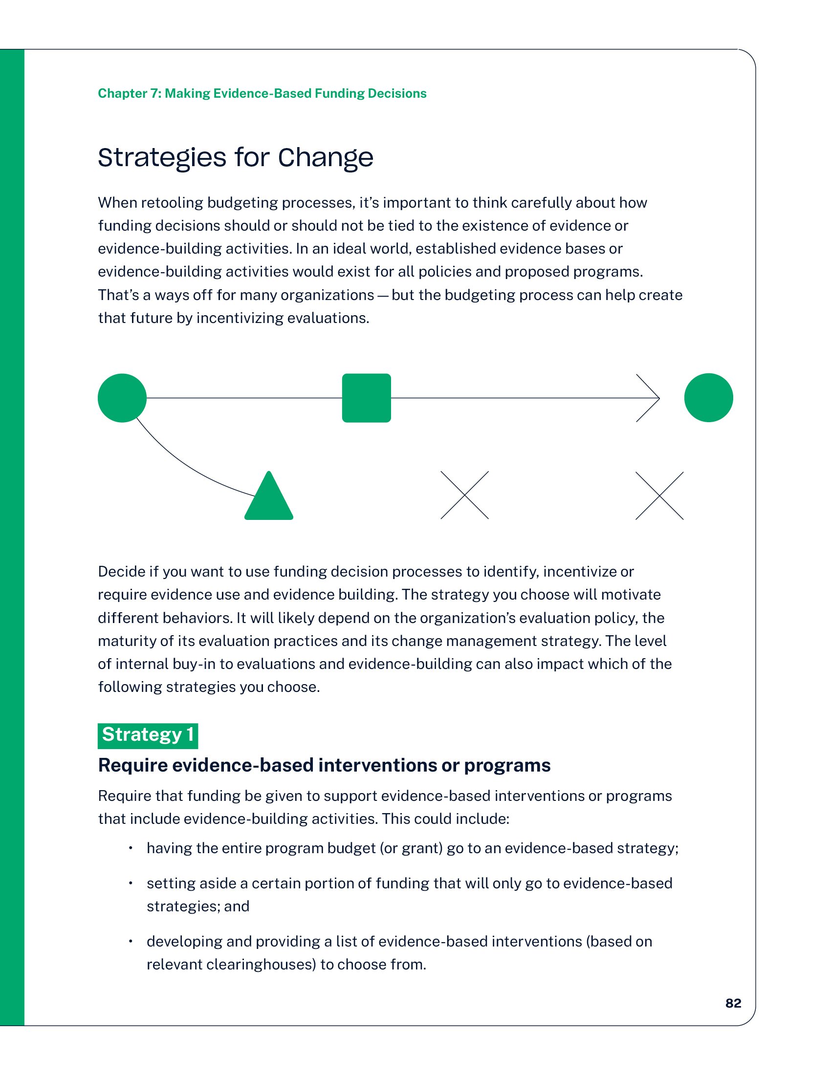
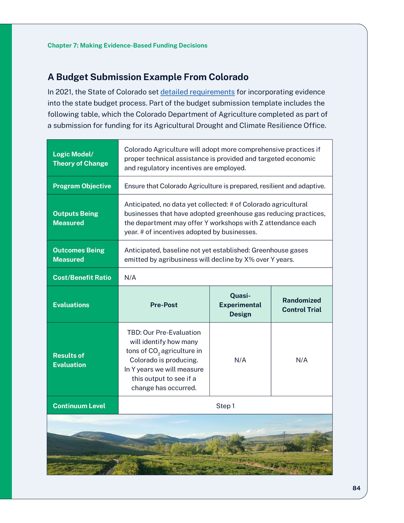
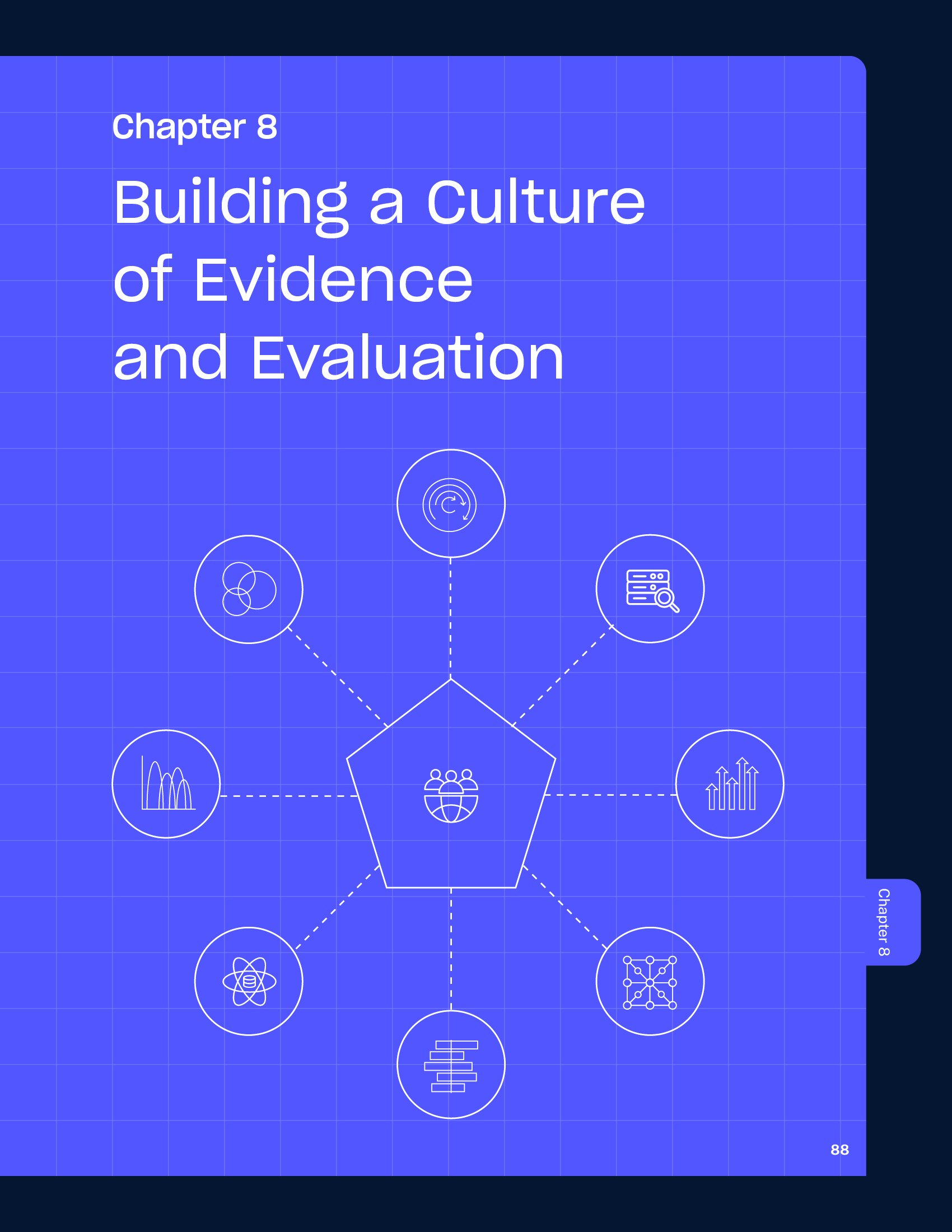
Results for America helps government leaders use evidence and data to create solutions that improve lives and increase economic mobility. The reports embrace the brand’s existing color palette and duotone imagery, and iconography, while introducing more abstract linework and playful touches that make complex content more approachable. For their policy guide, I adopted a workbook-inspired structure complete with tabbed sections, a graph paper motif, and schematic diagrams. This approach transforms dense policy information into an engaging, intuitive resource where color coding and visual hierarchy guide readers naturally through the material.

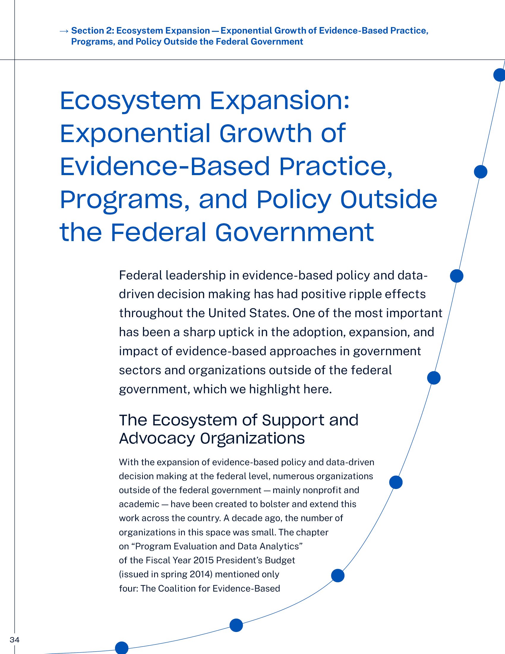
In their 10-year anniversary report, “The Power of Evidence to Drive America's Progress,” data visualizations transcend their functional role to become decorative elements, creating a fresh visual metaphor for the organization’s mission of using data to drive change.