Writers, artists, and independent professionals deserve websites that reflect who they actually are. These sites are built around each person’s voice, style, and goals, with considered typography, color palettes, layouts, and visual concepts that go beyond a surface-level, trendy looking résume.
The result is a collection of distinctly different digital spaces, from a virtual bookshelf for a publishing expert to a sparkle-dusted teenage diary for a YA author. Each one is designed to feel effortless and easy to navigate while giving its owner a presence that stands on its own.
Maria Eitel
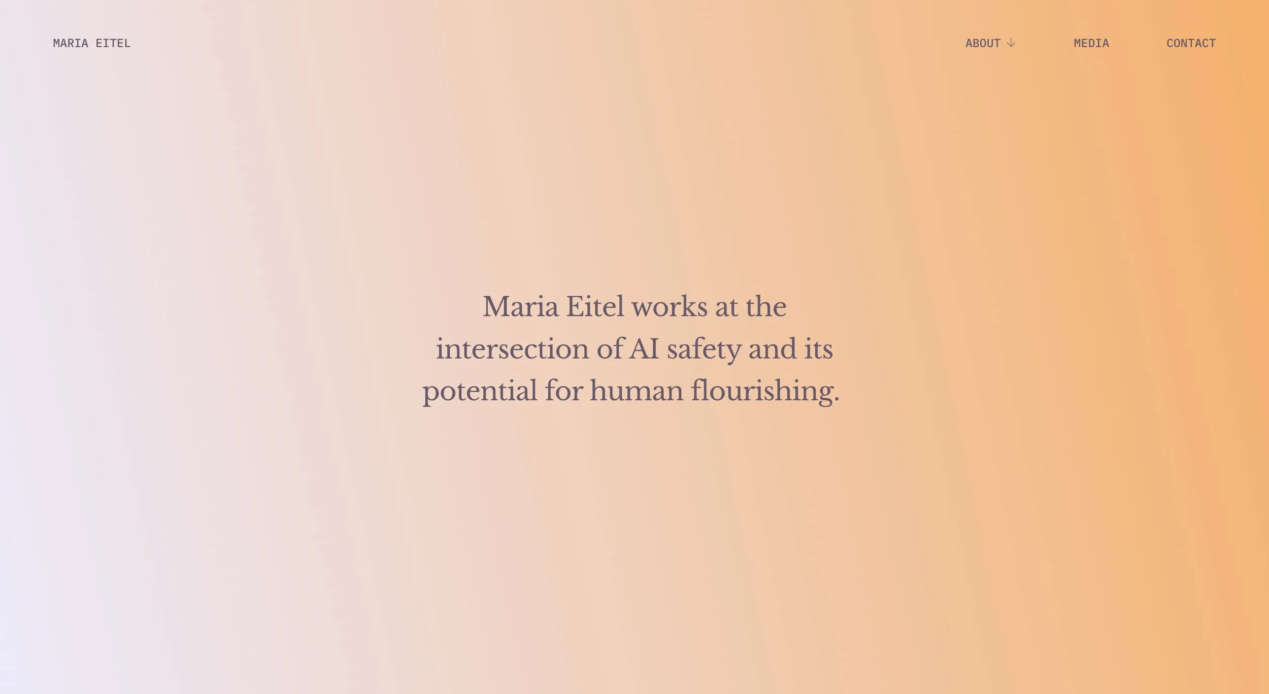
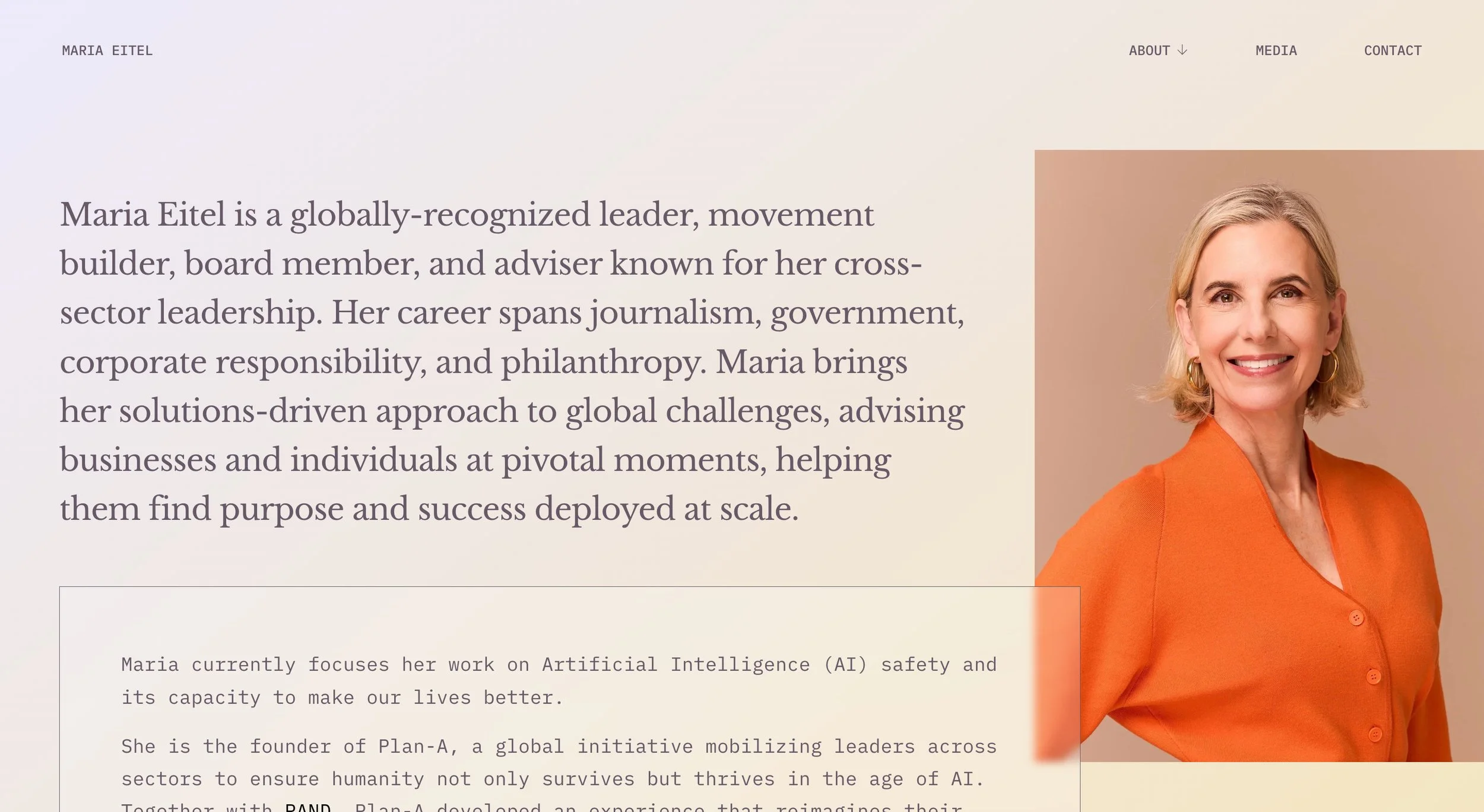
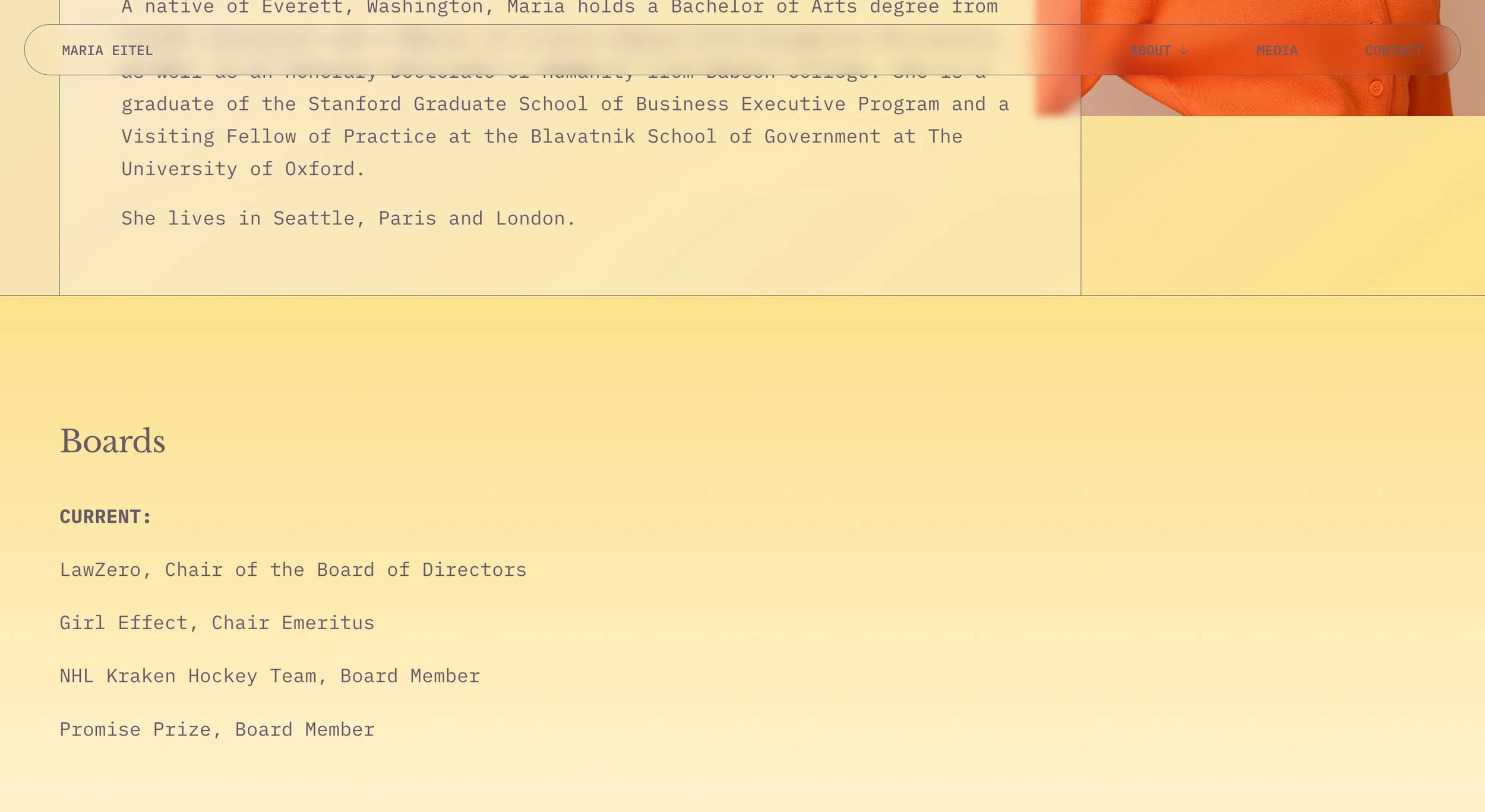
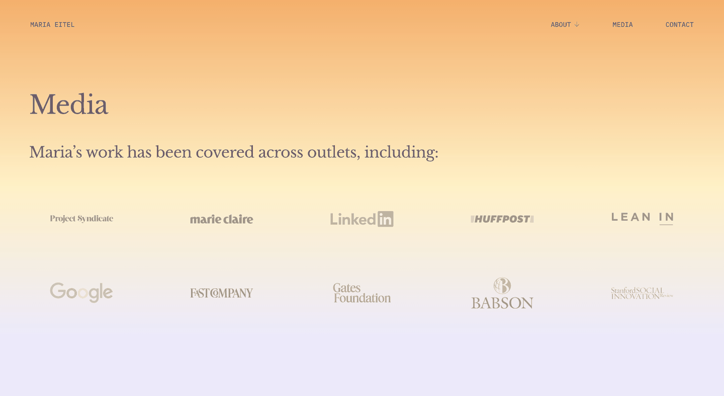
Maria is a globally-recognized leader and adviser whose career spans journalism, government, corporate responsibility, and philanthropy whose work now focuses on AI safety. Her website translates this into a visual language of clarity emerging from the blur. Sky dawn gradients suggest the start of a new era, while scroll triggered effects keep her words in sharp focus as certain elements soften behind them. Grayscale logos come into color on hover. The Libre Baskerville headline font carries Enlightenment-era history and weight, while IBM Plex Mono nods to the technological space she’s shaping — a pairing that holds Maria’s history and her current work in the same frame.
Madeleine Schwartz
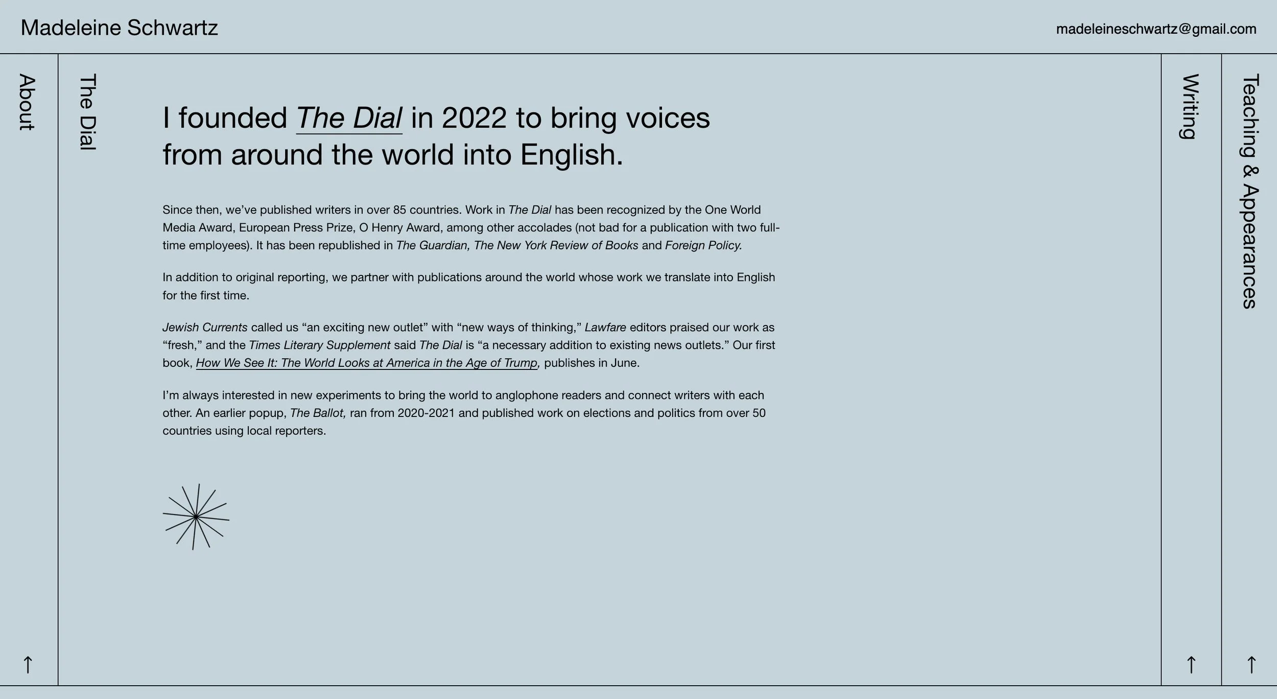
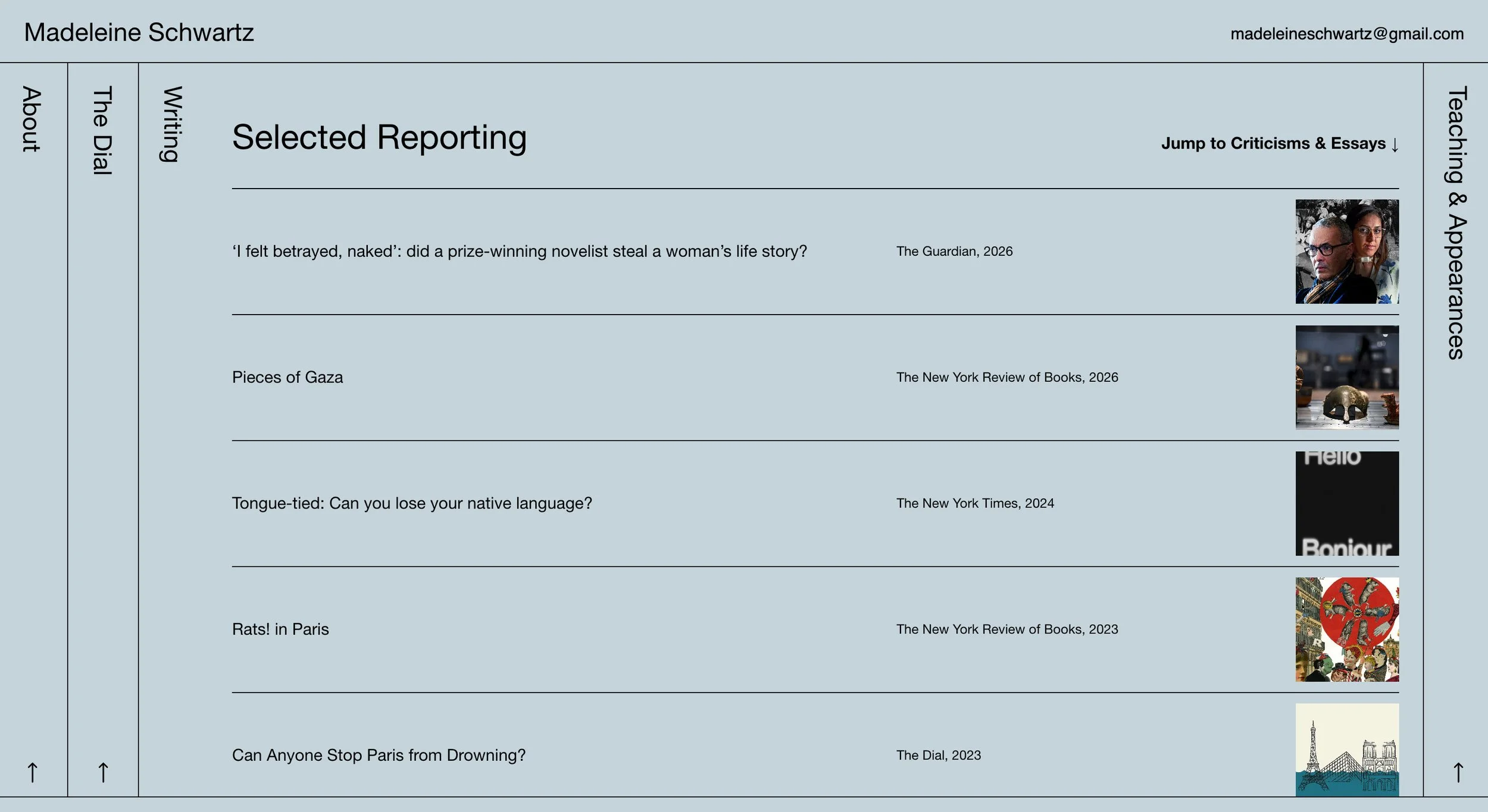
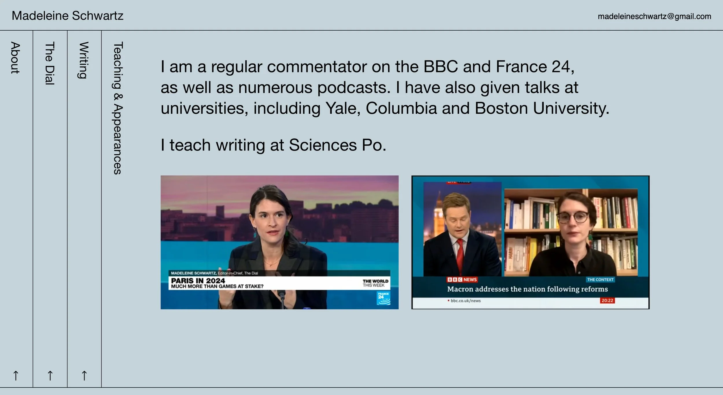
Madeleine is an award-winning journalist based in Paris and the founder and editor-in-chief of The Dial. Her website is built around a horizontal accordion: sections sit side by side as collapsed vertical columns, each labeled along its edge, sliding open as you click through. The broadsheet-like structure nods to the editorial spaces Madeleine has spent her career working in, while behaving like the digital archive it is. A single, clean sans serif font — the same used across The Dial — keeps the writing in the register of a working newsroom and quietly ties her projects together.

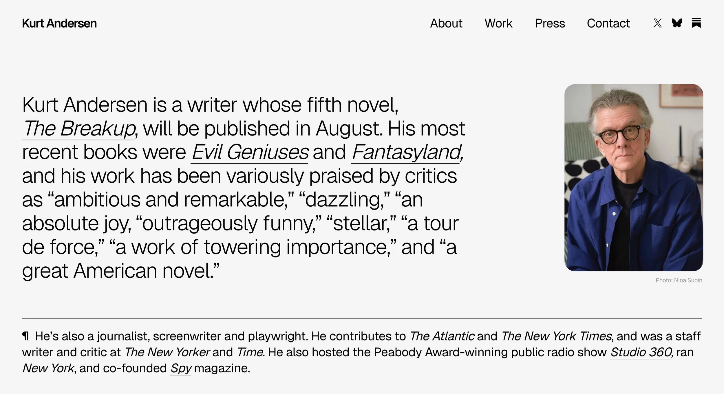
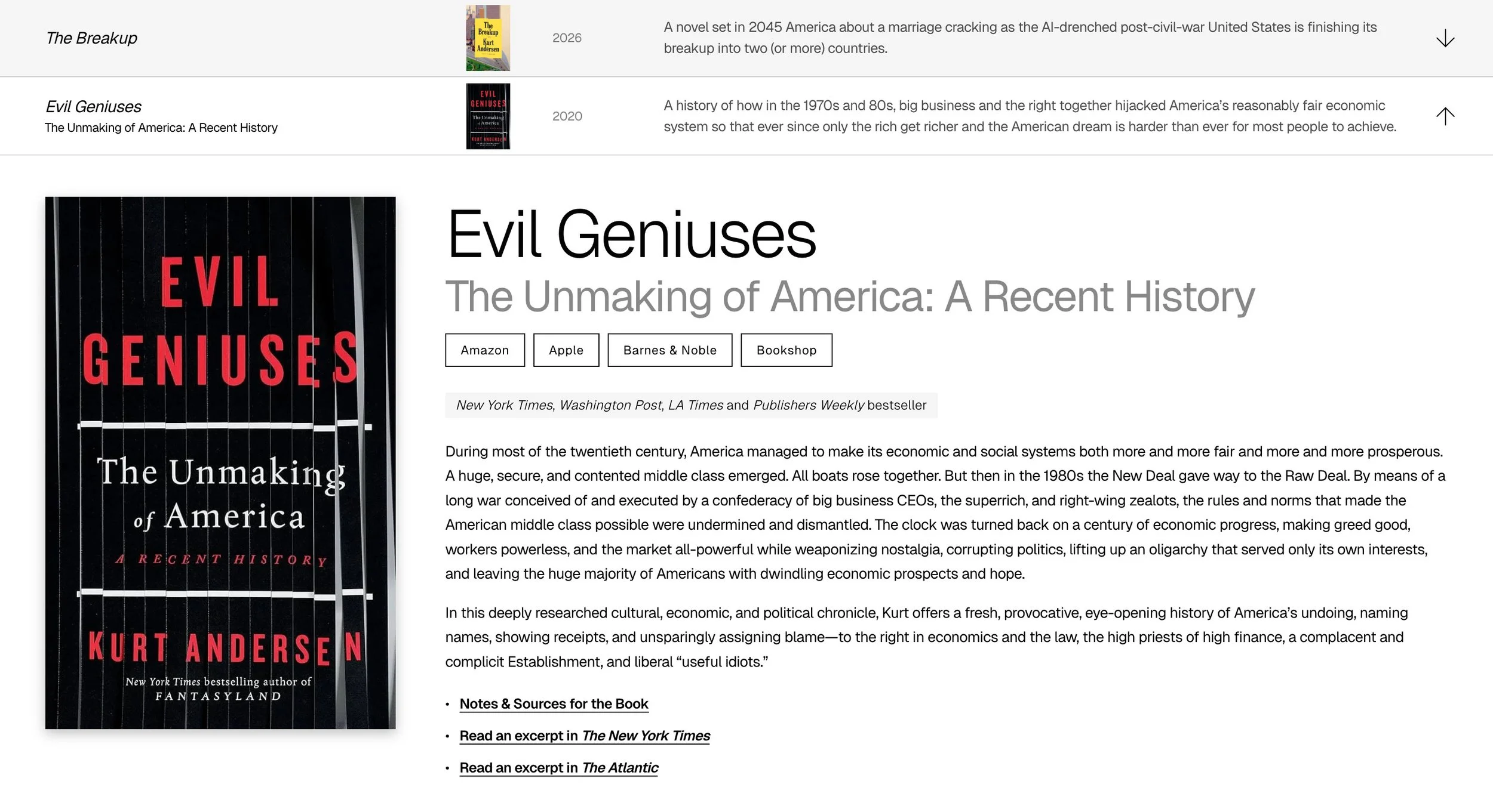
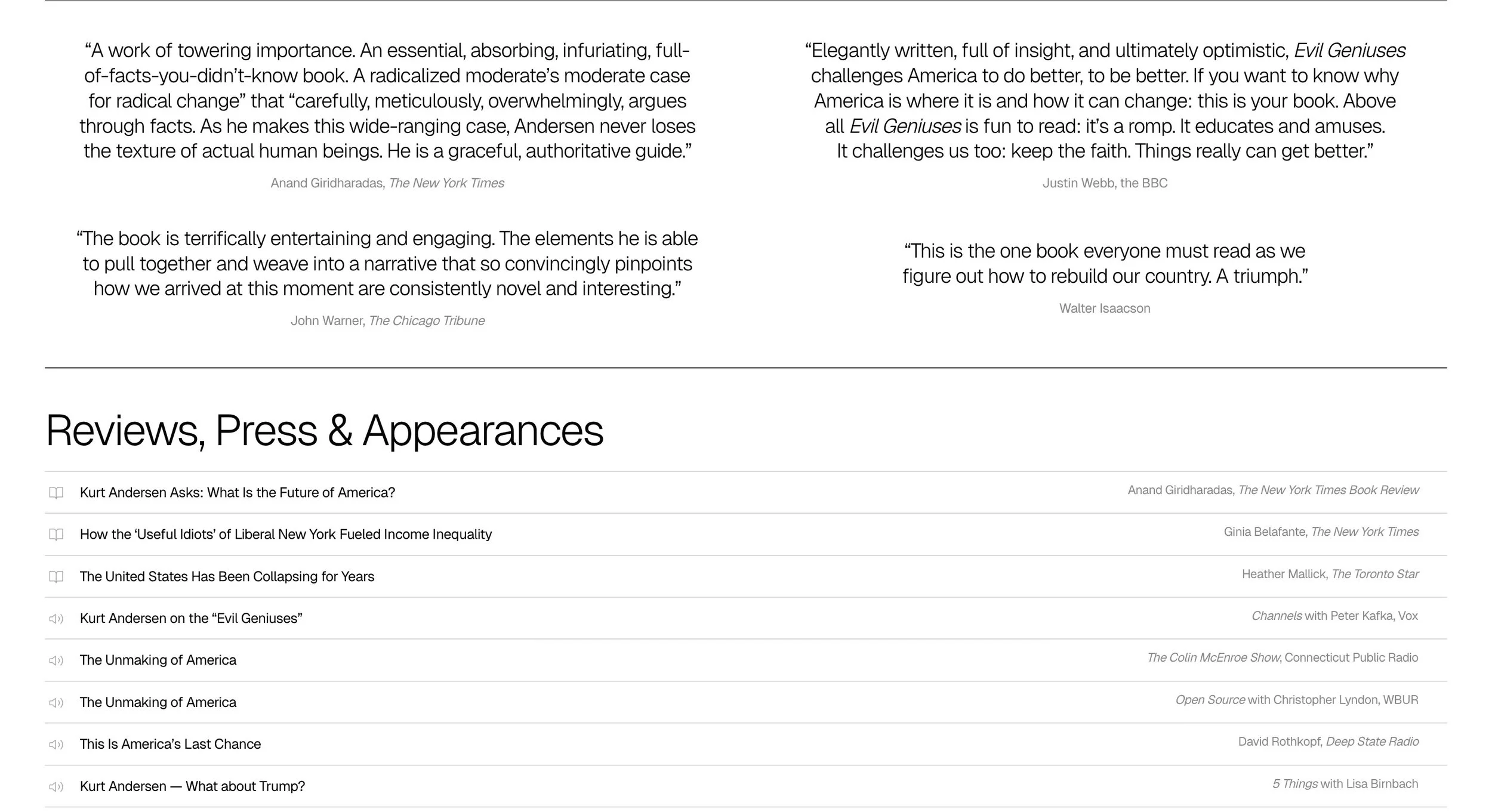
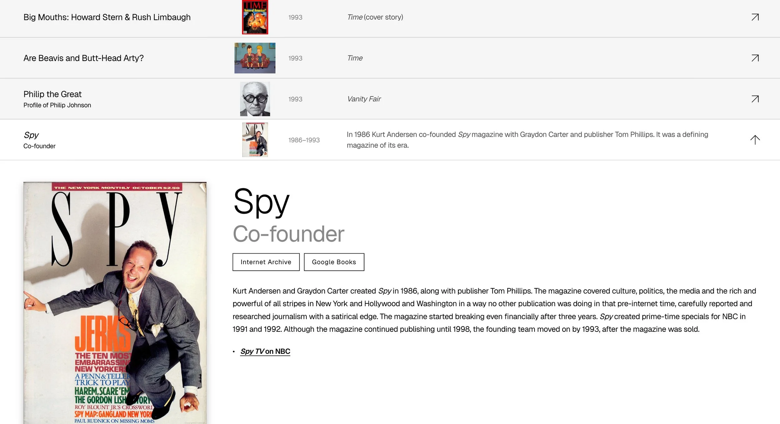
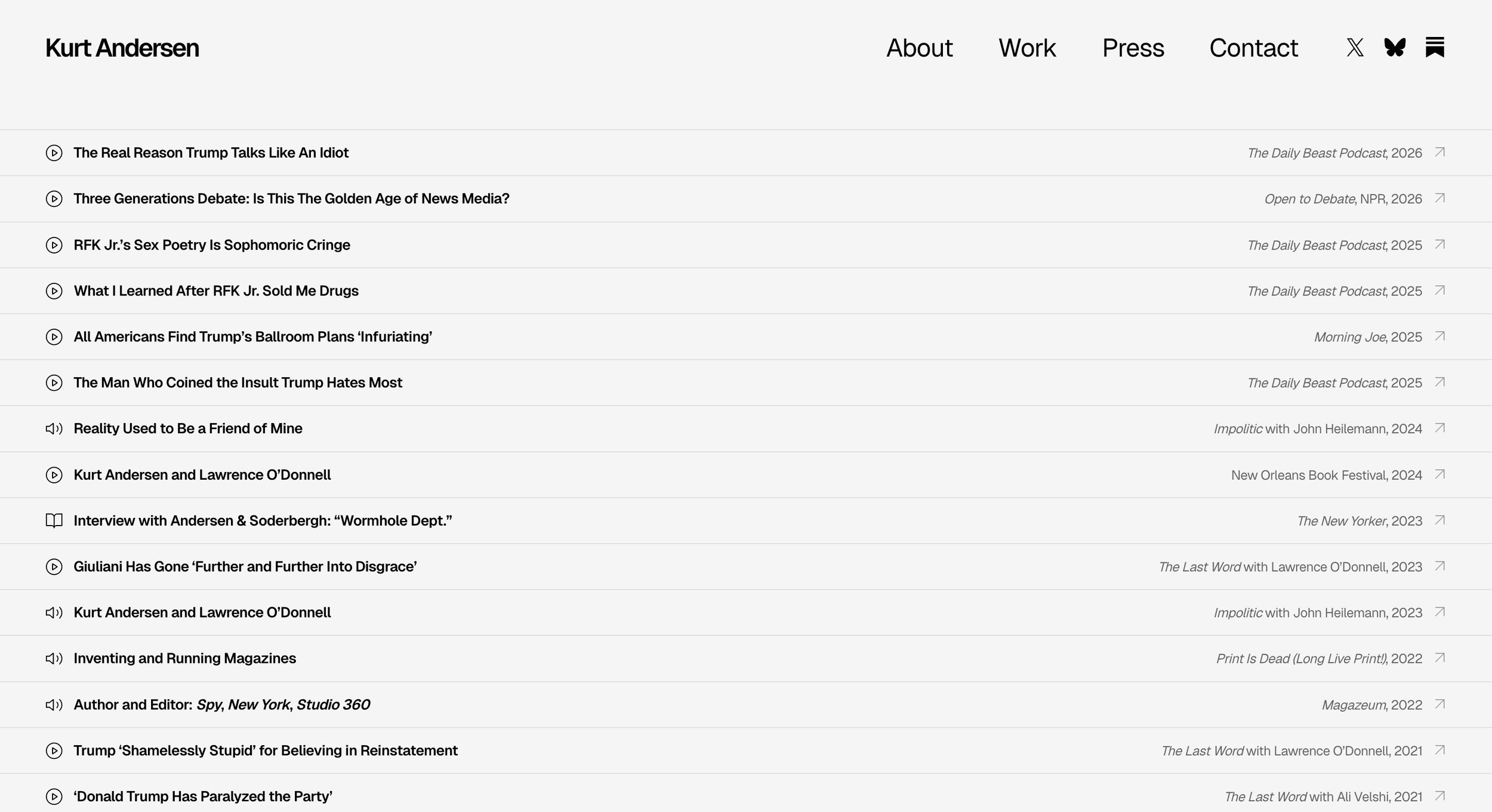
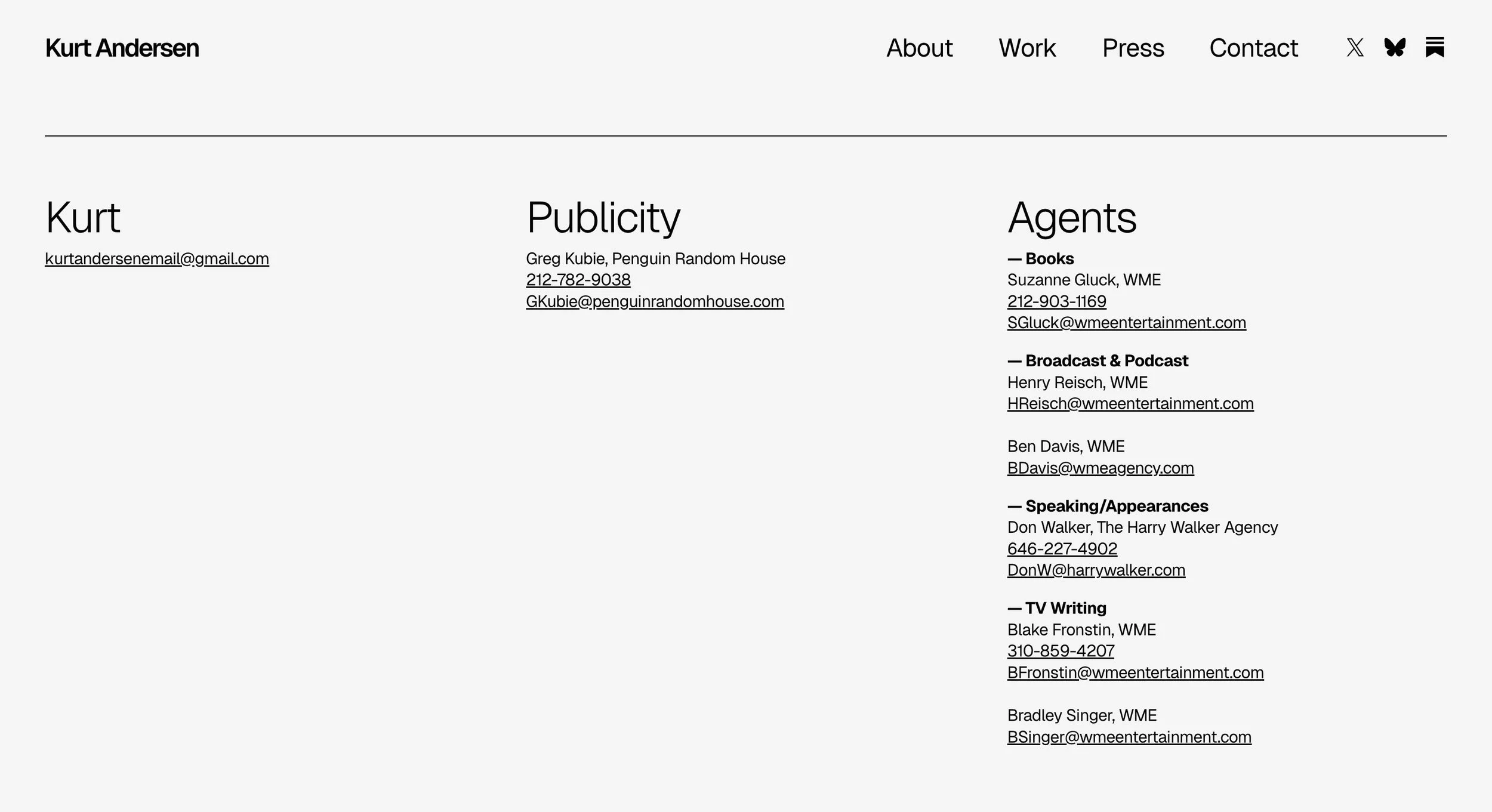
Kurt Andersen
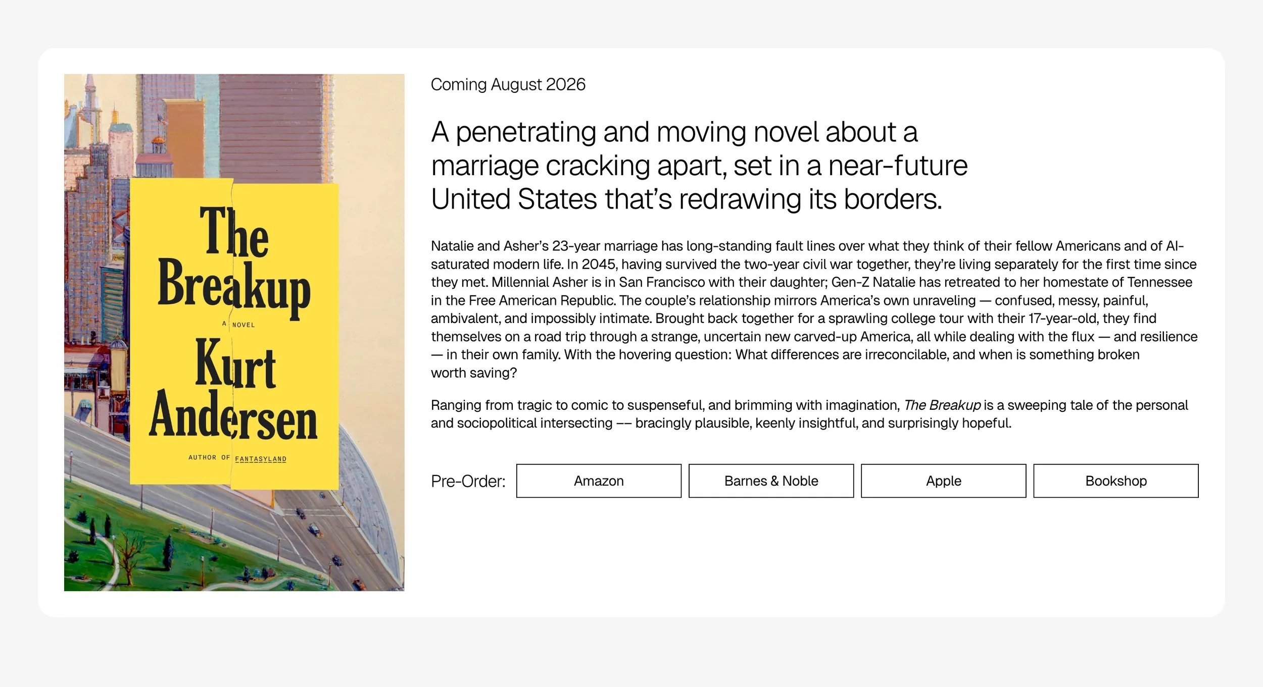
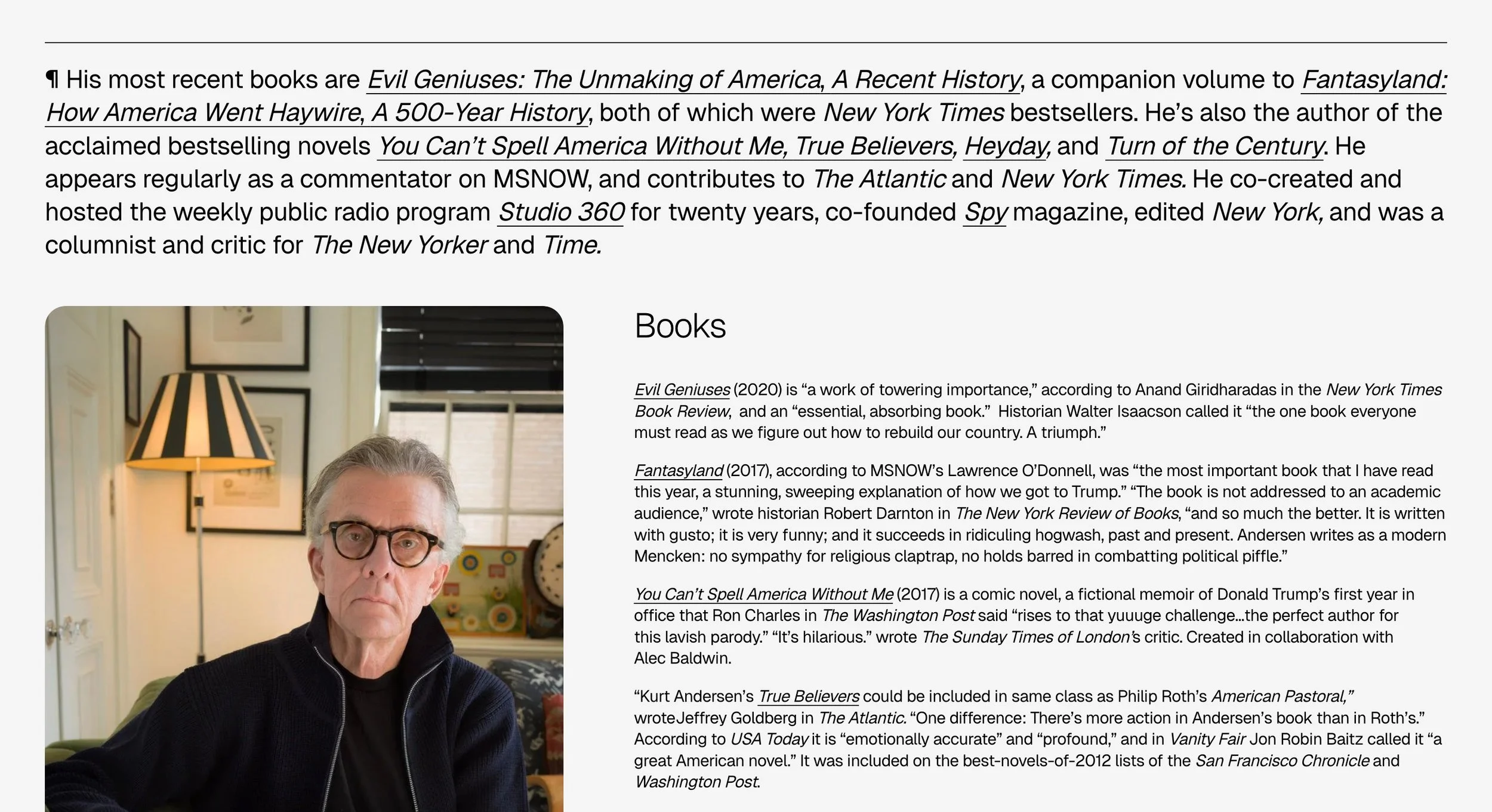
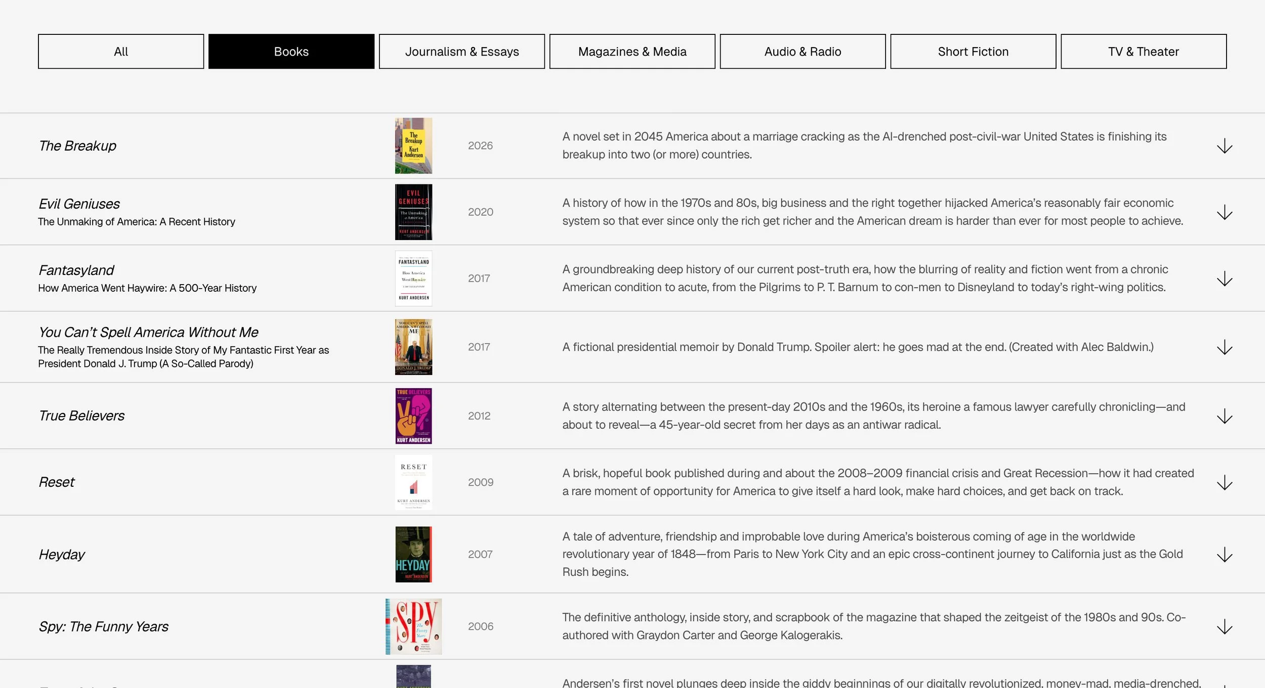
Kurt is a novelist, journalist, podcast host, and cultural critic. His website is built around a filterable index of every project across books, journalism, audio, theater, and TV: a working archive that prioritizes clarity, utility, and discoverability over flourish. Larger projects expand into inline panels with covers, blurbs, and reading links. Subtle horizontal rules and a recurring pilcrow mark nod to the structural bones of writing itself, while a contemporary, no-nonsense sans suits the steady, plainspoken voice of a writer who’s spent decades making sense of America. Also: he’s my dad.
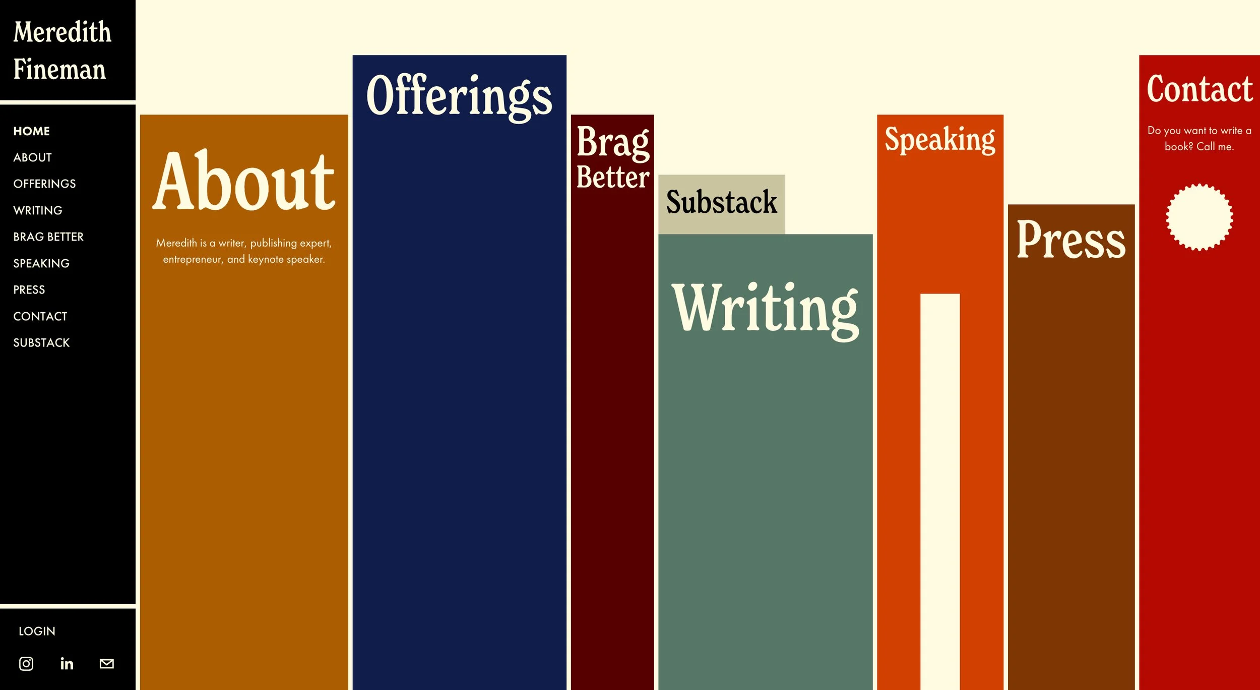
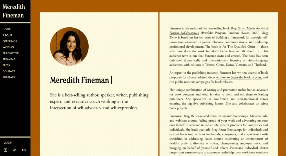
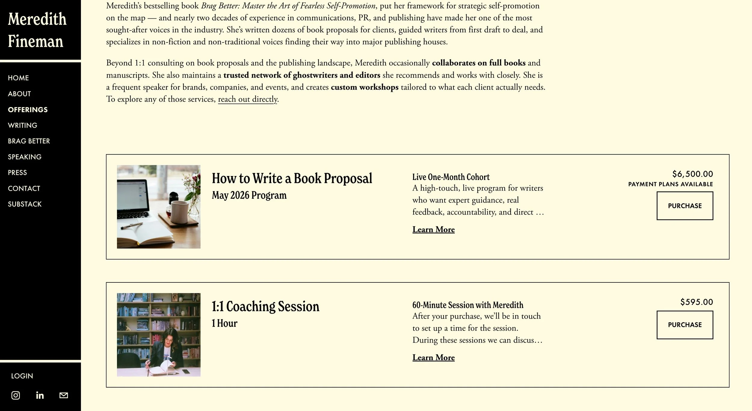
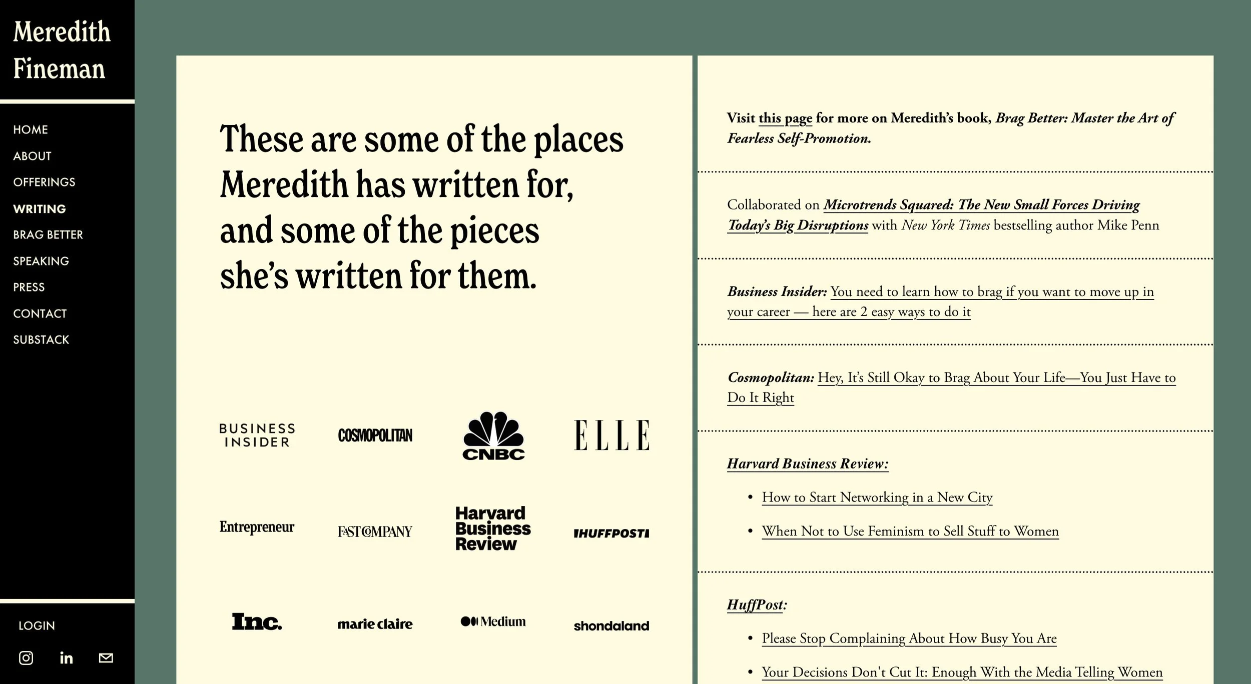
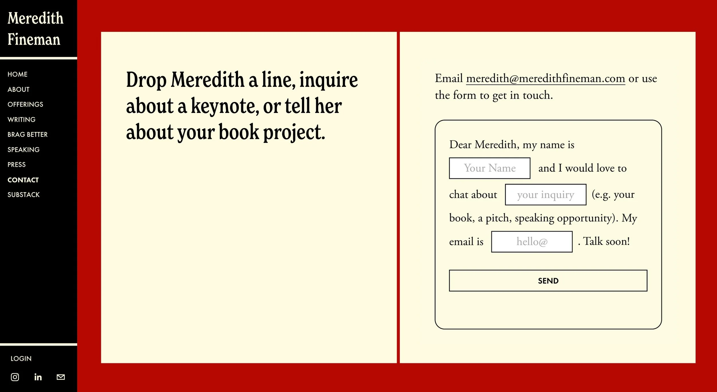
Meredith Fineman
Meredith guides aspiring writers through the publishing landscape as a bestselling author, speaker, and coach. Her website reimagines her digital presence as a personal library where visitors browse a virtual bookshelf on the homepage, selecting volumes that open to reveal different sections of her work. A vertical book serves as navigation, dynamic typing animations reinforce her writing expertise, and a 70s-inspired palette reflects her passion for vintage aesthetics. A professional portfolio that doubles as a metaphor for helping others find their place on the shelf.
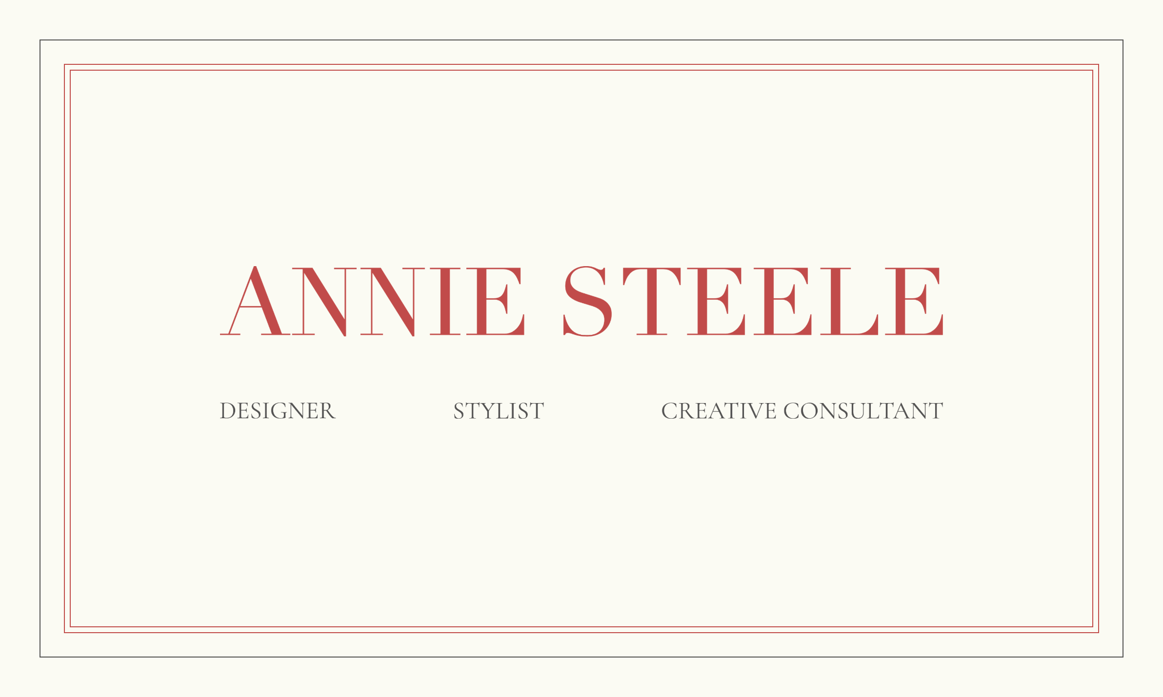
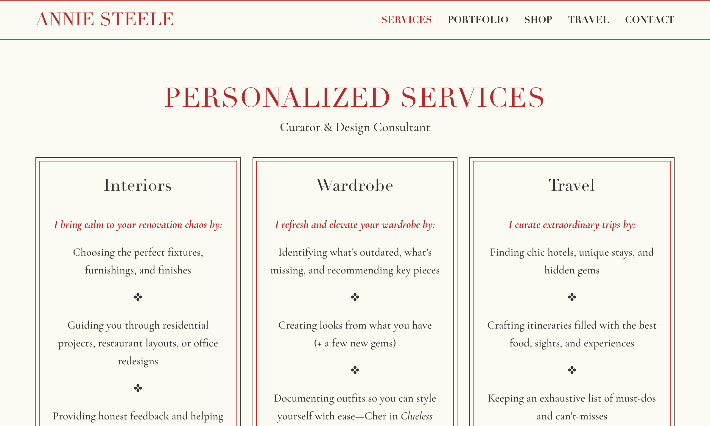
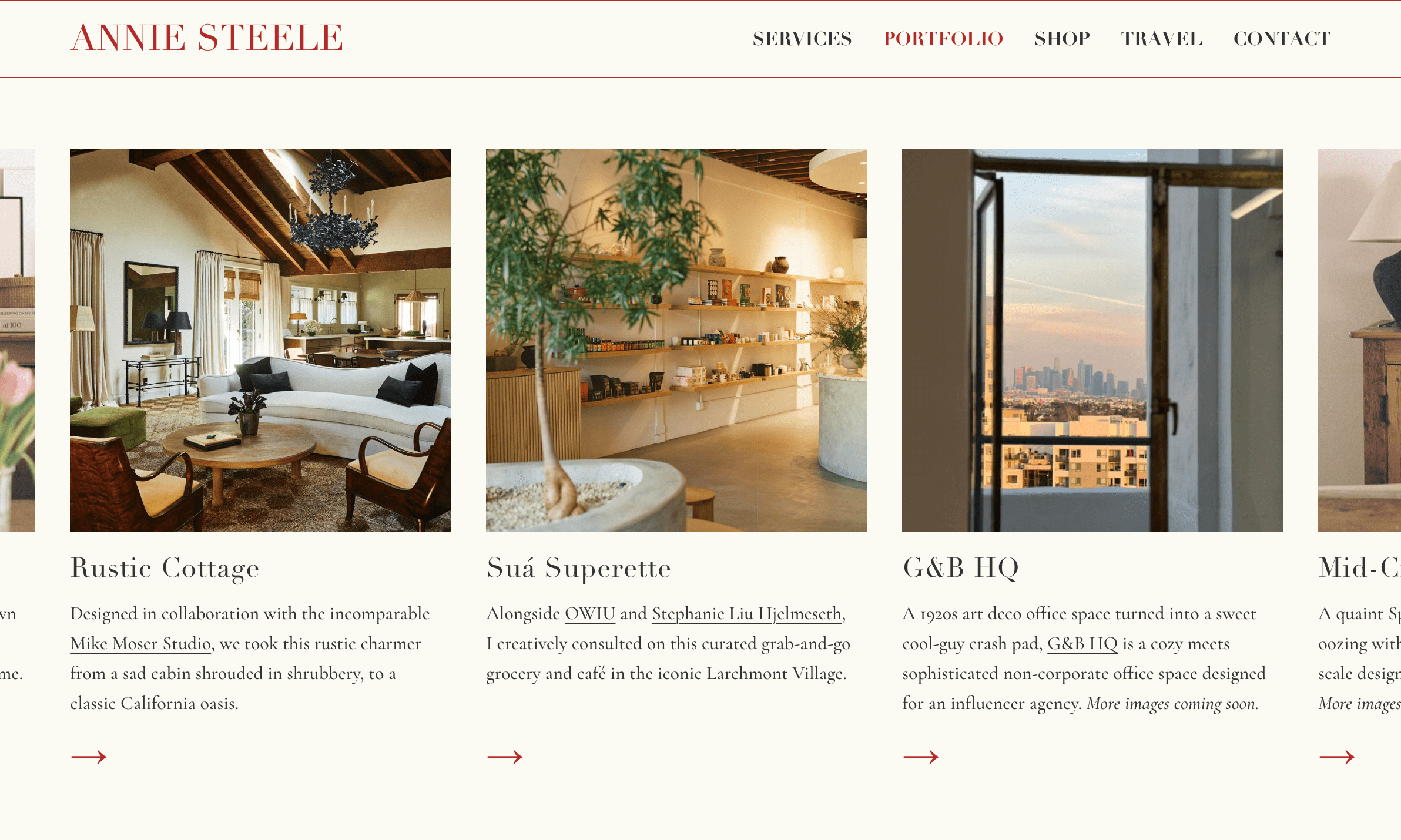
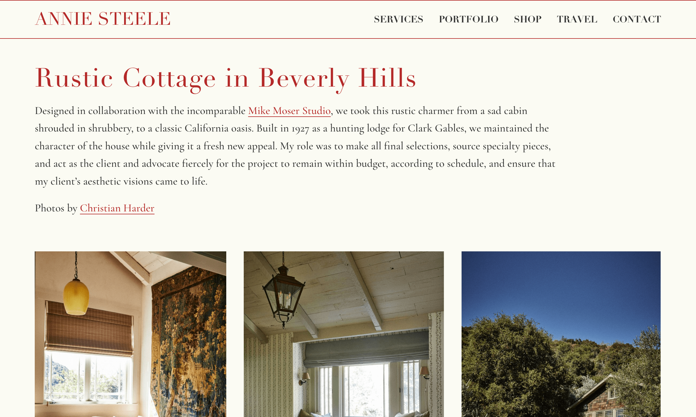
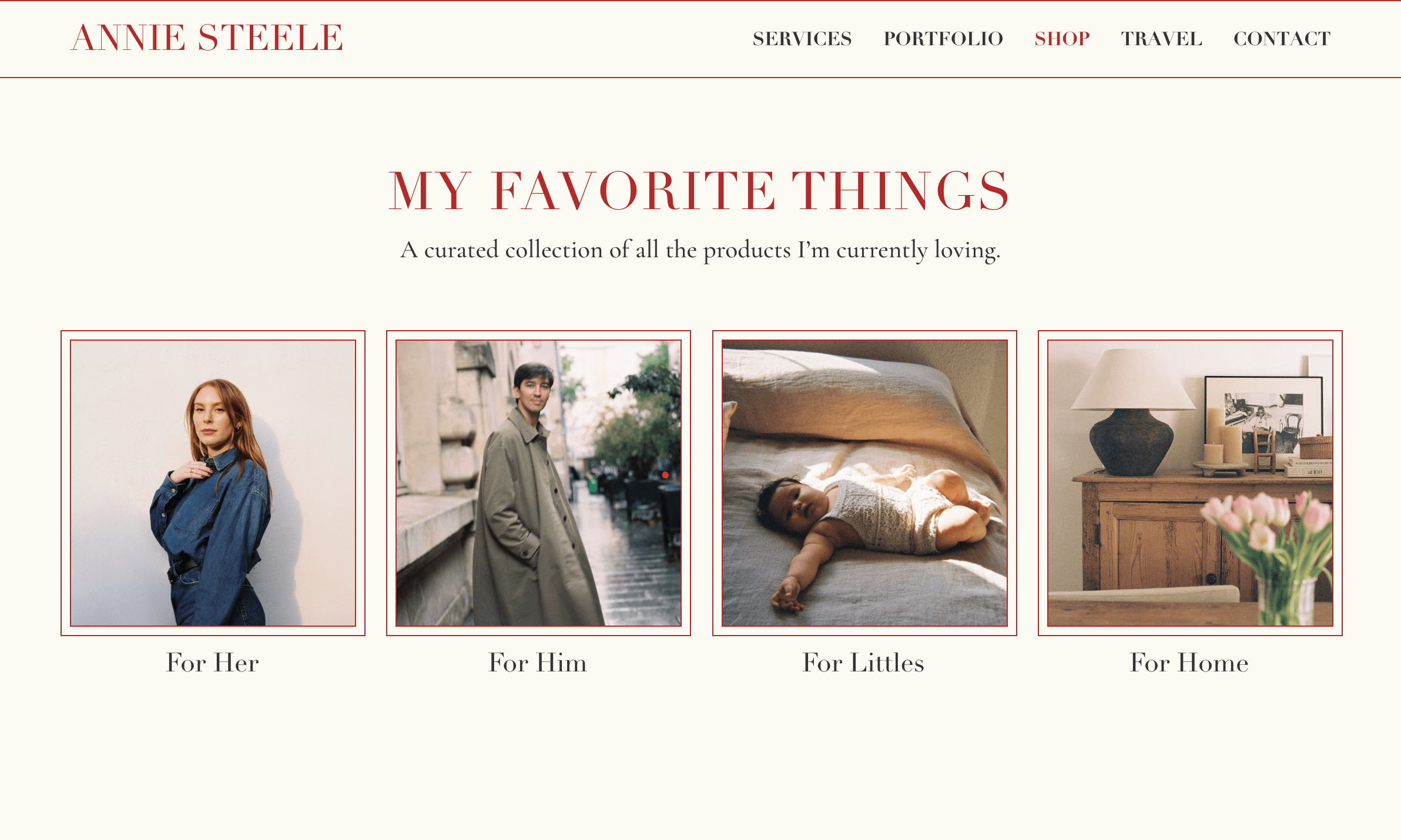
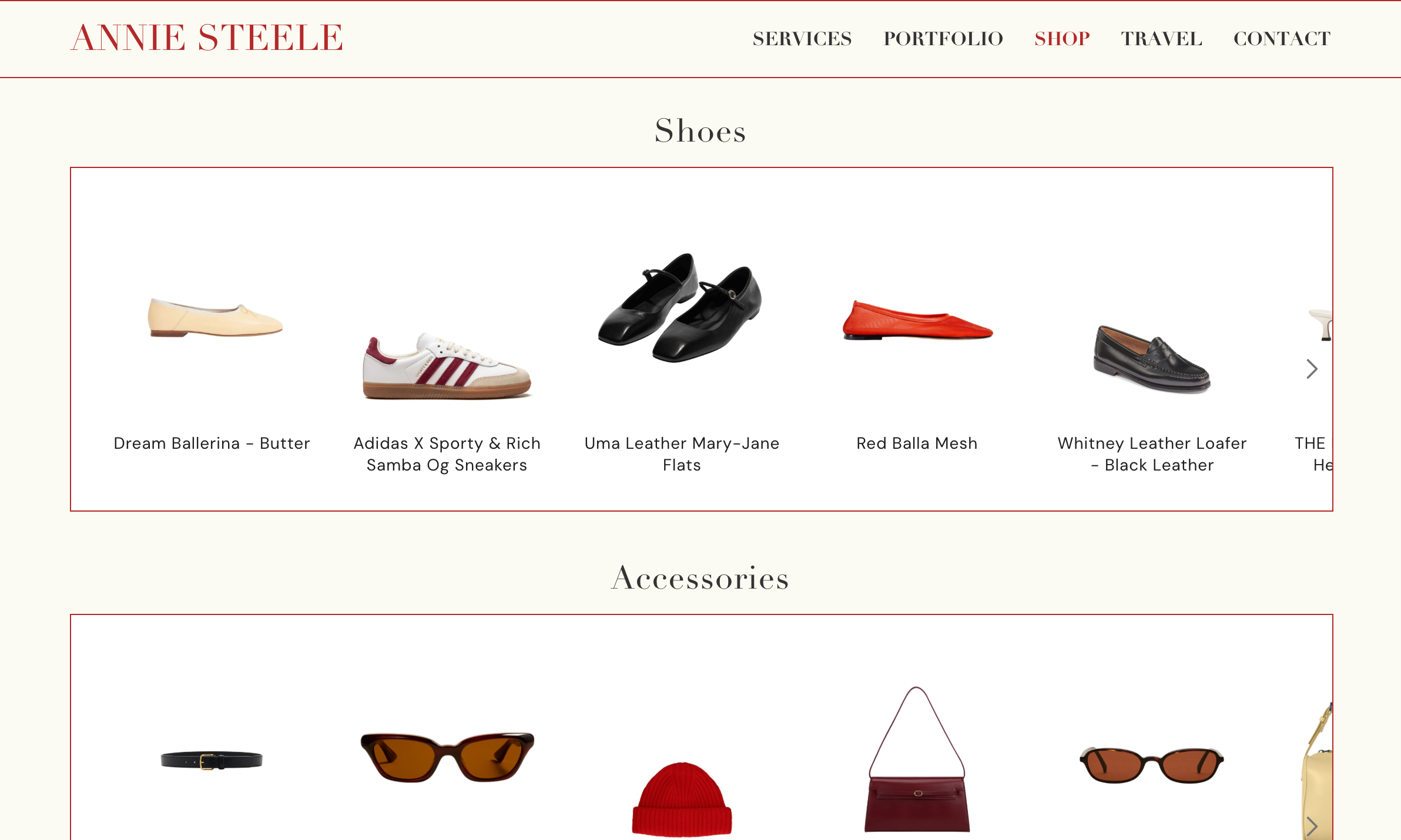
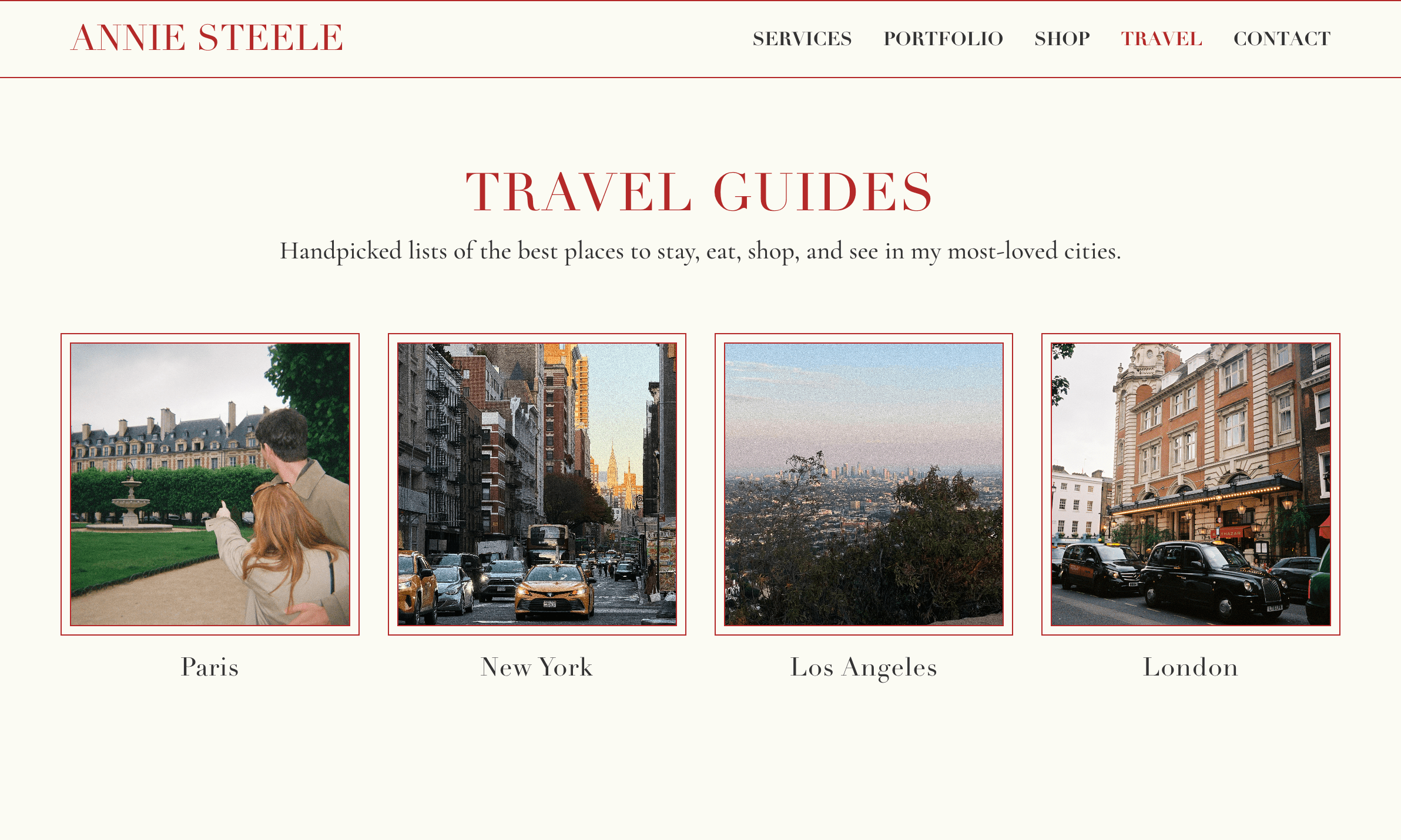
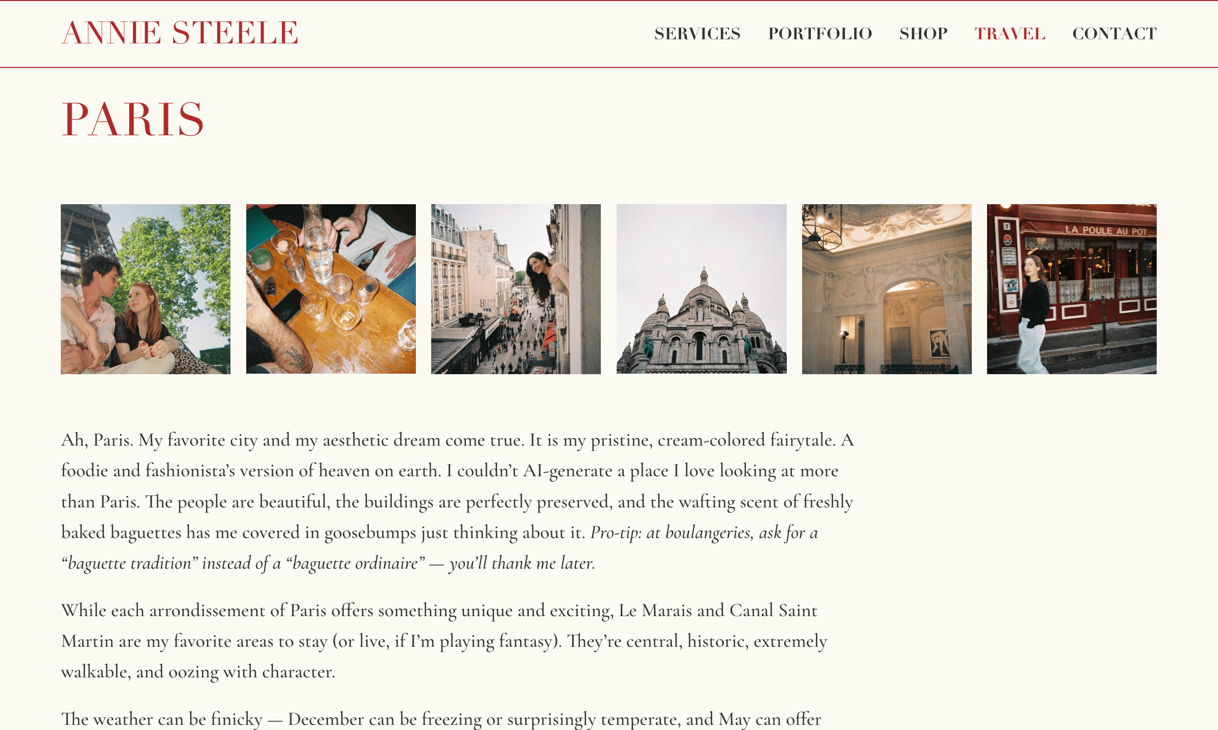
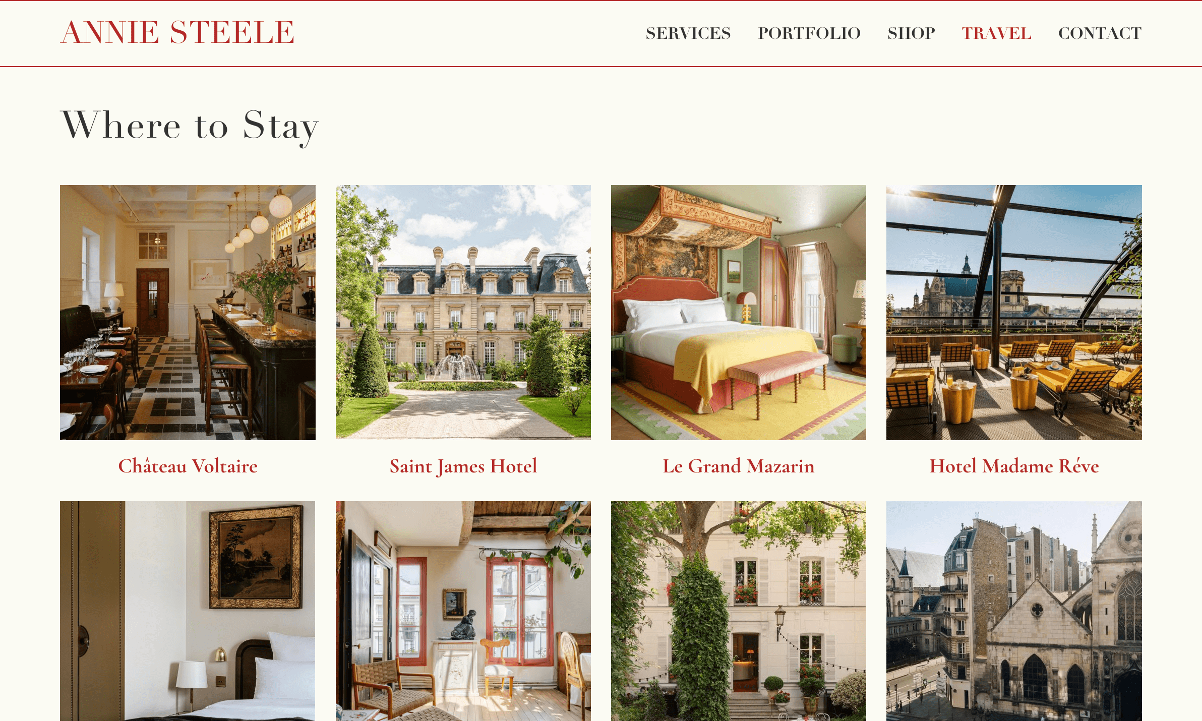
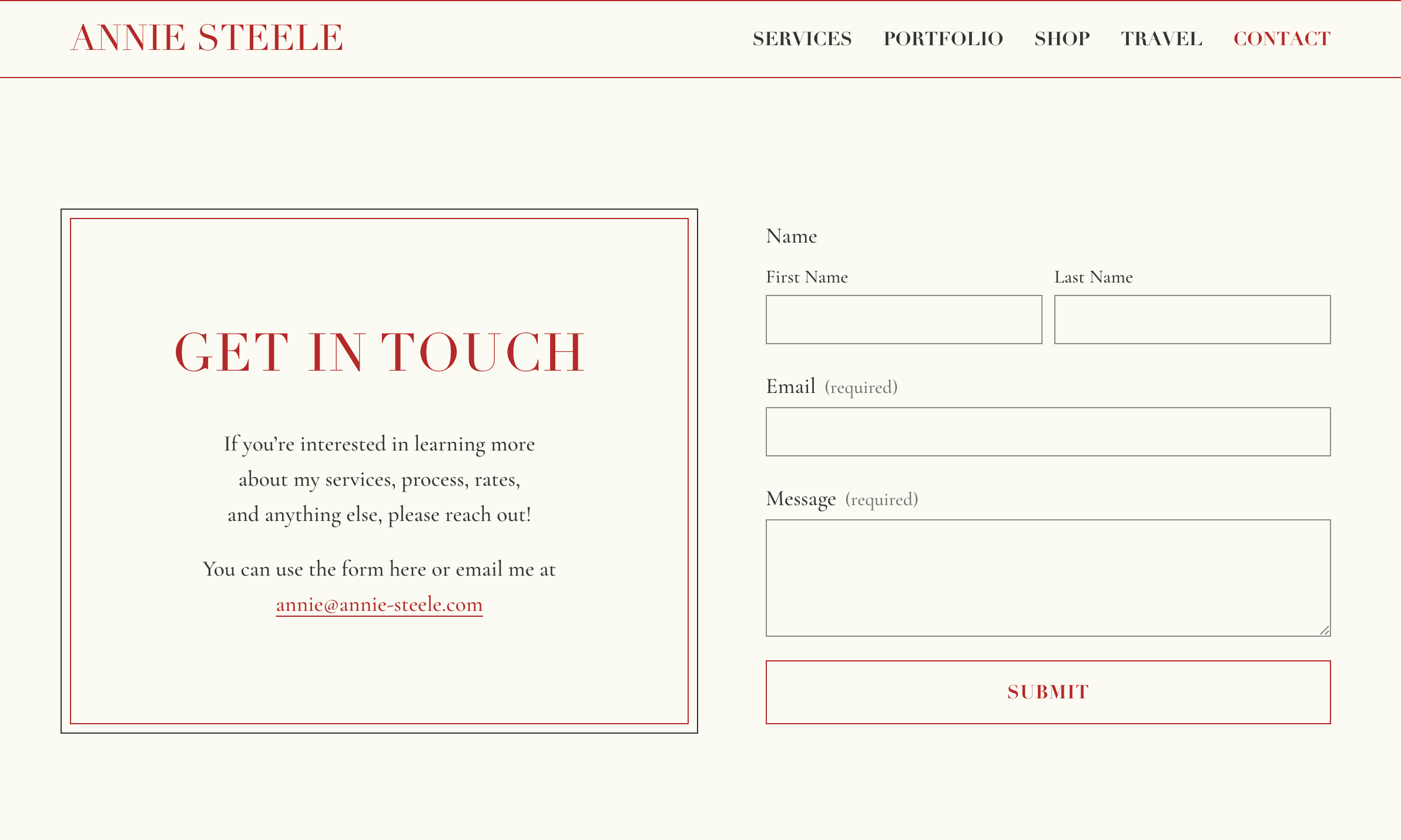
Annie Steele
Annie’s website translates her design and aesthetic expertise into a digital space inspired by her real, beloved French notebook. The interface unfolds on a pristine cream canvas accented with her personal signature bright red. Bordered panels evoke carefully pasted cards, travel recommendations read like pages from a journal, and refined serif typography maintains the vintage stationery feel throughout. An intuitive backend lets Annie continually refresh her content, keeping the site as current as the style confidante behind it.
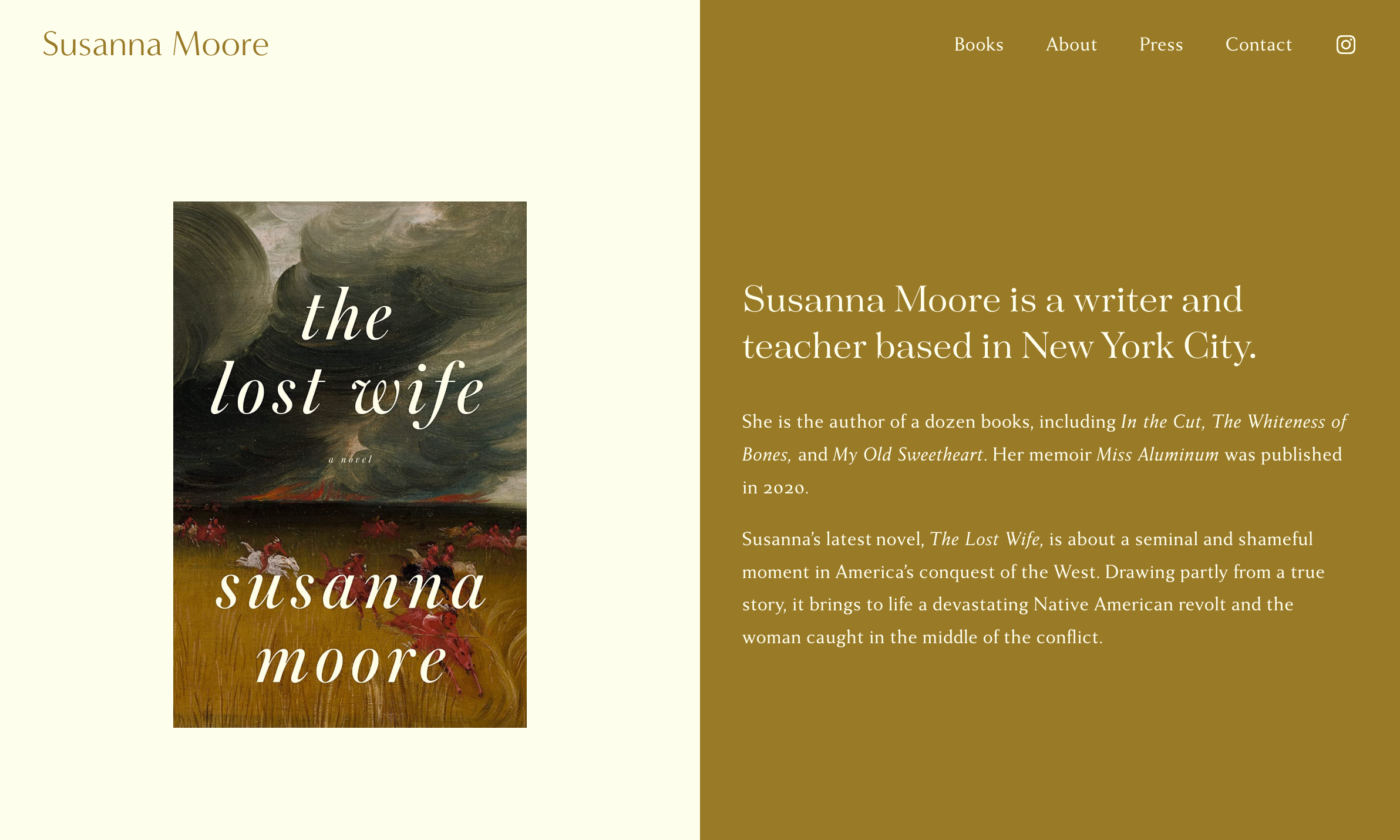
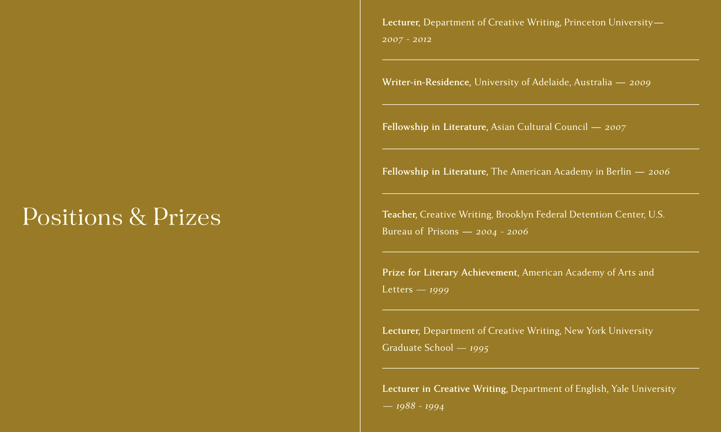
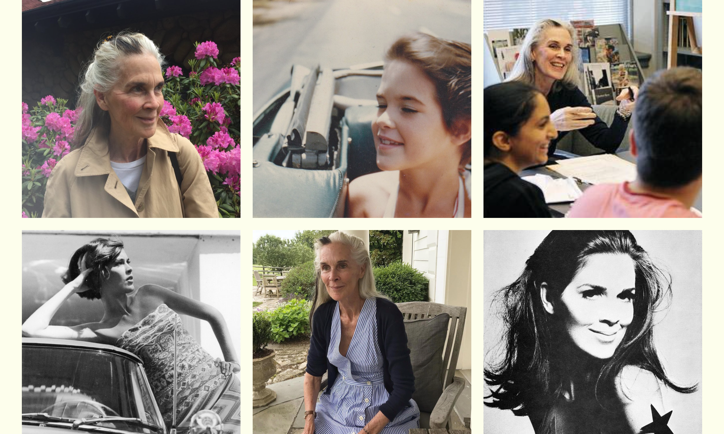
Susanna Moore
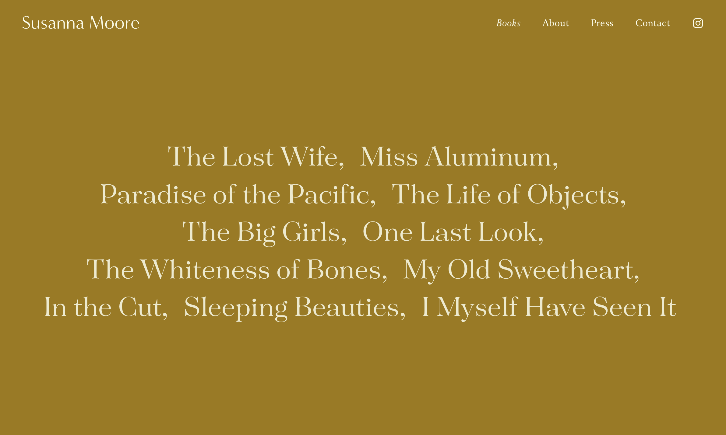
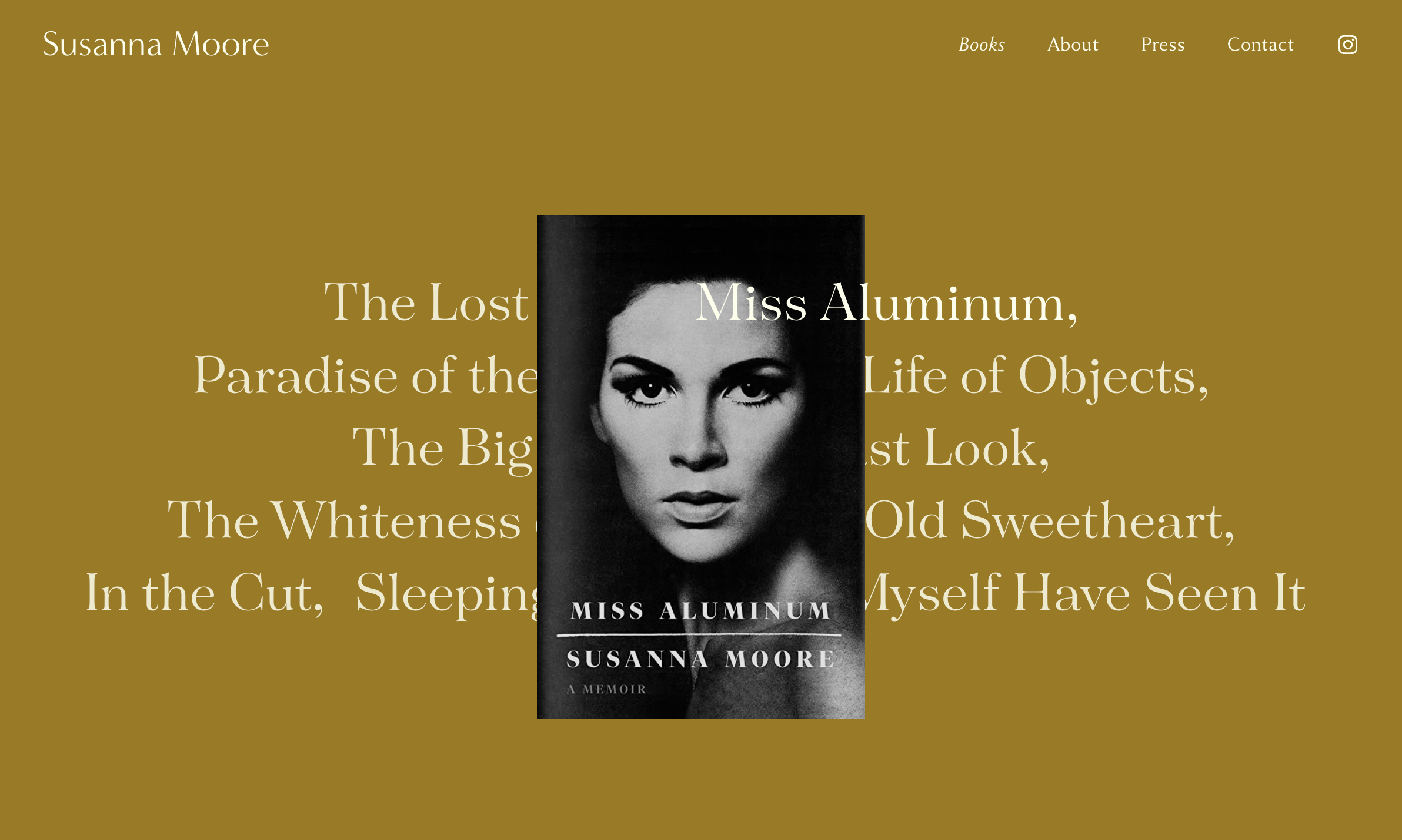
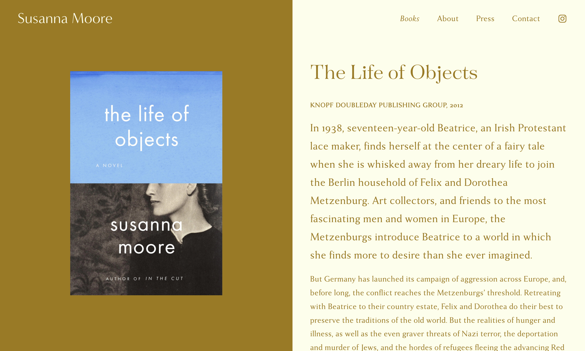
Susanna’s site embodies her elegance and straightforwardness, while providing a contemplative space for her words to resonate. A split layout creates a natural framing device for book covers and content, with refined serif typefaces conveying literary tradition. Book titles float across the screen like chapters in an unfolding narrative, positioned against a golden field that gives each work a gallery-like presence. The restraint of the design mirrors both Susanna’s dignified presence and the searing sparseness of her prose.
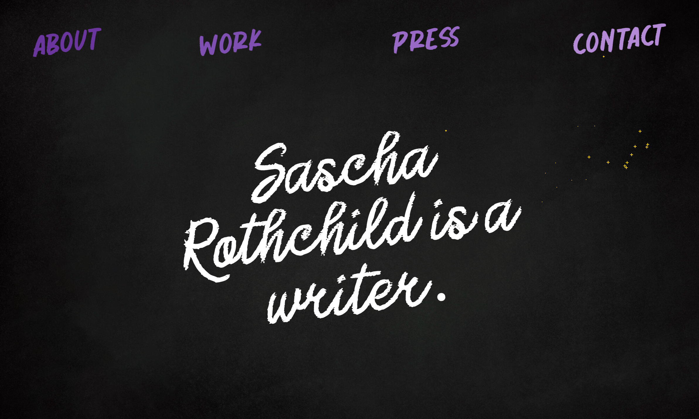
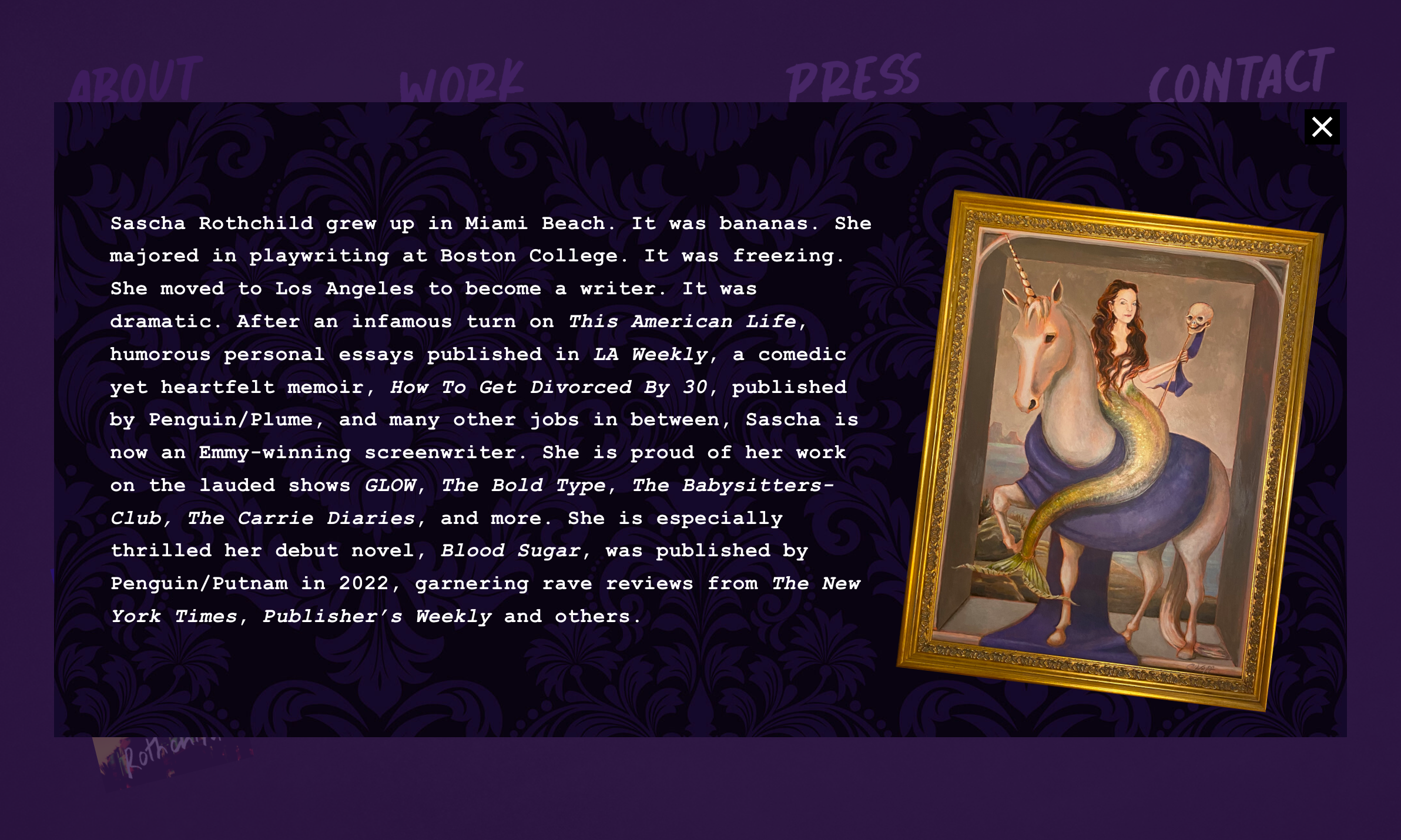
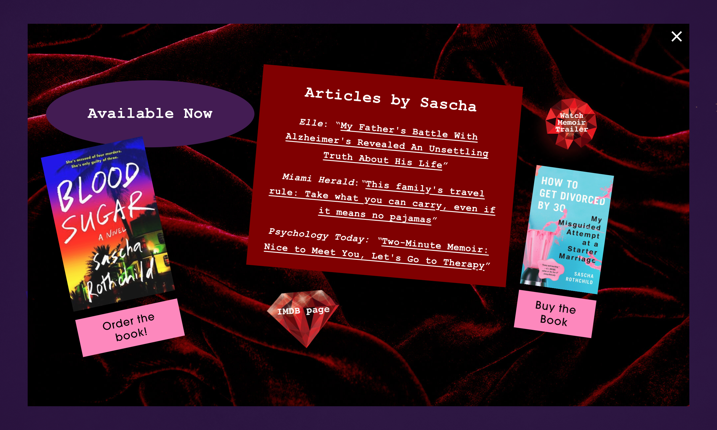
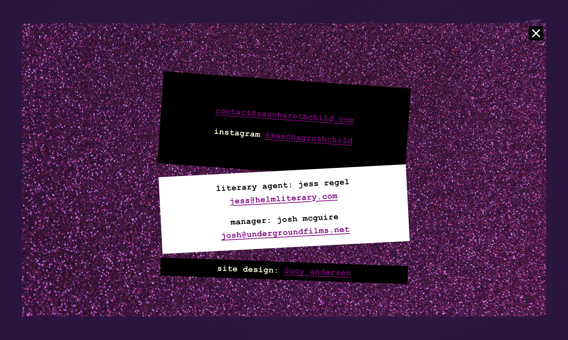
Sascha Rothchild
Sascha’s website bursts with personality through a design that feels like flipping through your teenage diary. Deep purple and black backgrounds set the stage for electric pink accents and handwritten chalk typography, while content appears in popup panels complete with velvet textures and glittering sparkles. The cursor leaves a trail of pixie dust, tilted text boxes and funky framed artwork lean into the kitsch — but there’s still restraint and polish underneath, mirroring Sascha’s writing voice perfectly.