Diptych Press is an independent literary publisher that pairs two seemingly unrelated texts in thoughtfully curated dialogue, illuminating unexpected connections between writers across literary and linguistic traditions. Each text holds its own, but together the pairings reveal surprising resonances. The press also hosts events that invite translators, writers, and readers to dig deeper into the connections between the works they publish.
The visual system was developed to support Diptych’s initial fundraising and development phase, with plans to expand as they begin publishing and building their catalog. The identity celebrates the imprint’s core duality through a medieval, diptych-inspired design system. Ornamental patterning and rich, warm tones evoke the decorative traditions of medieval illuminated manuscripts and the Arts & Crafts movement, grounding the press in a deep reverence for the printed word. At the center of the identity is the amphisbaena, a mythical two-headed creature that embodies the conversation between each pair of books.
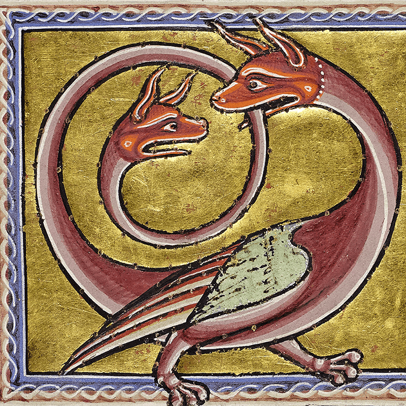


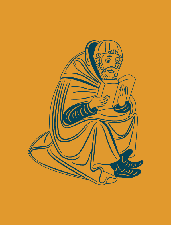


The visual identity draws from the rich color palette and ornate beauty of medieval diptychs and illuminated manuscripts, employing split-screen compositions and paired elements that mirror the publisher’s two-book model. Clean typography, bold patterning, and varied illustration styles sit alongside the historically rooted logo and warm palette, giving the publisher a feel that is both scholarly and fresh.


