Prickly Paradigm Press is an independent publisher reviving the pamphlet for the digital age, putting out short, provocative books by serious thinkers on topics ranging from anarchism to pizza to AI. After more than three decades and various lives, the press required a website that could hold its entire back catalog, an editorial supplement, and the full digital text of new pamphlets, all without softening the scrappy, idea-first ethos at the heart of the imprint.
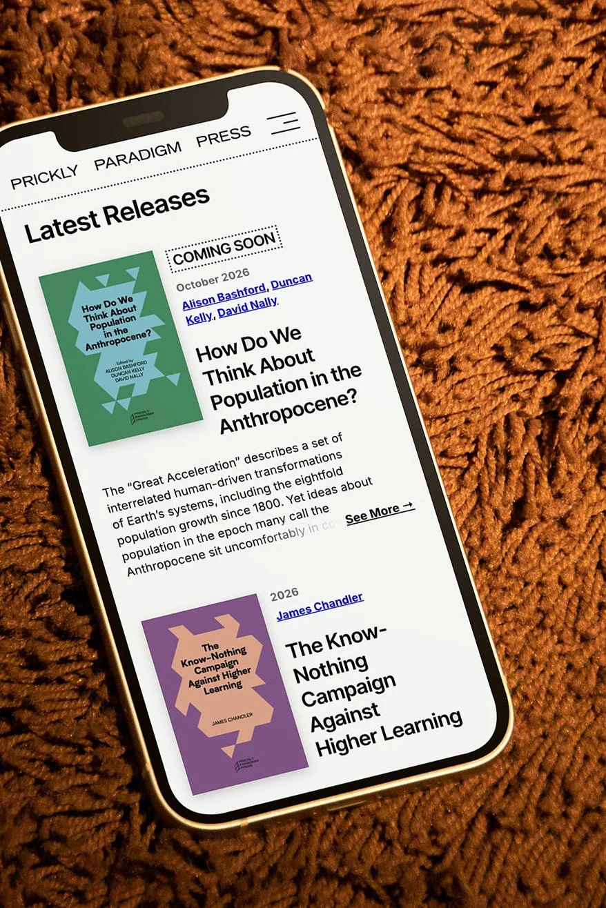
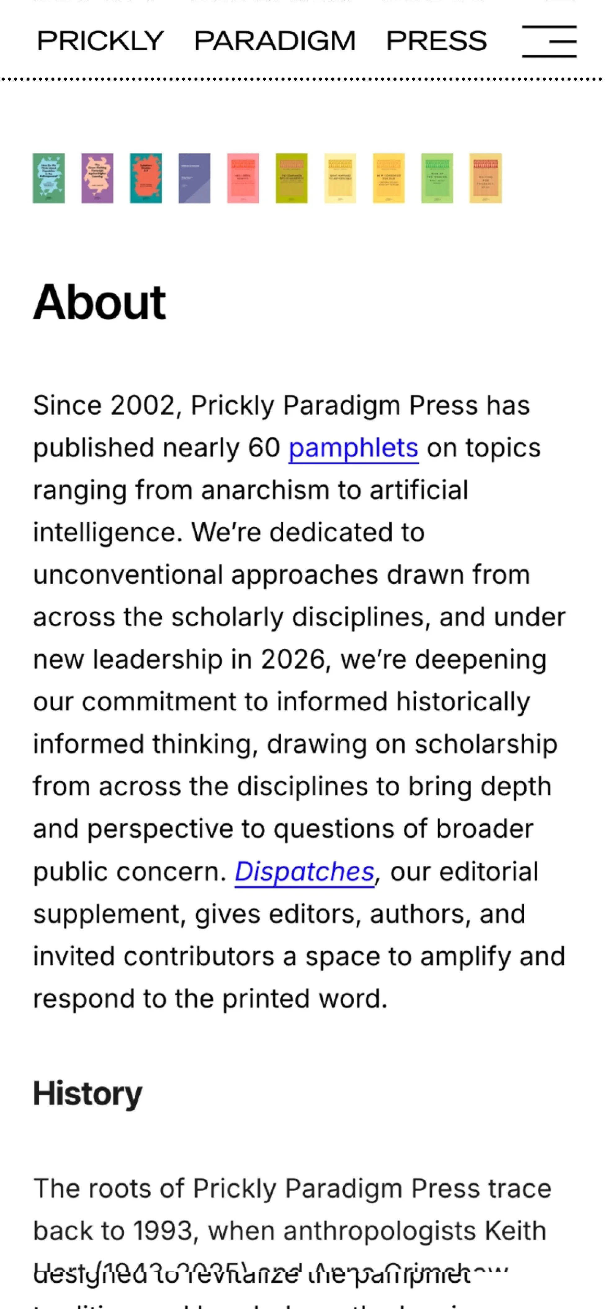
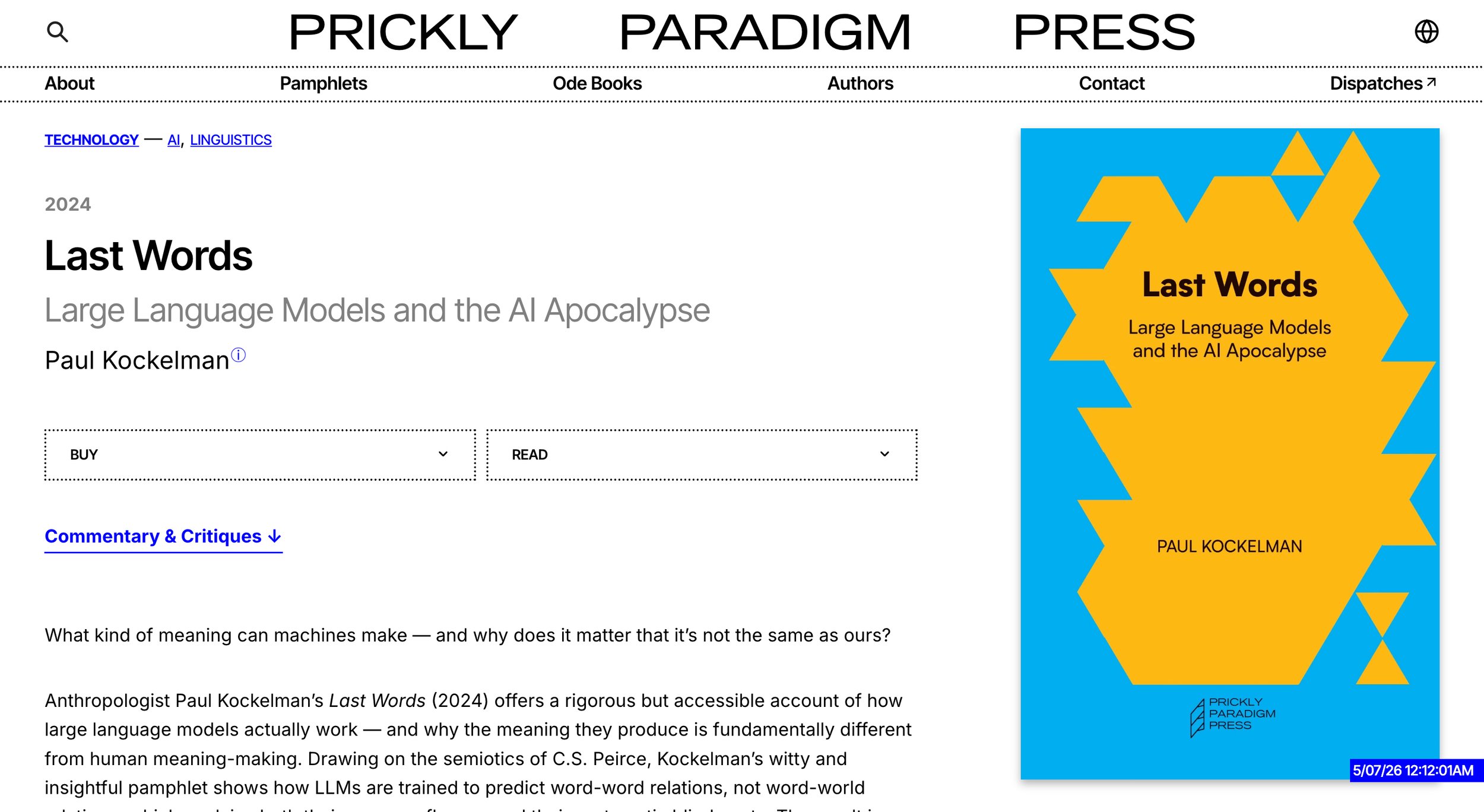
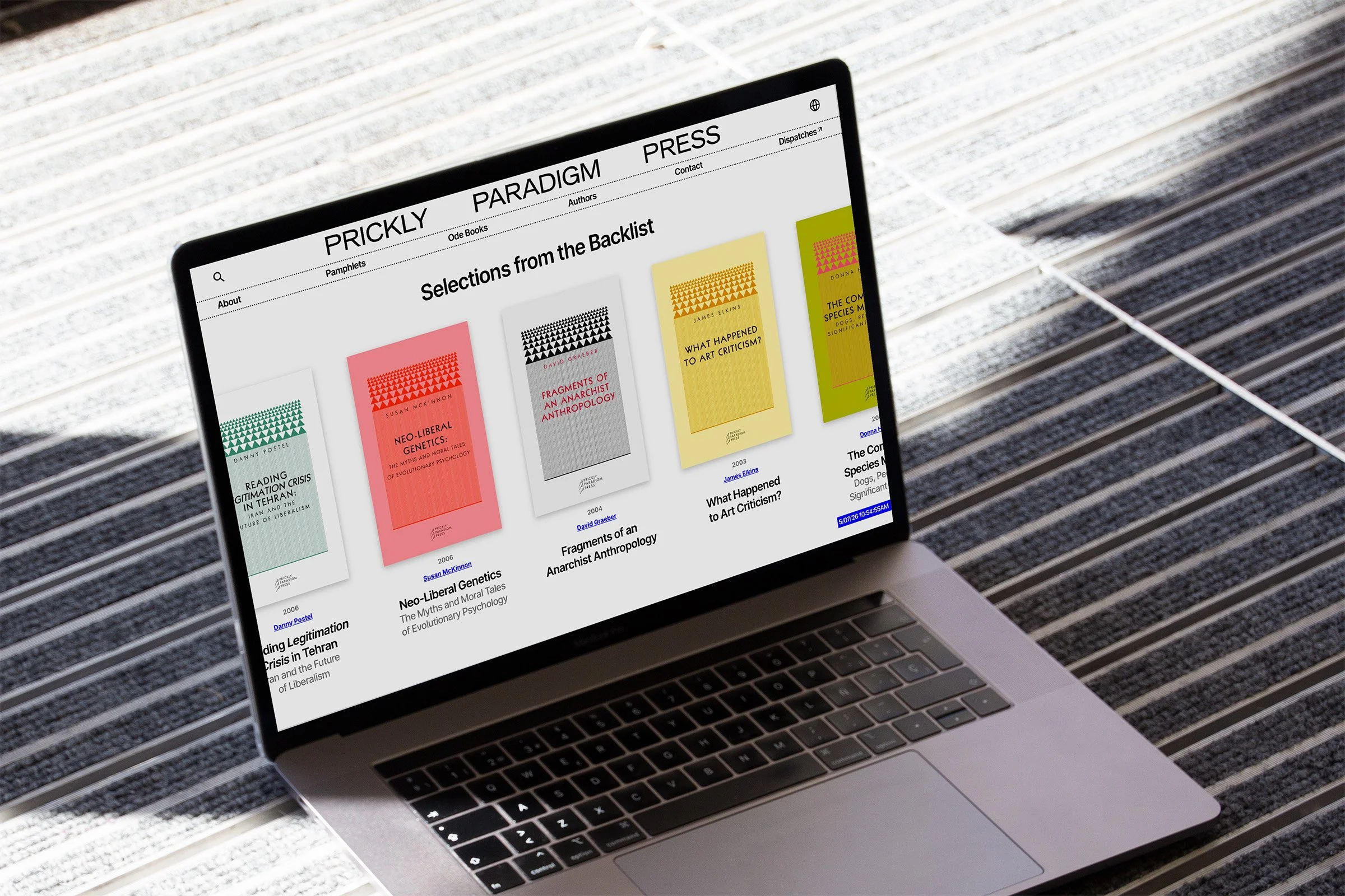
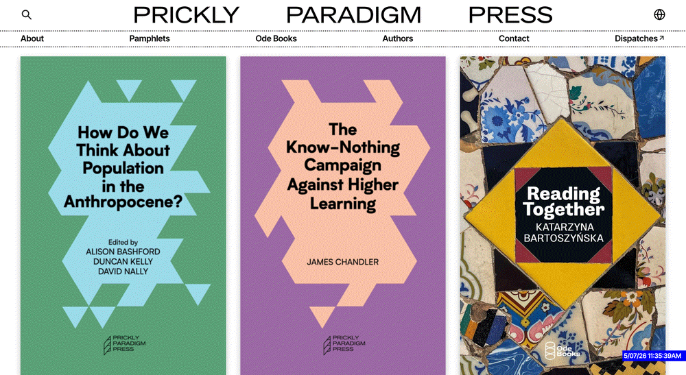
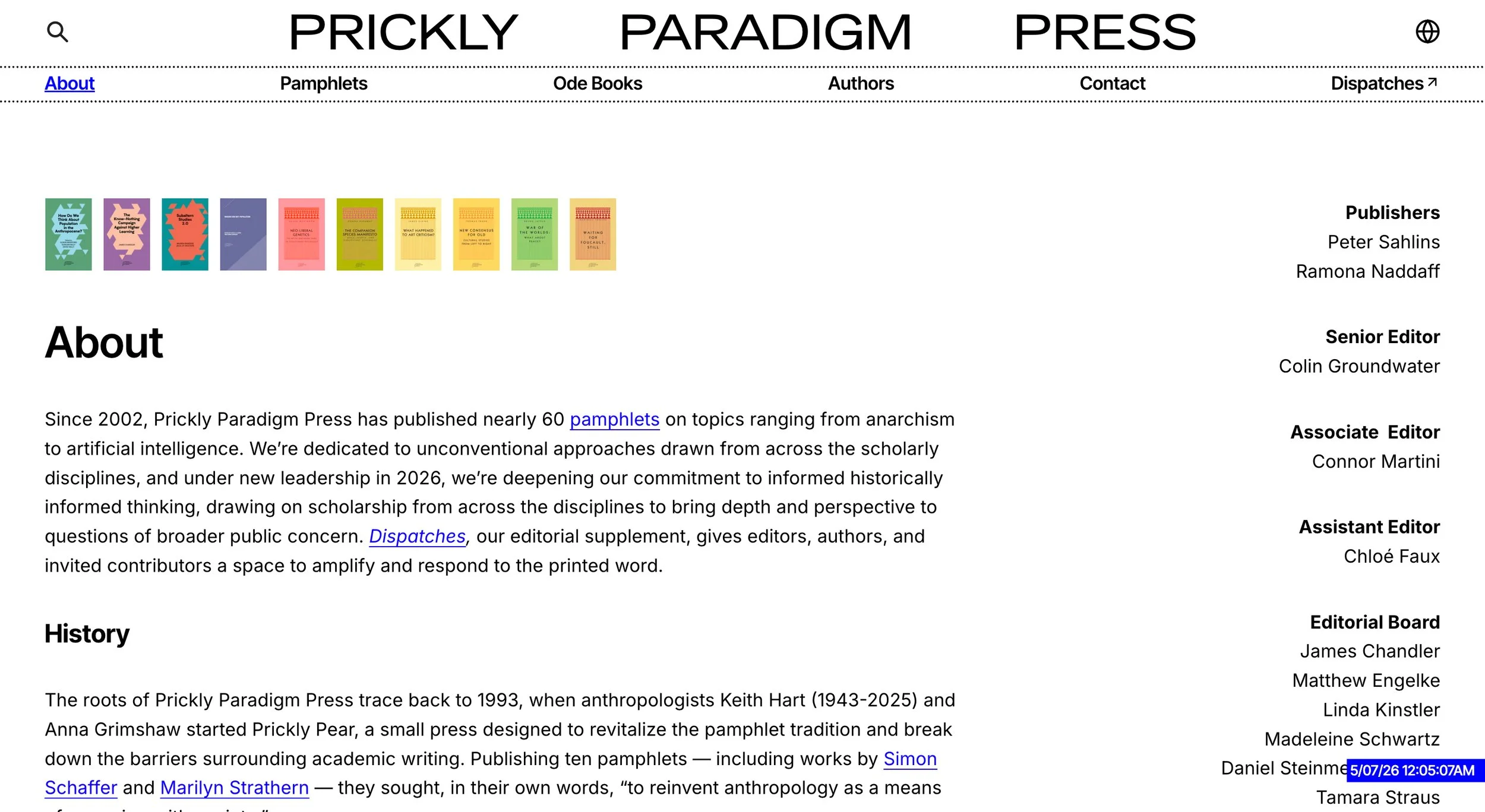
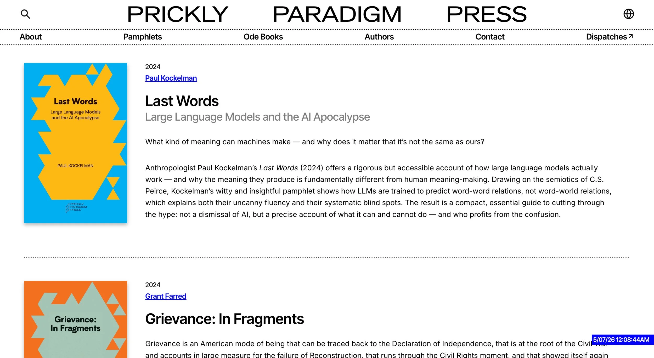
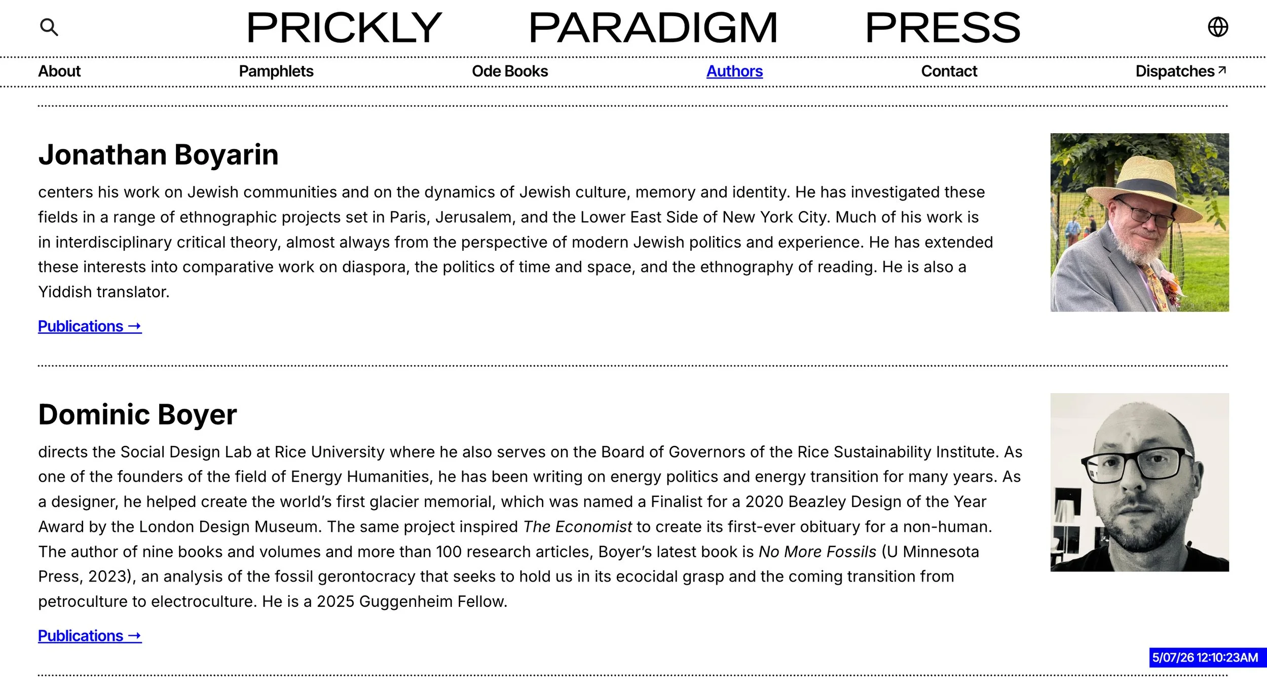
The site treats the press’s catalog and content as the main event. With more than sixty pamphlets and cover designs spanning multiple aesthetics, the online presence needed to be a coherent frame for it all. The design borrows from the visual language of printed pamphlets and the early web — two formats built for ideas to travel cheaply and far. Bold and intentional in its simplicity, the site lets the press’s restless bite come through.
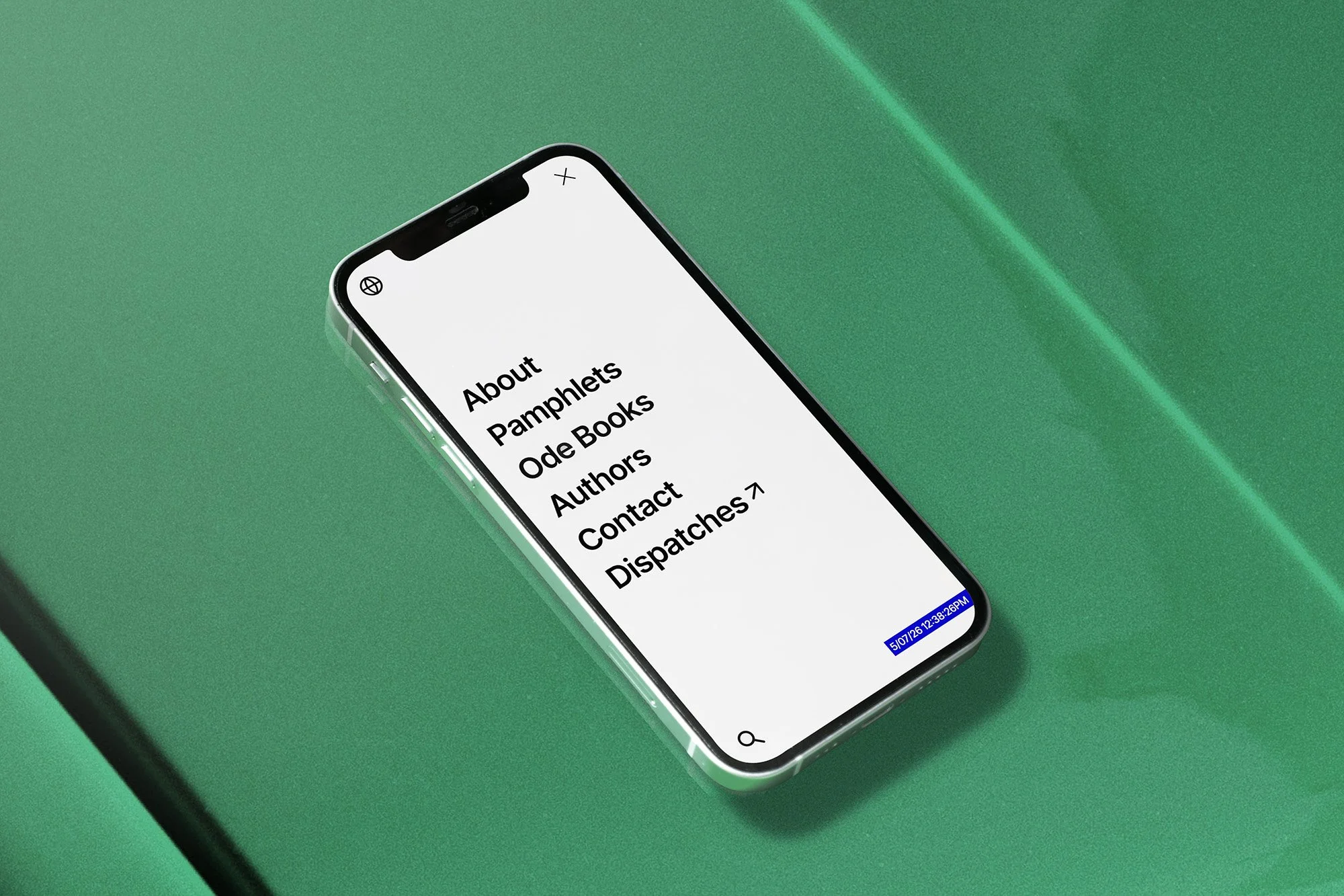
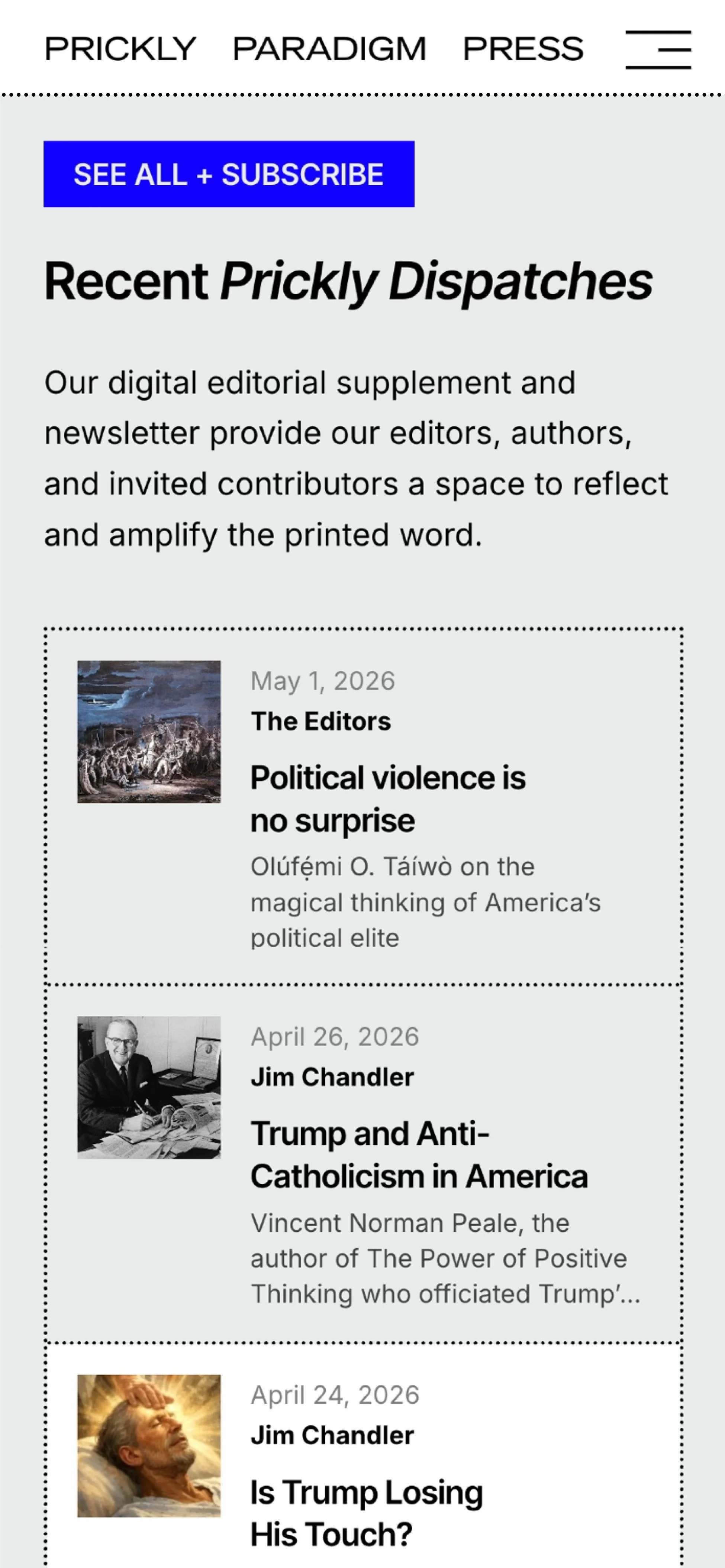
A horizontal wordmark adapted from the existing logo declaratively stretches across a fixed header. Dotted rules echo the fold lines of handmade pamphlets and the tear-away edges of flyers. The matter-of-factness of academic publications meets the looser energy of self-published print. A single open source font is used throughout, chosen as much for its reach as its plainness — anyone, anywhere can use it. Hyperlink blue serves as the primary accent color, the most essential user experience tool of the early digital era. A custom Google Translate widget makes the archive readable in a dozen languages. Every choice serves a press whose whole project is putting ideas into the world.
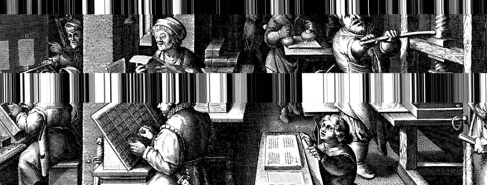
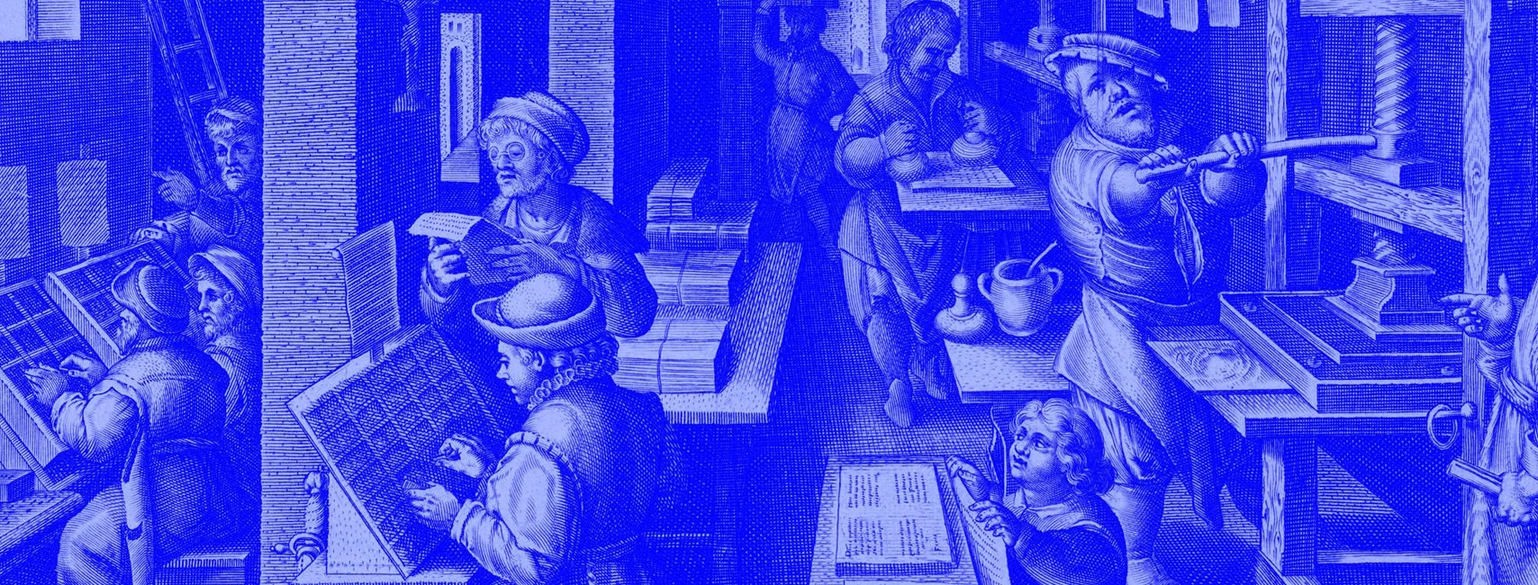
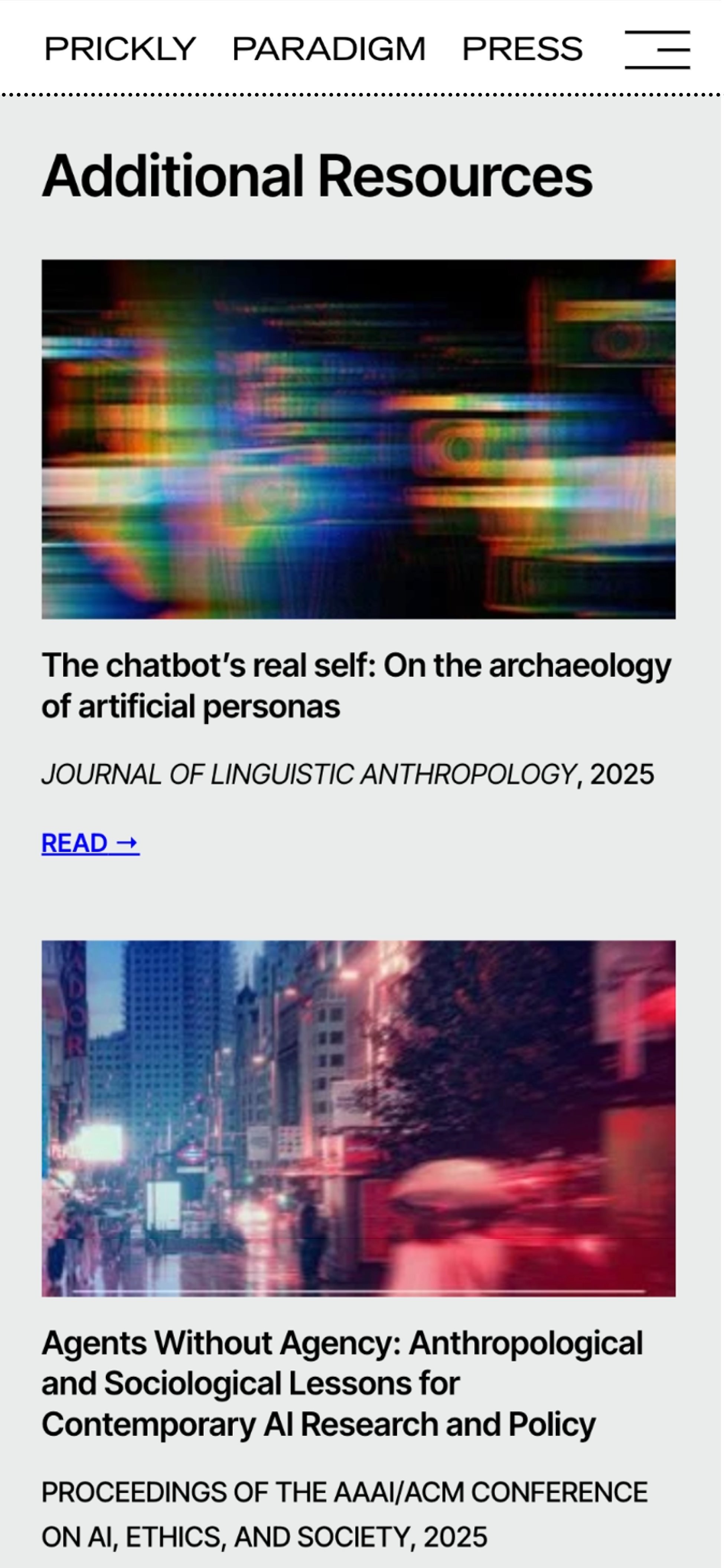
Social share assets take a 16th-century engraving of a Dutch printing office and run it through glitch effects and bright duotones to make the “pamphlet for a digital age” message immediately legible.